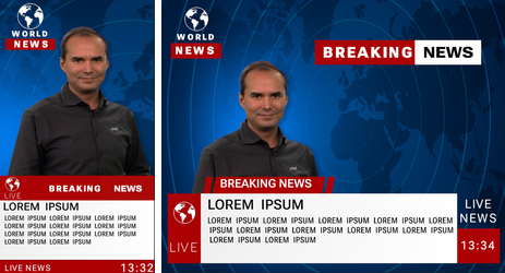
To adapt you graphics to different aspect ratios, resolutions and layouts, the classic 3D transformation is not flexible enough. The layout has to be done by using plugins or customized scripts. Absolute pixels values used for position or similar do not work as soon as the output format changes.
Modern web page design uses a very flexible approach by using nested boxes to define a layout. These layouts are very responsive, can automatically adapt theirs sizes and the way how to show its content. Positioning is no longer based on absolute pixel values, instead a flexible layouting algorithm uses aspect ratio, percentages and pre-defined behavior to render the content, even without knowing the final resolution. Scenes based on Flexboxes form-fit, based on the output format(s).
Building scenes based on boxes is a complete new approach and might be a bit tricky to start with. In the other hand, it solves problems where one typically had to use different plugins or even needed to write custom logic.
Information: The order of your tree structure has an influence on how your boxes are aligned. This does not apply to the classic XYZ-layout.
The flexbox integration is based on state-of-the-art web technologies, therefore a lot of documentation is available as well as simulators to test a concept.
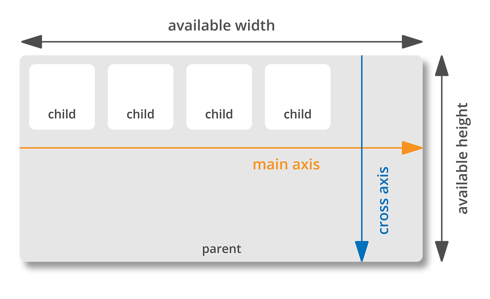
Using boxes on the container allows to alter its content width and height to best fill the available screen space. Flexbox layout is direction-agnostic. Lets have a look onto the following picture:
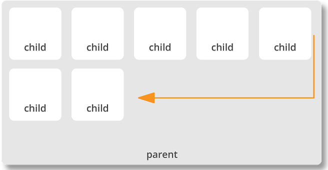
The alignment of any children is based on the direction of the main axis. The flex directional flow can be specified as left to right, right to left, top to bottom or bottom to top or in other words in columns or rows. Moreover, the flex layout is less restrictive in terms of content flow. The layout can adapt to the available width and height, boxes can adjust if their content won't fit.
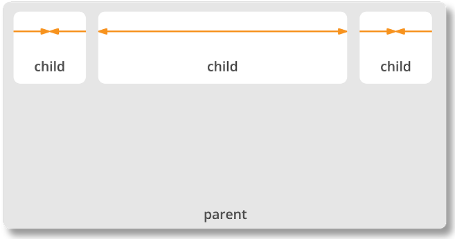
Boxes can adjust in size by either decreasing, to avoid unnecessarily monopolizing space, or increasing to make room for contents to be constrained within its boundaries. Individual items within a flex container may also be automatically reordered and rearranged to suit the available layout space
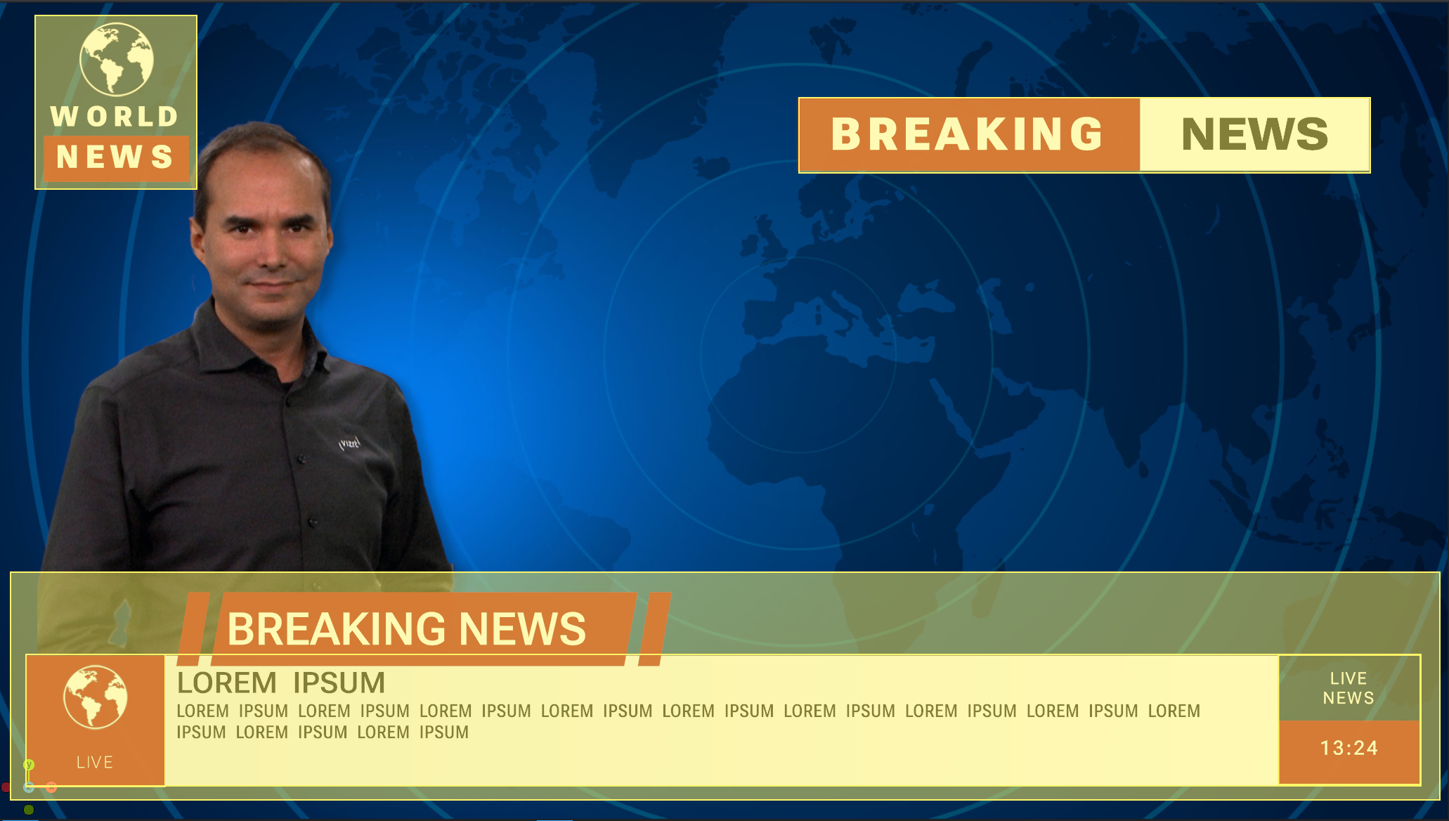
The Flexbox follows a two dimensional alignment, however it is possible to still use it within a 3D environment. Looking at a typical broadcast graphic, the layout can be split into the following boxes:
With the flexible layout and the possibility to work with aspect ratio, the graphics can easily adapt to different formats:
Information: The Flexbox plug-in requires a valid license and is available for the Viz Engine Render Pipeline only!
