The Gradient Texture Renderer draws a color gradient as a texture, so any material in a scene can use a linear, radial, angular, reflected or diamond gradient without an image file. You set the colors once in a color ramp, pick a style, and every setting can be changed live or animated.

Click on the icon to add a new gradient. Then double click it to change its settings. Drag the gradient to any texture drop area to use it.
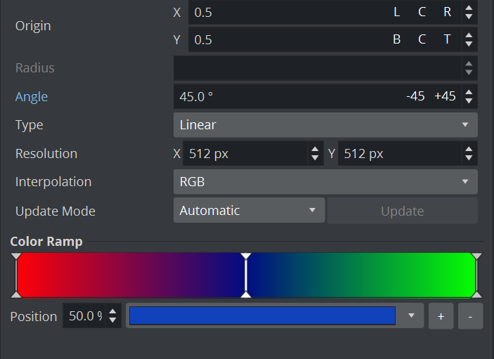
A new Gradient starts as a black-to-white Linear gradient at 45°, centered, 512 × 512 px. For a flat, poster-like look, switch off lighting on the material (unlit), otherwise scene lights shade the gradient.
Gradient types
The Type decides the shape the color ramp is laid along; the same ramp gives five very different looks.
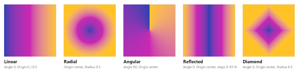
Type | Shape | Settings that matter |
|---|---|---|
Linear | Straight bands, ramp runs from the Origin along the Angle | Angle, Origin |
Radial | Circles around the Origin | Origin, Radius |
Angular | A sweep around the Origin, like a clock hand; starts at the Angle and runs counterclockwise once around | Angle, Origin |
Reflected | Linear, mirrored on both sides of a line through the Origin | Angle, Origin |
Diamond | Squares turned 45° around the Origin | Origin, Radius, Angle rotates it |
Radial and Diamond reach the last stop at the Radius. Linear and Reflected ignore Radius and reach it one texture width from the Origin, which is why a centered Reflected gradient only shows the first half (0–50 %) of the ramp.
Settings
Every setting can be changed live; Angle and Radius can also be keyframed.
Setting (editor) | What it does | Used by | Default | Range |
|---|---|---|---|---|
Type | Gradient style | all | Linear | Linear, Radial, Angular, Reflected, Diamond |
Angle | Direction in degrees: 0° runs left to right, 90° bottom to top | Linear, Reflected, Angular (start line), Diamond (rotation) | 45° | any value, animatable |
Origin X / Y | Start point or center, in texture space: 0 0 = bottom left, 1 1 = top right. Buttons L / C / R and B / C / T snap to edges and center | all | 0.5 0.5 | any value, outside 0–1 moves it off the texture |
Radius | Distance at which the last color is reached, in texture widths | Radial, Diamond | 1 | 0 or more, animatable |
Resolution | Size of the generated texture | all | 512 × 512 px | 1–16384 px per side |
Interpolation | How colors blend between stops: RGB or OKLab | all | RGB | RGB, OKLab |
Update mode | Auto redraws on every change, Manual only on request | all | Auto | Auto, Manual |
Color Ramp | The colors and where they sit | all | black at 0 % → white at 100 % | any number of stops |
Linear and Reflected start the ramp at the Origin and reach the last stop one texture width further along the Angle; everything behind the Origin shows the first color. For an edge-to-edge linear gradient, put the Origin on the edge the gradient starts from (for example Angle 0° with Origin X = 0).
Colors: the color ramp
The color ramp is a bar of stops; each stop is a color (with alpha) at a position from 0 % to 100 %, and the gradient blends between neighbouring stops.
In the Color Ramp editor:
Add a stop: double-click an empty spot on the bar, or use the add button (adds one at 50 %).
Select and move: click a marker and drag it, or type its Position in %.
Change its color: pick it in the color selector next to the bar; alpha is part of the color.
Remove a stop: select it and press Delete (the last remaining stop cannot be removed).
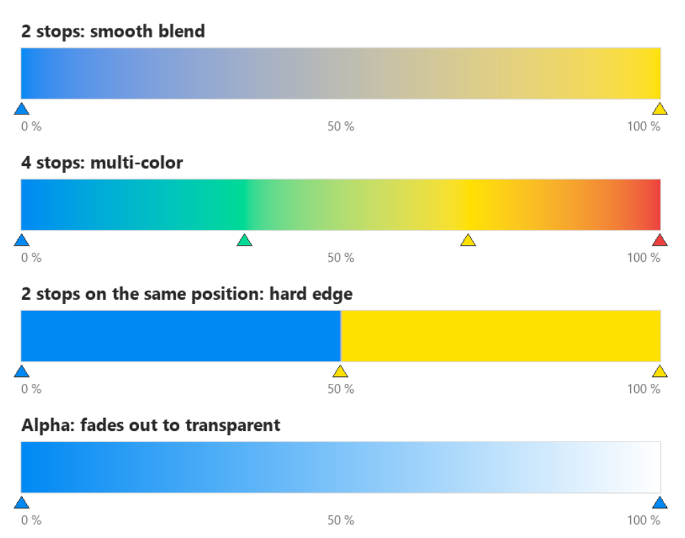
Before the first stop and after the last one, the end colors simply continue, so a ramp with stops only between 40 % and 60 % gives solid color at both ends. Two stops on the same position make a hard edge, which is how pie charts, progress rings and stripes are built.
RGB or OKLab blending
Use OKLab for blends between two different hues; use RGB for classic, technical looks and when you need to match an older design.
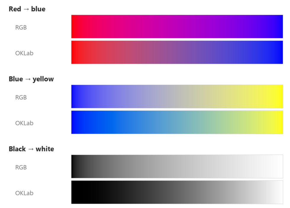
RGB mixes the color channels directly, which can pass through greyish or overly bright middle tones (blue to yellow goes through grey). OKLab mixes in a perceptual color space, so hue changes evenly and the brightness steps look even to the eye.
Update mode
Keep Auto unless you need several changes to appear at the same moment.
Auto: the gradient is redrawn as soon as any setting or stop changes. Best for design work and animation.
Manual: changes are stored but not shown until an update is triggered (
UPDATEcommand). Use it when a control system changes type, colors and position one after another and the viewer must never see the half-changed state; send all changes, then one update.
A Gradient in Manual mode is still drawn once when it first appears, so it never shows up black.
Use cases
Eight recipes cover most broadcast needs; copy the settings, then swap in your brand colors.
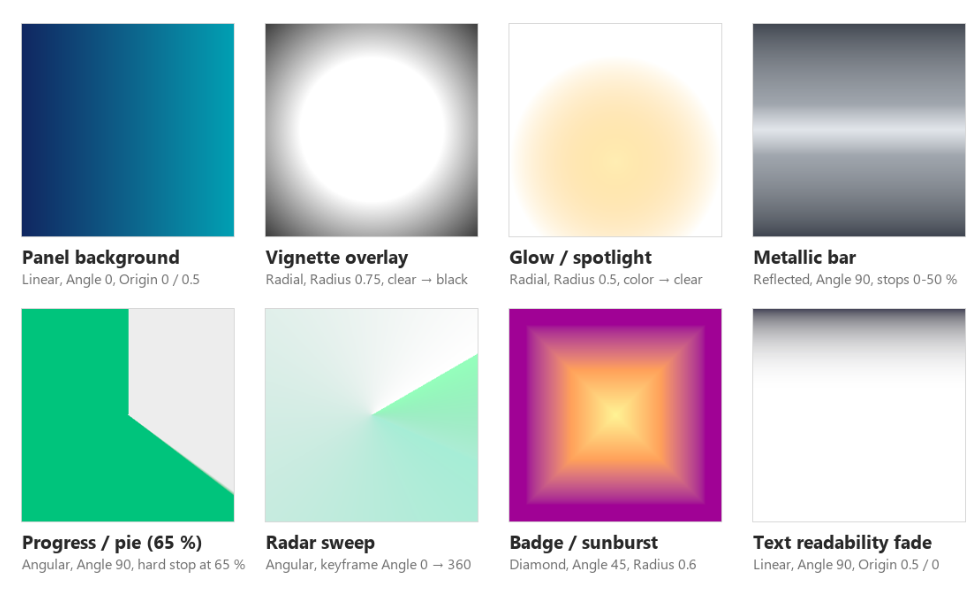
Use case | Type and settings | Color ramp | Where to use it |
|---|---|---|---|
Panel background | Linear, Angle 0, Origin 0 / 0.5, OKLab | 0 %: dark brand color → 100 %: lighter brand color | Lower thirds, tickers, full-screen info panels |
Vignette overlay | Radial, Origin center, Radius 0.75 | 45 %: black, alpha 0 → 100 %: black, alpha 85 % | Full-screen rectangle above the scene to darken the edges and focus the center |
Glow / spotlight | Radial, Origin where the glow sits, Radius 0.5, OKLab | 0 %: warm light color → 100 %: same hue, alpha 0 | Behind player cut-outs, logos, product shots |
Metallic bar | Reflected, Angle 90, Origin center | 0 %: light grey, 12 %: mid grey, 50 %: near black | Score bugs, name straps, buttons |
Progress / pie | Angular, Angle 90 (starts at the top), Origin center | Fill color 0 % and X %, then grey X % and 100 % (hard edge at X) | Polls, timers, progress rings (on a ring-shaped geometry); move the two X stops to change the value |
Radar sweep | Angular, keyframe Angle 0 → 360 | 0 %: transparent → 85 %: color, alpha 35 % → 100 %: bright color | Rotating light sweeps, scanners, "live" indicators |
Badge / sunburst | Diamond, Angle 45 (square look), Radius 0.6, OKLab | 0 %: yellow → 50 %: orange → 100 %: purple | Badges, retro sports graphics, tiles |
Text readability fade | Linear, Angle 90, Origin 0.5 / 0 | 60 %: transparent → 100 %: near black, alpha 90 % | Over video or photos so white titles stay readable at the top (use Angle 270 and Origin 0.5 / 1 for the bottom) |
Angle and Radius can be keyframed, so a breathing glow is a Radial gradient with Radius animated between 0.4 and 0.6, and a rotating sweep is an Angular gradient with Angle animated over 360°.
Tips and limits
Resolution: match it roughly to the size the gradient covers on screen. 512 × 512 px is plenty for soft blends; use 1024–2048 px for hard edges (pies, stripes) that fill a large area. Very large textures cost GPU memory: 4096 × 4096 px uses about 128 MB, 16384 × 16384 px about 2 GB and may fail to create, leaving the gradient black.
Aspect: the texture stretches to the object's mapping. A square texture on a 16:9 rectangle turns circles into ellipses; set the Resolution to the object's aspect (for example 1920 × 1080) to keep circles round.
Detail limit: the ramp is sampled in 256 steps across 0–100 %. Stops closer than about 0.4 % apart, or more than about 256 stops, cannot be told apart.
Transparency: alpha in the stops is kept, so a gradient can fade objects out; the material must be set up to use the texture's alpha.
Lighting: on a lit material the gradient is shaded by scene lights; switch lighting off for exact brand colors.
Values to avoid: keep colors between 0 and 1 and positions between 0 % and 100 %. Extreme or invalid numbers sent from scripts (for example 1e39 or nan) can give black or broken output.
Manual update: in Manual mode nothing changes on screen until an update is sent, which can look like a frozen gradient during design work; switch back to Auto while designing.