
Template Builder User Guide
Version 1.0.3 | Published September 27, 2017 ©
The Template Builder Window
The Template Builder window is located to the left in the application and is where all the customization of the template is done.
Settings
At the top of the Template Builder Window a Settings drop-down list is available, which allows for the following template settings:
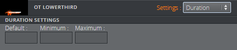
Duration
The duration setting can be used to specify the duration of the item. A default value is used when unspecified. Minimum and maximum duration values may also be specified. If these are set to the same number the item will get a fixed duration.
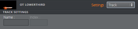
Track
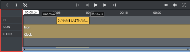
Setting a Name in the track settings allows for grouping of graphics in the timeline editor, see Track settings displayed in the timeline editor. The Index sets the position of the group in the timeline editor, where 0 is the lowest position.
WARNING
Make sure to use the same index for the same name in all modified templates
Track settings displayed in the timeline editor
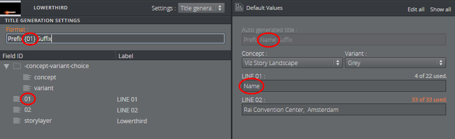
Title generation
The title generation setting allows for auto-generation of the title. The title can, for example, be text with a placeholder for one or several Field ID's. The placeholder is the {field ID path}. An example is shown below:
WARNING
The auto-generated title does not get trimmed inside Vizrt web clients. However, if the title is longer than 128 characters it will be trimmed when dragging out the MOS XML file due to size constraints. This will affect the element title in the newsroom system.
Field Tree
Each line in the Field Tree displays the ID and the label of a field in the template. It also contains an icon indicating the Type of the field.
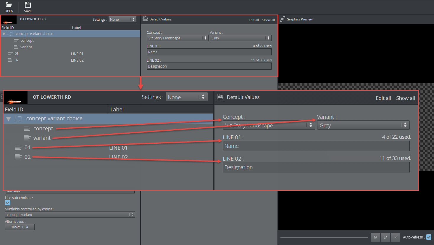
The listing of Fields can be rearranged by drag-and-drop within the Field tree.
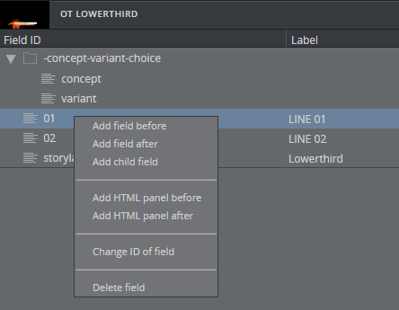
Right-clicking a Field a list of choices appears. From here Fields can be added/removed, HTML panel can be added, Field ID can be changed and the selected Field can be deleted.
The Fill In Form will always immediately update upon any change.
Info
Only Fields created in Template Builder can be deleted and given a new ID.
Each Field line can be customized using a set of properties which are displayed in the bottom half of the Template Builder window. Mark the desired Field in the top window, and the following properties can be set:
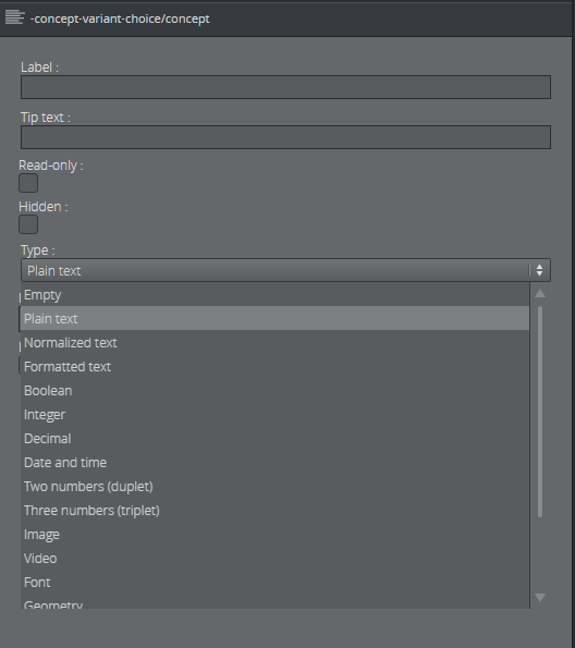
Label
Specifies the label of the field in the Fill In Form.
Tip text
A tooltip text can be entered to give more information about the field.
Read-only
Selecting the Read-only checkbox will keep the field visible, but grayed out in the Fill In Form.
Hidden
Selecting the Hidden checkbox will hide the field in the Fill In Form.
Type
The type of content allowed in the field in the Fill In Form are set using the drop-down list under Type. Depending on the type selected different sub-choices become available which is included in the table below.
The following types are available:
|
Type |
Icon |
Description |
|
Empty |
|
Will make the field unavailable. Typically used as a container for other fields. |
|
Plain text |
|
The field is a text field. Max length: Set the number of maximum characters in the field. |
|
Normalized text |
|
Normalized text. Max length: Set the number of maximum characters in the field. |
|
Formatted text |
|
A text that allows formatting. Max length: Set the number of maximum characters in the field. Single-line: Check this box to specify that the rich-text editor should only allow one line of text. |
|
Boolean |
|
Creates a checkbox which have two states; true and false. |
|
Integer |
|
The field is an integer field. Minimum: Set the minimum value allowed. Maximum: Set the maximum value allowed. |
|
Decimal |
|
The field allows decimal numbers. Minimum: Set the minimum value allowed. Maximum: Set the maximum value allowed. |
|
Date and time |
|
Use the Date Chooser in the Fill In Form to select date and time in this field. |
|
Two numbers (duplet) |
|
The field allows two numbers (decimal numbers are allowed). Minimum: Set the minimum value allowed for both numbers. Maximum: Set the maximum value allowed for both numbers. |
|
Three numbers (triplet) |
|
The field allows three numbers (decimal numbers are allowed). Minimum: Set the minimum value allowed for all three numbers. Maximum: Set the maximum value allowed for all three numbers. |
|
Image |
|
Will make the field available for an image. |
|
Video |
|
Will make the field available for a video. |
|
Font |
|
Will make the field available for a font. |
|
Geometry |
|
Will make the field available for a geometry. |
|
Material |
|
Will make the field available for a material. |
|
Map |
|
Will make the field available to present and edit a map. |
|
Custom |
|
Using the custom type the media- and XSD- type can be freely specified. |
|
List |
|
There is no support for making lists in Template Builder, but lists can be available in the template from Template Wizard. |


Note
The user must be aware of available control plugins in the template that have been exposed by the scene designer in Viz Artist.
Limit with Choice
A Limit with choice checkbox is available for each field. This option allows the template designer to present the right content in a drop-down list. For more information and examples, see Limit With Choice Option.