
Viz Mosart User Guide
Version 5.6 | Published April 04, 2024 ©
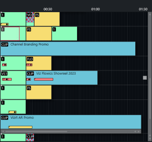
Rundown View
The active rundown is displayed in Viz Mosart as a list of stories and a timeline made up of the templates and items that will execute chronologically as the story is played out.
The details correspond to the content received from the NRCS and can be modified at any time by updates from the NRCS, or by manual edits from a Viz Mosart operator.
Story and Timeline
Each story line consists of a Story info area to the left and a representation of the Viz Mosart templates and secondary elements (extracted from Viz Mosart commands in the NRCS), in the Timeline view to the right.
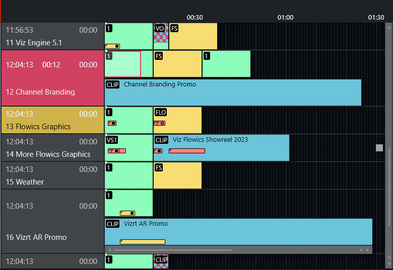
Story Info
The left Titles and Timings area (also called Story Info area) displays the following details:
-
Top left hand corner: Estimated On Air time (11.53.23 in this example).
-
Timer in the middle of first line: When the story is on air, how long the story has been running.
-
Top right hand corner: The editorial duration of the entire story, as entered in the NRCS.
-
Second line: The story title as entered in the NRCS.
-
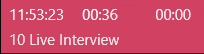
Red marking: The story currently on air.
-
Yellow marking: The next story that will be taken to air.
Timeline
The Timeline provides a story-by-story chronological, controllable, real-time monitor of the current rundown.
For an explanation of the details presented in this view, and the operations available, see section Operating from the Rundown View.
Story Elements
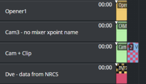
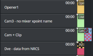
Templates are represented in the right hand, Timeline area using color-coded elements. The length of each element reflects the calculated or exact duration of the template, depending on the template type.
-
An identifier in the top left corner denotes the variant name of the template type.
-
A story using a recognized template type but an invalid variant displays the variant title in red:

-
When a story contains several elements with long duration, a vertical scroll bar appears to the right (one story will not display over more than four story rows in the Viz Mosart GUI).
-
Stories with no corresponding Viz Mosart commands appear as empty lines in the timeline.
Story elements are described in detail in the following sections:
Template Types: Primary Story Elements
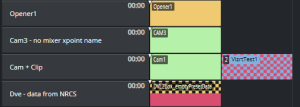
A story element corresponds with a Viz Mosart template type. From each basic template type, a show designer creates clones with show-specific commands. Each clone is called a variant.
Camera
A Camera template is displayed as a green colored element in the GUI. The variant of the template type (often the camera number) appears in the top left hand corner. The duration of the template is automatically calculated based on the presenter's script as entered in the NRCS (see Story Editorial Time below).
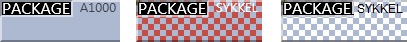
Package
This template type is for playing (or recording) a video clip.
The package template type is displayed as a light blue element in the GUI. The variant identifier appears in the top left hand corner. The length of the package element is calculated from the actual clip length, if available on the video server.
Note!
-
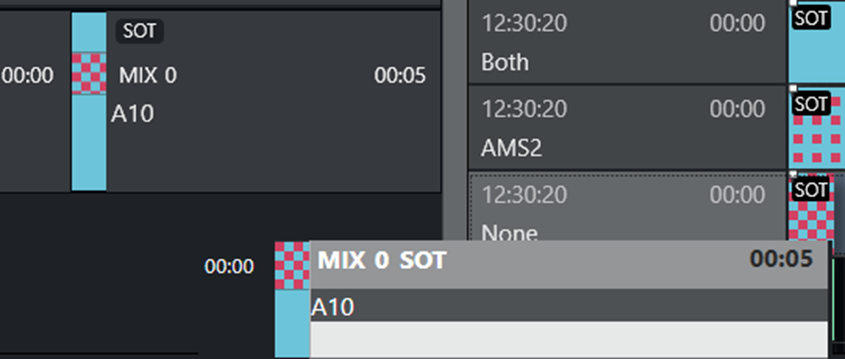
If the package clip is not available from the video server , the template representation appears with a blue/red checkered pattern.
Similarly, placeholder clips are displayed with a white/blue-checkered pattern. -
Zebra-stripes mean that the video server has failed to cue clip for playing.
Keyframes
In some systems, Keyframe markers are displayed with grey semicolon markers:
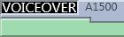
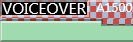
Voiceover
A Voiceover template is displayed as a light blue and green element in the GUI. The variant of the template type is indicated in the top left hand corner of the colored element. The small notch in the green bar shows the calculated duration of the presenter text. The light blue represents the clip as with the server template type and the green represents presenter text as with the camera template type. If the clip is not available from the server, the clip section of the element has a checkered pattern.
The length of the voiceover element is calculated from the actual clip length when available on server.
Live/external Source
A Live template is displayed as a red element in the GUI. The variant of the template type is indicated in the top left hand corner of the colored element.
Graphics
A Full screen graphics template is displayed as a yellow element in the GUI. The variant of the template type is indicated in the top left hand corner of the colored element. Duration of the element is timed from the presenter text entered in the NRCS.
For graphics systems which support this feature, the element has a checkered pattern if the attached graphics content is not available for playout from the graphics system.

Note: If back-to-back full screen graphics are within in the same story (and use the same engine), the scene is not retaken for each graphic, but just kept playing. As the show advances, and one story is left, a new story entered, the graphics are taken again (the engines are ejected) so that any other graphics that are using the same engine are taken normally.
Digital Video Effect (DVE)
A DVE template is displayed as a yellow and red element in the GUI. The variant of the DVE template type is indicated in the top left hand corner of the colored element.

Telephone
A Telephone interview type is displayed as a yellow and white element in the GUI. The variant of the template type is indicated in the top left hand corner of the colored element.

AdLib Pictures/Floats
An Adlib pictures template is represented by a symbol at the right end of the story line on the timeline. If the associated media object is not on the server, the symbol is checkered.
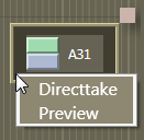
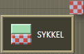
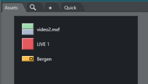
The element also appears in the Assets window as a colored slug with a green top half and light blue bottom half for clips, and orange bottom half for graphics. They can be taken on air or to preview either by right-clicking and using the context menu in the Timeline or the Assets pane.
Adlib picture templates adds the audio faders specified in the template to the current audio fader set. The faders are subtracted when returning from the Adlib pictures. Adlib pictures are typically used in live external or studio interviews.
Adlib pictures pause when it is taken off air. If the Adlib picture is inserted again, the clip continues from the paused point.
Break
A Break/continuity template is displayed as a white element. The break story is the default start and end-point of the show from which total show timers are made. Break templates can also be used for commercial breaks, when master control takes over.

Other Primary templates
-
Jingle
-
Video Wall
Template Types: Secondary Story Elements
Overlay Graphics
An Overlay graphics (lower third) is shown as a yellow secondary element. Secondary elements appear on top of primary elements and are executed relative to the primary template. The secondary element is scaled to the duration of the lower third element, set in the NRCS.

Different types of overlay graphics with separate handlers in the Overlay Graphics application, such as lower thirds, wall elements or OSGs, can be displayed on different lower third levels.


See General Settings for details on setup.
Take In
Take-in of lower third elements may be performed either manually or automatically by Viz Mosart.
-
Automatic: If an in-time is set in the NRCS for the lower third, Viz Mosart automatically takes it in.
-
Manual: If no time-in is set in the NRCS for the lower third, Viz Mosart marks it as a manual lower third. These elements are displayed on the right hand side of the GUI window, and can be executed in the same way as adlib pictures.
Take Out
Take out of lower thirds can be performed in four ways. Each are displayed differently in the Viz Mosart GUI:
-
AUTOOUT: Is taken in and taken out automatically from the in-time and duration or out-time set in the NRCS
-
 BACKGROUNDEND: Is taken in automatically as defined in the NRCS and taken out together with the primary element to which it is attached.
 -
 STORYEND: Is taken in automatically as defined in the NRCS and taken out when the story it is attached to is taken off air.
 -
 OPENEND: Is taken in automatically as defined in the NRCS and is not taken out until the operator takes it out.
Audio Play
An Audio Player secondary element is displayed as a small speaker symbol on top of a primary template. Its position represents the time code given in the NRCS. The audio starts to play when the timeline reaches this position. If no in-time is defined for the sound, it appears as a manual element in the symbol in the right hand area of the rundown (where manual lower thirds and adlibs are shown).

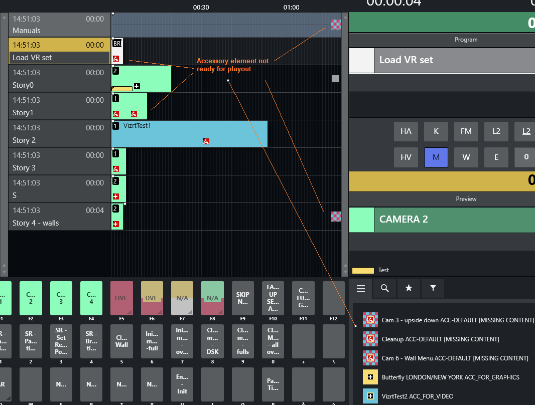
Accessory Elements
Accessory secondary elements are usually displayed as a small, black background plus (+) icon, on top of its primary template  .
.
However, the icon will change slightly to reflect the content type driven from the newsroom system. For example, if the Accessory item holds Viz Arc related content (in this example, three items), the icons are visualized as follows:
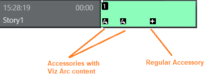
Taking an Accessory element
There are two ways to use an Accessory element. This relates to how they are taken:
-
Automatic: (timecode driven) The element's display position represents the timecode provided in the NRCS. The Accessory item is taken when the timeline reaches the accessory icon.
-
Manual: If no in-time is defined for the Accessory item, it is displayed as a manual element, with its icon to the right of the rundown, similar to where manual lower thirds and adlibs are displayed.
Tip: Mouse-over an Accessory element (manual or automatic) to see further details.
Example of Accessory Elements in a Rundown
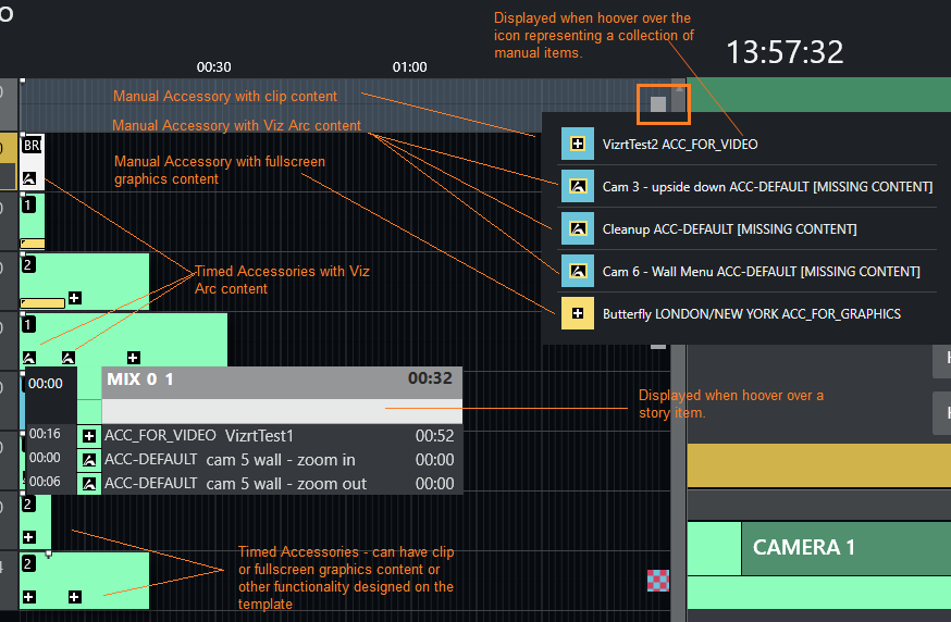
Color coding
-
Black background: Normal, the element is available.
-
Red background: The Accessory template does not exist/is unavailable or an error is reported related to the content.
-
Checkerboard background: Content is not available (for example, with clips or full screen graphics)
Other Secondary Templates
-
Sequence
Additional Rundown Features
Story Editorial Time
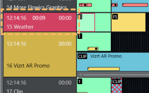
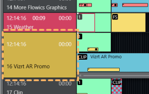
The story planned duration (editorial time) entered in the NRCS is indicated by a grey marker on a story element or after the last story element.

Autotaking an Element
If a primary story element is programmed with autotake next, this is indicated at the end of that element with a black triangular symbol.
Any element e1 following immediately any element e2 based on that template, will be taken automatically when e2 is 'finished'.

Effect Transitions
If an element is set to use an effect transition (either defined from the NRCS or the Template Editor), this is indicated with a black and white symbol.

Timing Information
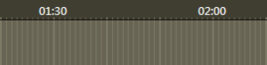
At the top of the rundown view, there are indicators at every 30 second mark. Vertical lines across the timeline indicate every second, broader lines every ten seconds.
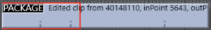
Mouse-over Rundown Info
Hovering the mouse pointer over an element in the rundown displays the NRCS script and timed commands connected with the story element.
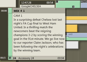
In this example, mousing-over the Camera 1 element displays the transition which is used going into the template: A four frame mix and the template variant 1.
In addition, the entire script written into the NRCS story connected with this template is visible, along with details of a secondary Accessory template element.
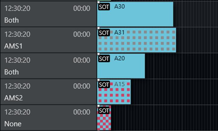
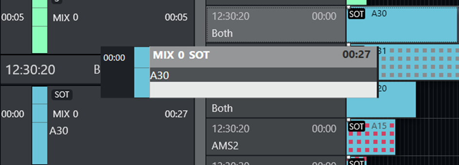
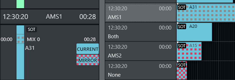
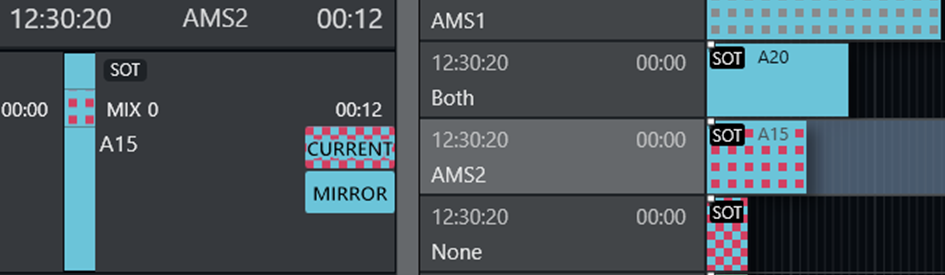
Clip Status on Current and Mirror Server
When a current-mirror server pair is employed for redundancy, a clip will be either available or unavailable on each server in the pair.
Color coding and patterns of the corresponding Package template, report the status of the clip on each server, guiding the operator to switch to the the server where the clip is available.
|
Appearance of Package template |
Clip status |
|
Blue |
Current server: Available Mirror server: Available |
|
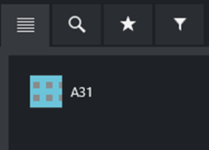
Blue / Gray |
Current server: Available Mirror server: Unavailable (See A31 below). This blue/gray template representation appears in the Script, Rundown and Asset panes. In the Script and Tooltip panes (see above)
|
|
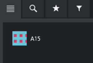
Red on Blue checkered |
Current server: Unavailable Mirror server: Available (See A15 below). This blue/red template representation appears in the Script, Rundown and Asset panes. In the Script and Tooltip panes (see above)
|
|
Blue on Red checkered |
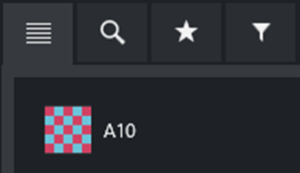
Current server: Unavailable Mirror server: Unavailable (See A10 below). This blue/red template representation appears in the Script, Rundown and Asset panes. This is a potential failure situation that must be addressed, as the clip is not available for playout! |
Floating Windows
Timeline
You can open the Timeline as a separate window, either fully operational or as a read-only copy.
To float the Timeline window
All operations are available from the floated window.
-
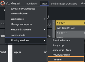
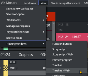
From the menu bar select View > Floating windows > Timeline.
-
Position the floating window by dragging its menu bar and adjustable frame handles.
-
To view the Timeline window in a web browser
You can display a read-only copy of the Timeline, floating as a web-based window.
-
From the menu bar, select View > Floating windows > Timeline - Web.
-
Position the floating window by dragging its menu bar and adjustable frame handles.
-
Tip: A superior, scalable read-only view, is offered by viewing these details as a separate web browser app. See Mosart Web Apps below.
Story Info
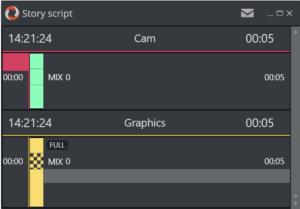
You can open the Story Info floated as a separate fully operational window or as a read-only copy.
To float the Story script window
All operations are available from the floated window.
-
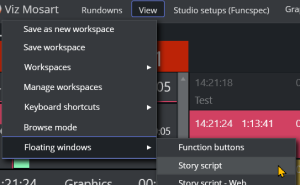
From the menu bar, select View > Floating windows > Story script.
-
Position the floating window by dragging its menu bar and adjustable frame handles.
-
To view the Story script in a web browser
You can display a read-only copy of the Story script, floating as a web-based window.
-
From the menu bar, select View > Floating windows > Story script - Web.
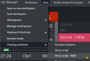
-
Position the floating window by dragging its menu bar and adjustable frame handles.
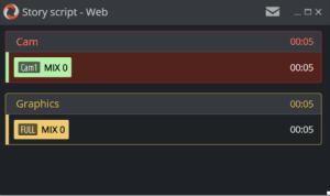
-
Tip: A superior, scalable read-only view, is offered by viewing story details in a separate web browser app Rundown viewer. See Mosart Web Apps below.
Mosart Web Apps
As part of a modernization and optimization improvements to Viz Mosart, much of the existing Viz Mosart feature set is now being offered as simple Web Apps, that run on any browser in the Mosart network.
Rundown Viewer
The Mosart web App Rundown Viewer displays both Timeline and Story Info.
To view rundown details in a web browser
As a useful extension to a floating window, you can also view the current rundown details as a scalable read-only display of the Story info and Timeline, in a separate Mosart Web App.
-
This view offers advantages in readability and clarity when monitoring the ongoing show.
Compare the scalable App view below, where all item details are readable, with the floating Timeline - Web view above.
-
This view is available on any device that is connected to the Mosart server.
Note: The view runs as an app in your web browser, requiring an additional once-only installation as explained in Mosart Web Apps - Rundown Viewer.