Template Builder User Guide
Version 3.0 | Published October 04, 2023 ©
Template Fields
The left window in Template Builder contains the field tree. The initial fields reflects the exposed Control plugins in the imported scene(s), but it is possible to add fields that are not bound to plugins in the scene. Each field has a type, and numerous properties that alters the behavior of the field.
Fields can be restricted: for example, to only include text with a certain amount of characters, numbers within a specific range, or media placeholders for media assets, or be displayed as options in a drop-down list.
The fields can be manipulated in various ways to decide how data is entered into the field. See Data Entry.
Field representation in the UI can also be replaced with an inline HTML panel.
Field Tree
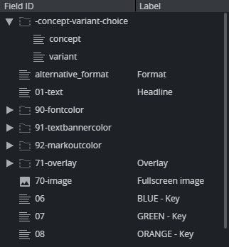
The Field Tree contains the Field ID and Label, which are also shown in the Fill-in form. The icon beside each line in the tree indicates the Type of content in the field.

Fields can be rearranged by drag-and-drop within the Field tree. Right-click a field to open a menu where additional fields and HTML panels can be added.
Info: Only fields created in Template Builder can be deleted and given a new ID. Fields bound to the scene have a fixed name and cannot be deleted.
Sub Fields
In the Field tree we can find the main fields and the sub fields:

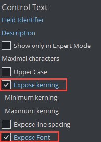
In this case, sub fields are Control Plugin properties of the main field. In Viz Artist, the scene designer has chosen to expose kerning and font for the main text field:

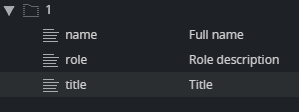
Sub-fields can also be used in Viz Artist and Template Builder to group fields. This is important when using Feed Browser functionality to bind multiple child fields to the parent field:

In Viz Artist, the three Control Plugins above are named 1.name, 1.role and 1.title in the Viz Artist scene. When using the dot naming notation in Viz Artist, Graphic Hub and Template Builder will group these fields as parent/children.
Text Fields
-
Multi-line text: Multi-line text supports standard ASCII characters. It does not support any type of text formatting and does not convert any text. It keeps the text as it was typed.
-
Single-line text: A single-line text field converts any white-space to space. White-space includes space, tab, newline, etc. Single-line text converts any white-space to the space character you get by pressing the spacebar KEY only. For Template Builder, this is also a text field with a single-line entry, unlike multi-line text.
-
Formatted text: Formatted text refers to the ability to hold formatted text. For example, a formatted text field can show that some of the texts are bold or italic, for example, when a field has Rich-Text functionality.
Although such a display is not yet completely supported (no Rich-text support yet) on our payload text field, formatted text is used so that if a field has a formatted type text created in Viz Artist, the field type can also be selected in Template Builder.
Field Properties
The Field Properties window is located below the Field Tree window. It displays the properties of a selected fields in the Field Tree.
Multi-selection: If several fields are selected in the Field Tree (CTRL + click), a subset of the field properties is displayed. If the selected fields have different field property values, the Field Properties window displays a multiple values state. Changes made in the Field Properties window are immediately applied to all the selected fields.
Note that the set of properties displayed depends on the type of the field. The following properties are available:
-
Label: Specifies the label of the field in the Fill-In Form.
-
Tip: A tooltip text can be entered to provide more information about the field.
-
Read-only: The field remains visible, but is grayed out in the Fill-In Form.
-
Hidden: Hides the field in the Fill-In Form.
-
Publishing variable: Viz Story specific property. Can be used to link the field to a system field affecting the playout or publishing of the template.
-
Regular expression: Defines constraints for the value in the field, using Regex. See the table below for examples.
-
Preview point link: If set, clicking on/selecting the field will also show the given preview point in the Preview.
-
Type: The field type. might be changed here.
-
Max length: Text fields only, see comments in table below.
-
Single-line: Formatted text fields only, see comments in table below.
-
Data entry: Set how data is entered into the field. Drop-down list of all field types. For more information, see Data Entry.
-
Read-only and Hidden expression: Basic Javascript eval expression that decides whether a field should be hidden or read only. This can be used instead of scripting to build conditions based on values in other fields. See the table below for examples.
Info: A Regular Expression (or Regex) is a pattern (or filter) that describes a set of strings that match the pattern . In other words, a regex accepts a certain set of strings and rejects the rest.
|
Regex |
Description |
Example |
|
[a-zA-Z]+ |
Match a word containing only letters. |
MyLongWord |
|
^[A-Z][a-z\s]*$ |
Match a string starting with capital letter containing only lowercase letters and space. |
This is a sentence |
|
\d+ |
Match a sequence of digits. |
123489 |
|
\b[A-Za-z0-9._%+-]+@[A-Za-z0-9.-]+\.[A-Za-z]{2,}\b |
Match a typical email address. |
joe@microsoft.com |
Info: Read-only and Hidden expressions support javascript notation to evaluate an expression. It supports field lookup, arithmetic and logical operators.
-
Field references must be enclosed in double curly brackets, for example {{field01}}.
-
Text fields in the expression must be of type Single Line.
|
Expression |
Description |
|
{{L301}}=="HIDE" || {{selector}}<2 |
Match if the L301 field value is "no-logo" and the numeric field selector is less than 2. |
|
({{V01}} / {{V02}}) *100 < 50 |
Match if the numeric field V01 is less than 50% of V02. |
Image Constraints
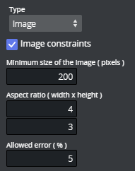
For fields of type Image, it is possible to set image constraints to force the Viz Pilot Edge user to select an image having the correct aspect or a minimum resolution.

Specify standards for image quality and size using either or both of the following:
-
Minimum size of the image (pixels): Number of pixels (width or height), irrespective of aspect ratio.
-
Aspect ratio: Any number describing the proportional relationship between the image with and height.
-
Allowed error: Specifies a margin for the constraints when an image is selected.
Default Search Parameters
For the types Image, Video, Font, Geometry and Material, it is possible to define default search parameters that will be used by the media search that is launched when you click on the field:
-
Click the Set button to open a media search window.
-
Enter text in the search field, selecting whether to show all items or to limit by time from the Show drop-down list, and/or selecting a tag from the Tags drop-down.
-
Save by clicking Use current search parameters.
Field Types
The type of content allowed in the field in Default Values is set by using the drop-down list under Type. Depending on the type selected, different sub-options become available, as specified in the table below.
There are two main field type categories: scalar and list. Fields of all types apart from the list type are referred to as scalar fields. Fields using the list type are referred to as list fields.
The following types are available:
|
Type |
Icon |
Media Type (XSD Type)* |
Comments |
|
Empty |
|
|
Makes the field unavailable in the Fill-in form. Typically used as a container for other fields. |
|
Multi-line text |
|
text/plain (string) |
Max length: Sets the maximum number of characters allowed in the field. |
|
Single-line text |
|
text/plain (normalizedString) |
Max length: Sets the maximum number of characters allowed in the field. |
|
Formatted text |
|
application/vnd.vizrt.richtext+xml |
Max length: Sets the maximum number of characters allowed in the field. Single-line: Check this box to specify that the rich-text editor allows one line of text only. |
|
Boolean |
|
text/plain (boolean) |
Creates a checkbox that has two states: true and false. |
|
Integer |
|
text/plain (integer) |
This field is an integer field. Minimum: Sets the minimum value allowed in the field. Maximum: Sets the maximum value allowed in the field. |
|
Decimal |
|
text/plain (decimal) |
This field allows decimal numbers. Minimum: Sets the minimum value allowed in the field. Maximum: Sets the maximum value allowed in the field. |
|
Date and time |
|
text/plain (dateTime) |
Use the Date Chooser in Default Values to select date and time in this field. |
|
Date |
|
text/plain (date) |
Use the Date Chooser, or the individual editors for day, month and year in Default Values, to select the date in this field. |
|
Two numbers (duplet) |
|
application/vnd.vizrt.duplet |
This field allows two numbers (decimal numbers are allowed). Minimum: Sets the minimum value allowed for both numbers. Maximum: Sets the maximum value allowed for both numbers. |
|
Three numbers (triplet) |
|
application/vnd.vizrt.triplet |
This field allows three numbers (decimal numbers are allowed). Minimum: Sets the minimum value allowed for all three numbers. Maximum: Sets the maximum value allowed for all three numbers. |
|
Image |
|
application/atom+xml; |
Makes the field available for an image. Image Constraints: Enable this option if you want to set constraints on the image. Minimum Size of the image (pixels): Specifies the minimum allowed image dimensions in pixels. Both width and height must be at least this big. Aspect Ratio (width x height): Specifies the aspect ratio of the image. Allowed Error (%): Specifies the maximum stretch limit for both the width and height of the image, in relation to its defined aspect ratio. |
|
Video |
|
application/atom+xml; |
Makes the field available for a video. |
|
Font |
|
application/vnd.vizrt.viz.font |
Makes the field available for a font. |
|
Geometry |
|
application/vnd.vizrt.viz.geom |
Makes the field available for a geometry. |
|
Material |
|
application/vnd.vizrt.viz.material |
Makes the field available for a material. |
|
Map |
|
application/vnd.vizrt.curious.map |
Makes the field available to present and edit a map. |
|
Custom |
|
|
Lets you freely specify the media and XSD type. |
|
List |
|
|
Lists may be modified by adding and removing columns in the Field Tree.
Note: List fields are fundamentally different from scalar fields. It's therefore not possible to change a list type to a scalar type and vice versa. Minimum number of rows: Defines the minimum allowed number of rows in the list. Maximum number of rows: Defines the maximum allowed number of rows in the list. |
|
Color |
|
text/vnd.vizrt.color |
Text (for example: #140E7E or rgba(255, 0, 0, 1)). |
* For more information on media types, see: Overview of Media Types.


