
Template Builder User Guide
Version 3.1 | Published June 26, 2024 ©
Data Entry
The Data entry field property specifies how users should fill in field values.
Manual
Selecting Manual in the Data entry drop-down list does not give access to any additional settings for the field. The default is for the input to the field to be a text box with manual input.
Radio Buttons and Drop-down
Selecting drop-down or one of the radio button options lets you see the content in a static list, which may in some cases make it easier and less error-prone to fill the template in with the right content.
Example: OMO Plugin
When a Control Object moving (Omo) plugin is accessible in the template, scenes using Omo plugins are originally presented as integer values for the different elements in the Fill In Form. The drop-down and radio buttons options can assign text to these values to make it easier to select the right element.
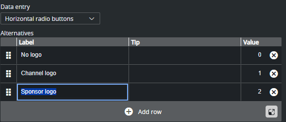
The example below contains a scene with a sponsor logo having different display options in the graphics. For the Omo plugin, these options correspond to the values 0, 1 and 2 respectively.
To assign text to these values:
-
Select the Omo field in the Field Tree.
-
Select Horizontal radio buttons in the Data entry drop-down list.
-
Add alternatives in the inline list editor:
-
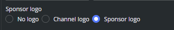
The Omo field in the Fill In Form now contains a drop-down list or radio buttons containing the alternatives created above as text, as opposed to an integer field where the user would have to remember which integer corresponds to which position.
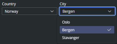
Double drop-down
With the Double drop-down it is possible to add a two-level selection, letting you set multiple sub-choices for each primary choice.
For example, if the choices list different countries, sub-choices could list cities in each country.
-
Mark the desired Field ID in the Field Tree.
-
Select Double drop-down in the Data entry field.
-
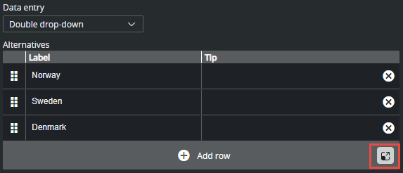
Fill in the primary choices in the inline table.
-
For each primary choice, enter the table editor and add sub choices.
-
A new table for sub alternatives appear. Fill the table and click back when complete:
-
Instead of a text field in the Fill In Form, the field now contains two drop-down lists: the main choices, which in this case is a list of countries, and sub-choices, with corresponding cities.
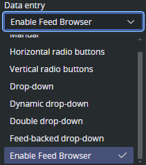
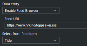
Enable Feed Browser
This options specifies that the field should get its value from a property of an Atom or RSS feed entry. If the field is a sub-field of another field that has enabled feed browser, the option is named Parent feed browser. Otherwise, it is named Enable feed browser.
-
If the Enable feed browser option is selected, a Browse button appears next to the field in the fill-in form.
-
Click Browse to open the Feed Browser dialog.
-
In the Feed Browser, the items of the feed are presented (with thumbnails, if available), and one of the entries can be selected.
-
Information from the selected item is used to fill in the feed browser enabling field and its sub-fields.
-
Alternatively, if Feed-backed drop-down is selected, the feed is presented as a drop-down instead of a feed browser.
Note: In order to be able to fill in multiple fields from a single selection in the feed browser, fields must be sub-fields of the field that enables the feed browser.
Feed URL
Specify the feed URL for the field. The URL must be accessible from the Viz Pilot Edge browser and lead to a valid Atom XML or RSS feed:
Note: Internet servers can have strict CORS policies denying access to their feed from within Viz Pilot Edge.
Select from Feed Item
This option binds the element of a feed item (title, link, content etc.) to the value of the current field. This is a 1:1 relation between the feed item and the field value, but it is fully possible to bind a feed item to multiple fields in the template. For example, if you select a story from a feed and title, content, author and image is applied to the template. To accomplish this, the fields in the template need to be grouped under a parent field. See Sub Fields for more information on this.
Note: The options available for a given field depend on the type of the field (the atom namespace prefix represents the http://www.w3.org/2005/Atom namespace, and the media namespace represents the http://search.yahoo.com/mrss/ namespace).
These are the fields in Atom/RSS that can be linked to:
-
<Not linked>: Not linked to the feed item, and must be filled in manually.
-
Content: Linked to the content of the atom:content element in the atom entry.
-
Title: Linked to the content of the atom:title element in the atom entry.
-
Link: Linked to the href attribute of the atom:link element in the atom entry. Which link entry to pick depends on the Link-rel in atom entry property and the type of the field (the first link with a correct rel attribute and a type that matches the type of the field is chosen).
-
Entry: Linked to the atom entry itself.
-
Author name: Linked to the content of the atom:name element inside the relevant atom:author element, if the entry itself contains an atom:author element that is used. Otherwise, the atom:author element of the feed is used.
-
Author e-mail: Linked to the content of the atom:email element inside the relevant atom:author element, if the entry itself contains an atom:author element, that is used. Otherwise, the atom:author element of the feed is used.
-
Author URI: Linked to the content of the atom:uri element inside the relevant atom:author element, if the entry itself contains an atom:author element, that is used. Otherwise, the atom:author element of the feed is used.
-
Contributor name: Linked to the content of the atom:name element inside the atom:contributor element in the atom entry.
-
Published: Linked to the content of the atom:published element in the atom entry.
-
Updated: Linked to the content of the atom:updated element in the atom entry.
-
Thumbnail: Linked to the url attribute of the media:thumbnail element in the atom entry.
-
Summary: Linked to the content of the atom:summary element in the atom entry.
-
Link-rel in Atom Entry: Only available if Link is selected in the Select from atom entry property. It specifies the rel attribute of the link element in the atom entry.
Note: A linked field may also be filled in manually if it is not hidden or read-only.
RSS Mapping
The feedbrowser in Template Builder works with Atom XML, but also supports a minimal mapping from standard RSS items according to the RSS 2.0 specification: https://www.rssboard.org/rss-specification.
The media namespace xmlns:media="http://search.yahoo.com/mrss/ is specified in https://www.rssboard.org/media-rss.
|
RSS |
Template Builder |
Comment |
|
<title> |
Title |
|
|
<description> |
Summary |
|
|
<pubDate> |
Updated, Published |
RSS has only one field when the item is published. |
|
<author> |
Author e-mail |
In RSS the <author> element is strictly specified as an e-mail address. |
|
<enclosure type =" image/jpeg "> |
Thumbnail, Link rel="enclosure" |
Both Thumbnail and Link with link relation "enclosure" map to the <enclosure> element in RSS. |
|
<media:content type="image/jpeg"> |
Thumbnail, Link rel="content" |
Both Thumbnail and Link with link relation "content" map to the <media:content> element in RSS. |
|
<media:thumbnail> |
Thumbnail |
|
Feed-backed Drop-down
The Choose from feed option works exactly like the Enable feed browser option, but displays the results in a drop-down instead of in the feed browser window:
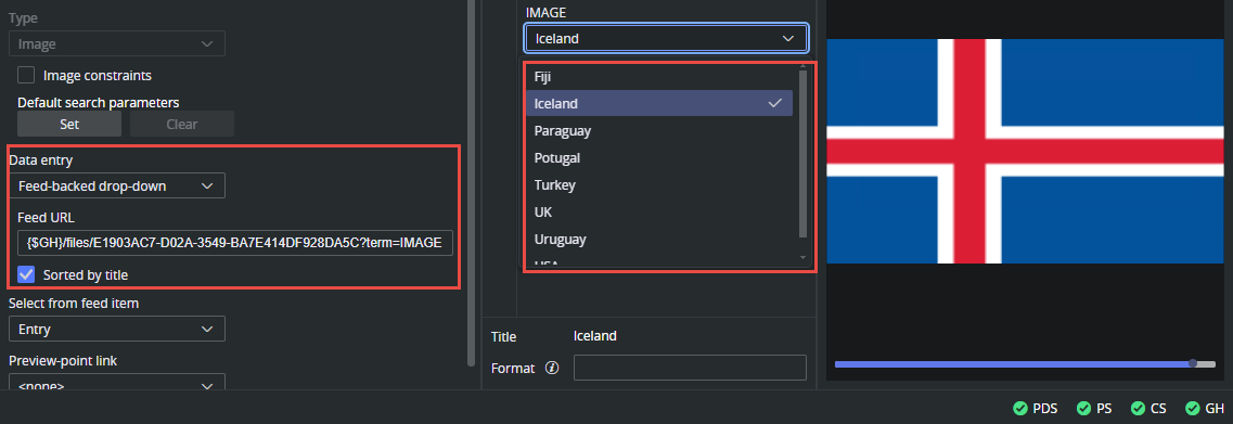
Example: Link Image Field to Graphic Hub Folder
In this example we set up a link from an image field in the template to a Graphic Hub folder and present the result in a sorted drop-down.
-
For the image field in the template, choose Feed-backed drop-down from the Data entry drop-down.
-
The Feed URL should point to a Graphic Hub folder, and we add a search term parameter to display only images. The URL is a part of the Graphic Hub REST API.
To quickly build a valid URL to a folder in Graphic Hub, follow these steps:-
The {$GH} environment variable can be used to build the base URL part. This variable resolves to the configured graphic hub on Pilot Data Server (for example, http://gh-host:19398/).
-
Add the /files/ part of the path.
-
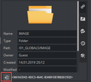
Add the UUID of the folder to the URL. This value can be copied from Viz Artist when browsing in Asset view:
-
Add the ?/term=IMAGE to the URL.
-
-
In the Select from feed item drop-down, select Entry. This makes sure the complete Atom entry is put into the field, making it playable for the Viz Engine.
-
Click Sort by title to make the entries sorted.
-
The result should be a sorted drop-down with the images in the Graphic Hub folder.
Dynamic Drop-down
The Dynamic drop-down option allows you to create a dynamic drop-down with items read from the value of another field. Whenever the (hidden) source field is changed, the drop-down items are updated. See Dynamic Dropdown.