Datacenter User Guide
Version 2.1 | Published April 03, 2024 ©
Working with Real-time Data: The Performance Dashboard
When working with real-time data (data coming from a Tracab dataset), inspecting the performance of the incoming data streams, as well as applied scripts, can be crucial to spot problems in the pipeline. To help with this, Datacenter offers a Performance Dashboard.
The Performance Dashboard helps operators inspect the sanity of the incoming data, and the runtime of any applied script.
To open the dashboard, click on the graph icon  in the Dataset Entries panel:
Adjust the settings at the bottom of the dashboard to configure the viewing options.

-
Window Size: Select the time span (in seconds) to inspect.
-
Target FPS: Configure these parameters to match the incoming stream FPS. This parameter, in combination with the Window Size, effectively configures how many frames are shown in the graph.
To temporary freeze the dashboard updates, click anywhere on the graph. Clicking again resumes the updates.
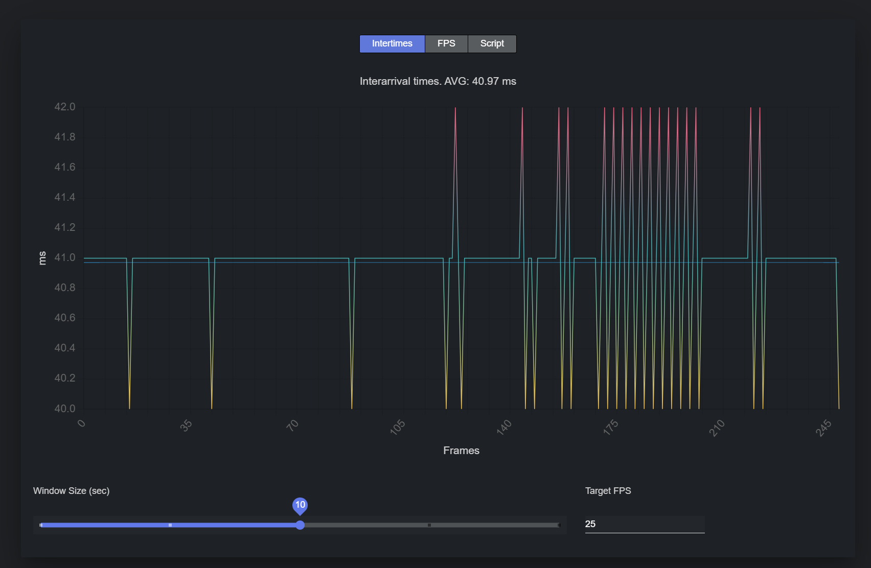
Intertimes
Click on the Intertimes button at the top of the dashboard to show Interarrival times statistics.
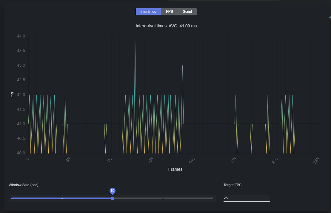
The resulting graph shows the time elapsed, in milliseconds, between the reception of two 'packets' from a data stream.
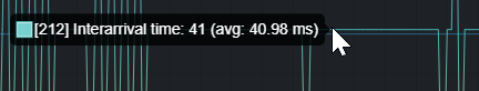
The current average is reported in the title, and shown in light blue in the graph. When hovering on the chart, the intertime for that frame is revealed:
When inspecting intertimes, you can easily figure out if the incoming stream is sending packets slower or faster than the declared FPS. For the earlier, the reported average is larger than the ideal intertime average, while for the latter it is smaller.
FPS
Click on the FPS button at the top of the dashboard to show FPS (frames per second) statistics.
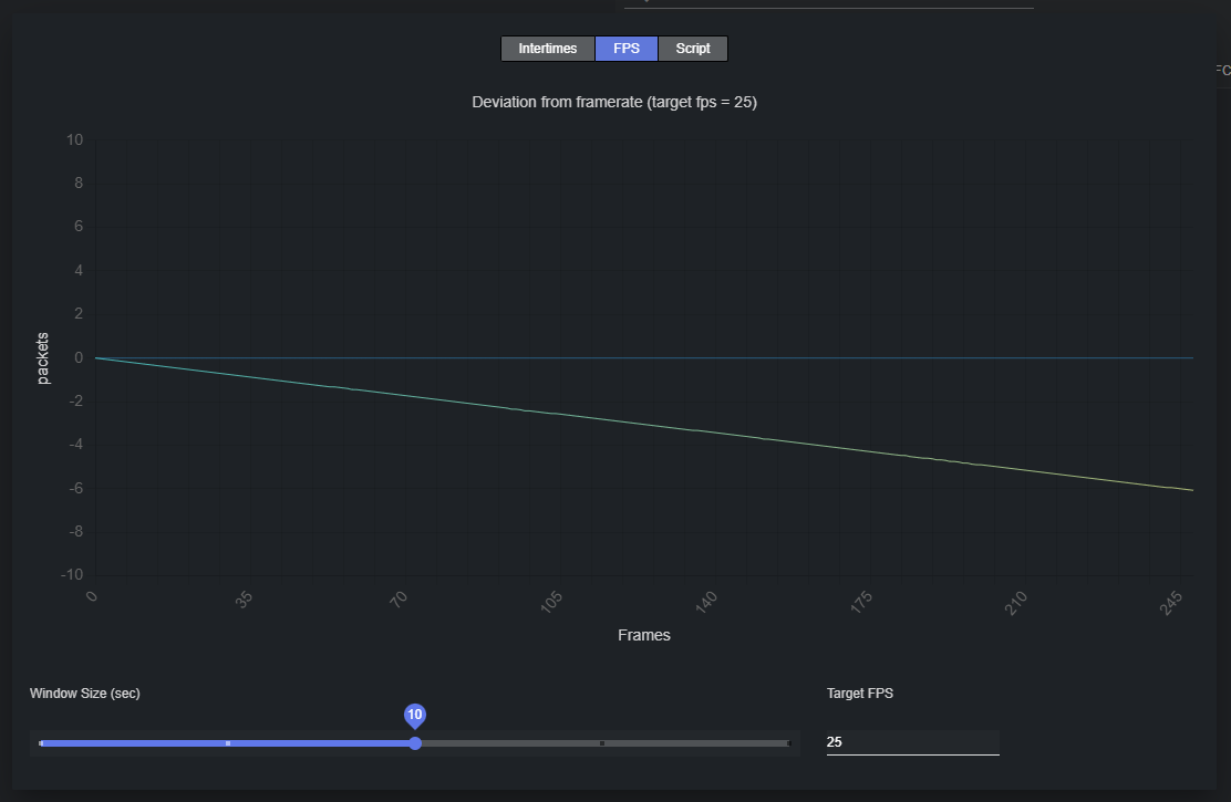
The resulting graph shows the difference between the ideal number of packets that the provider should have sent at a given frame and the actual number of received packets.
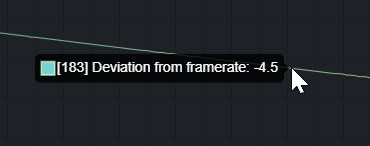
The current target FPS is reported in the title. When hovering on the chart, the deviation from the ideal framerate for that frame is revealed:
When inspecting FPS stats, you can easily examine if the incoming stream is sending a different number of packets than the declared FPS. In case of a slower stream, the deviation should move towards the negative part of the Y axis over time.
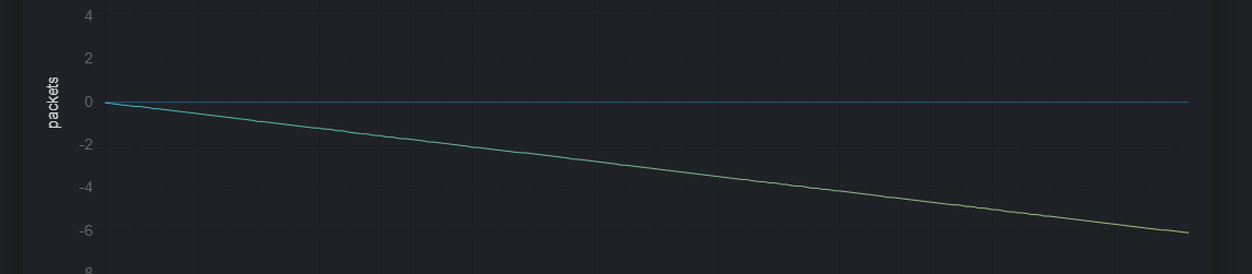
In the example above, an increasingly smaller number of packets than expected is received as the time advances.
Conversely, in case of faster stream, the deviation should move towards the positive Y axis over time.
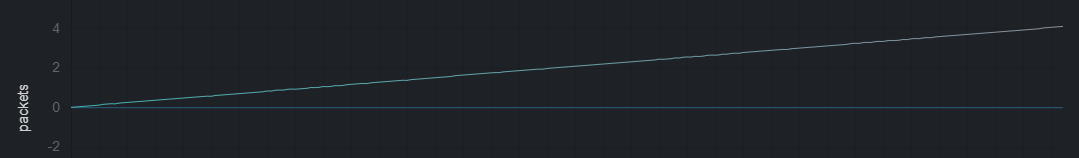
In the example above, an increasingly larger number of packets than the expected is received as the time advances.
Script
Click on the Script button at the top of the dashboard to show script execution time (in milliseconds) statistics.
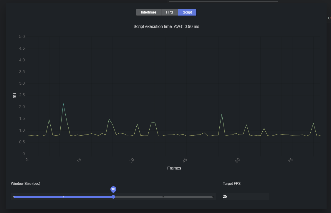
The resulting graph shows the execution time (in milliseconds) of the applied script, if any, over time.