
Viz Pilot User Guide
Version 8.5 | Published December 16, 2019 ©
Template Editor
The template editor is used to create and edit a template’s user interface. Templates can be created from scratch, or by using the Wizard to select the scene the template is to control. Using the Wizard adds a default set of components to the template during scene import.
This section contains the following topics:
Template Editor Functions
The components added when using the Wizard tool are based on the Exposed Objects information in the scene; however, components can be replaced and new ones added to extend or change the functionality of the template and to change the appearance and behavior of the scene.
Note that the template name (square brackets) and the scene path is visible in the template window title bar. For standard scenes the scene name is used; however, for transition logic scenes the background scene name is used.
IMPORTANT! Always remember to test templates before deploying them.
Template Editor Context Menu
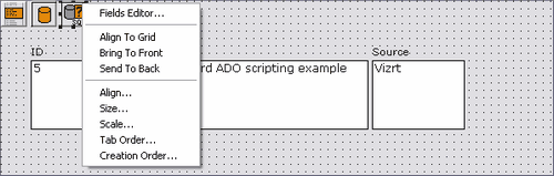
The context menu in the Template Editor contains the following functions:
-
Edit Image...: Adds a Static Image Component to be used as a template background, for example. Only available when using Static Image Component.
IMPORTANT! When using the static image component, use compressed image types such as JPG or lossless ones such as PNG to conserve space. The image does not need to be small in terms of pixel size. The whole template is streamed to the database as a BLOB, and the image data will not be altered. Using JPG or PNG will therefore use much less space than BMP, which is not compressed.
-
Fields Editor: Adds string components to represent database fields using an active database connection. Only available when using specific Database Components.
-
Align to Grid: Aligns the template’s selected component to the template grid.
-
Bring to Front: Brings the template’s selected component to the front of all stacked components.
-
Send to Back: Brings the template’s selected component to the back of all stacked components.
-
Align: Lets the user set the Alignment of the template’s components.
-
Size: Lets the user set the size of the template’s components (see Size and Scale).
-
Scale: Lets the user set the scale of the template’s components (see Size and Scale).
-
Tab Order: Lets the user set the Tab Order for the template’s components.
-
Creation Order: Lets the user set the Creation Order for the template’s components.
Standalone Templates
Unlike Transition Logic Templates, standalone templates are only based on a single scene.
Generate a standalone template
-
Select Wizard on the File menu.
-
Add the scene.
-
Click Next
-
Select the exposed objects that are to be added to the template automatically.
-
Click Finish.
Transition Logic Templates
This section contains the following topics:
Transition Logic Scenes
A transition logic scene consists of a background scene and a set of front scenes. When used to create a template in Template Wizard, the front scenes are created as GEOMs (objectified). The objects are added to the background scene in their respective placeholders called layers. Once the template is used to play out the scenes, the front scenes themselves are therefore not used, rather their objects in the background scene are used.
When generating a transition logic template the logical layers, visible in the Layer Panel, are placed on the template in separate group boxes. Each group box also has a drop-down menu with all the GEOMs (the front scenes) for that layer. The currently selected front scene is displayed in the ActiveLayerID property for the TVTWLayerControl component.
Note: Although the ItemIndex property is similar to ActiveLayerID, using the ActiveLayerID is recommended as it preserves links to items regardless of changes to the index order or description names in the scene’s control object.
A background scene can contain many logical layers. A layer is a placeholder for front scene objects (graphical elements) that are intended to be on air one at a time. In order to have independent elements that can be on-air simultaneously, new logical layers must be added to the background scene.
Each layer can have several states, including everything from position on screen to layout variants or off screen. Certain controls in templates will be visible depending on which layers are currently selected.
Using this method, several independent graphical elements can be on air at the same time and can be taken in and out independently of each other. Transitions can be built into the background in order to obtain a smooth transition between the different states.
Field Identifiers
In order for Template Wizard to generate transition logic templates correctly, one important design convention needs to be followed. As a general rule, all scenes must have unique Field identifiers for all Control plugins. The identifier can be both text and numbers but must not contain any spaces.
There is one exception where it is permitted and even useful to have the same Field identifier on multiple Control plugins. The same Field identifier for values of the same data type can be used for scenes that use the same logical layer, since this means that they will not be on-air at the same time. In the template, these values can be set in a single editor rather than in several editors; one set for each scene, when using unique Field identifiers for all.
The description label for the editor will be the same so it must work logically for both objects, otherwise the user could become confused.
An example where using the same identifier is useful follows below:
-
When there are two OTS graphics with an image and a text in the same logical layer, one on the left side and one on the right side, it is possible to name both Control Text plugin Field identifiers OTS_Text, and the Control Image plugin Field identifiers OTS_Image.
With common identifiers for the two OTS text elements and the two OTS image elements, the Wizard will only generate one set of components. This setup will work well since the elements will never be on screen at the same time.
Generate a transition logic template
-
Select Wizard on the File menu.
-
Add the front scenes that are controlled by the background scene.
-
Click Next
-
Select the exposed objects that should be added to the template automatically.
-
Click Finish.
Note: If a background scene is selected, an error message is shown (The background scene cannot be selected!).
Template Testing
It's good practice to create procedures for testing templates. The procedure below is an example of how to best test templates before using them in a production environment.
Test templates
-
Design and test scenes in Viz Artist.
-
Double check all Control Objects in Viz Artist.
-
Using the Wizard tool, design the template and save it in a test Concept.
-
Clean-up the template layout and do a manual and final design.
-
Test the template in Template Wizard.
-
Playout and Control Objects
-
Scripts
-
Special Characters
-
-
Test the template in Viz Pilot News.
-
Tab order of all components
-
Default save name (& Save Template window on/off if used)
-
Variants
-
Optional: Crop Tool
-
-
Test the playout of data elements from a control room with Director.
-
Deploy the template to journalists.
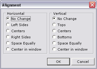
Align
Components can be positioned manually by drag and drop, or by selecting multiple components and using the built-in alignment functions. It's also possible to snap components to the template grid.
This section contains the following topics:
Position components
-
Select the components to align.
-
Right-click on the template and select Align.
-
Set the horizontal and vertical alignments and click OK.
Position components by snapping them to the grid
-
Position components to the template grid automatically by selecting Snap to Grid on the View menu.
Size and Scale
Setting the size and scale of components can be done per component or by selecting a group of components, and can be used to make text boxes and other components of the same type with the same size and/or scale.
This section contains the following topics:
Size and Scale
-
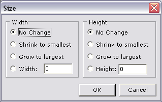
Size: Width/Height: Sets the width or height of selected components.
-
No Change: No changes are applied to the width or height of the selected components.
-
Shrink to smallest: Shrinks the size of all components to the same as the smallest.
-
Grow to largest: Grows all components to the same size as the largest component.
-
Width/Height: Sets a custom width/height for the selected components.
-
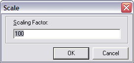
Scale: Scaling Factor: Sets the scaling factor in percentage.
-
Set component size
-
Select the components to size by pressing SHIFT and clicking the components.
-
Right-click the template, and on the context menu select Size.
-
Set the Width and Height properties and click OK.
Set component scale
-
Select the component to scale by pressing SHIFT and clicking the components.
-
Right-click the template, and on the context menu select Scale.
-
Set the Scaling Factor (percentage) and click OK.
Tab Order
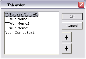
This option lets the template user to press the TAB key to move between the different fields (components) on the template.
Set the tab order
-
Right-click on the template and on the context menu select Tab Order... .
-
Arrange the order by selecting items and using the arrow buttons, or drag and drop, to move them up and down.
-
When done click OK.
Creation Order
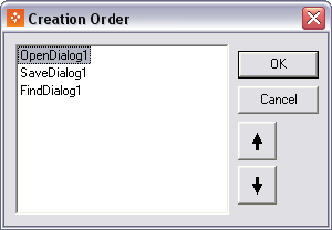
Use the Creation Order dialog to specify the order in which the template creates non-visual components. The order is used when the form is loaded at design time or run time. A non-visual component is a component that is visible when designing, but has no appearance at runtime until it is called (for example SaveDialog), or simply never appears at runtime (for example TWComPort).
The Listbox only displays non-visual components on the active template, their type, and their current creation order. The default creation order is determined by the order in which the non-visual components are placed on the template.
Background Images
The use of large size background images (in bytes) in templates is not recommended. This is made possible by the Static Image Component component; however, for every data element that uses the template, a copy of the template is created and saved on the database, including the background image.
Tags
Tags are administered through the Pilot Data Server Web Interface. Templates can then be tagged by selecting a tag in the Save Template dialog.
This section contains the following topics:
Access the Tag settings
-
Select the Pilot Data Server Web Interface from the Windows Start Menu.
-
Click the Settings link.
-
Click the Tag settings link.
Define a new tag
-
Click the Add tag button on the Tag settings page.
-
Enter a name for the tag in the New Tag field.
-
Click OK.
Rename a tag
-
On the Tag settings page, click the Rename icon next to the desired tag.
-
Enter a new name for the tag in the RenameTag field.
-
Click OK.
Delete a tag
-
On the Tag settings page, click the Delete icon next to the desired tag.
-
Click OK to confirm the deletion.
Note: Deleting a tag will not delete the templates that refer to the tag.
Assign a tag to a new template
-
Create a new template.
-
Click Save.
-
Enter Template name and Concept as required.
-
Select a tag in the Tag dropdown.
-
Click Save as New.
Assign or modify the tag of an existing template
-
Open an existing template.
-
Click Save.
-
Select a tag in the Tag dropdown.
-
Click Overwrite existing.
Remove an assigned tag
-
Open an existing template.
-
Click Save.
-
Select <None> in the Tag dropdown.
-
Click Overwrite existing.