Viz Social User Guide
Version 1.0 | Published June 22, 2021 ©
Interpreting Data in Reports
After the data has been selected and the time interval has been chosen, the most important task can be performed: the interpretation of the data. Currently, Viz Social shows four different data categories in four separate tabs:
Each one is described in its own section below.
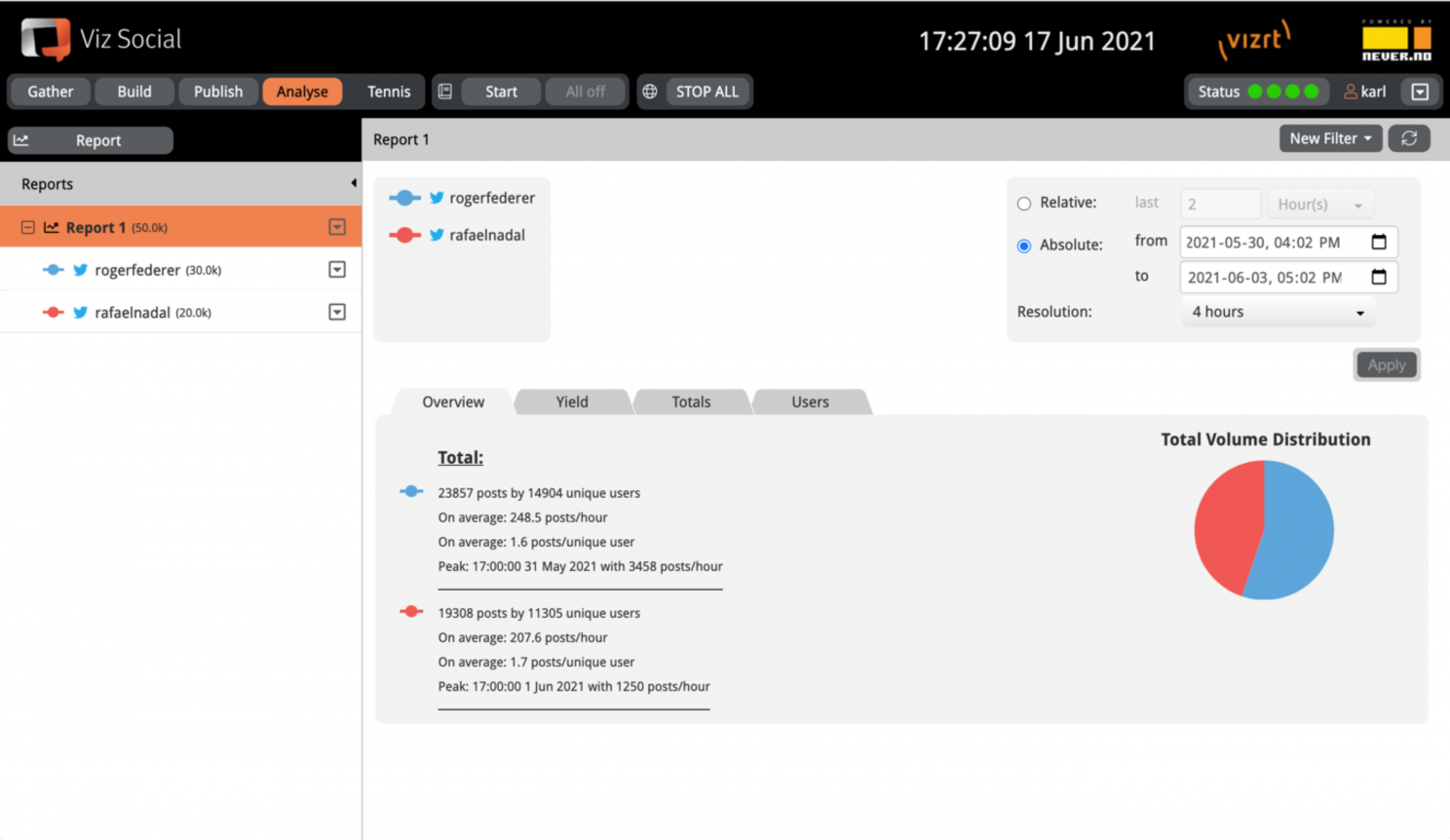
Overview
The Overview tab shows the key figures per data set within the Report and for the configured time window. Currently these figures are:
-
The number of posts and the number of unique users.
-
The average number of posts per time interval.
-
The average number of posts per unique user.
-
The peak moment and the peak traffic.
-
The top user and his/her total number of posts.
Figures are presented per data set and in case overlays are active, both filtered and unfiltered data can be shown in parallel. In addition, a pie chart is shown to make it easy to visually compare the volumes of the various data sets (both for total and for filtered data where relevant). A mouse-over effect shows the actual numbers used in the pie chart(s).
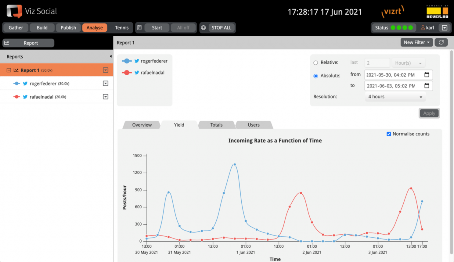
Yield
The Yield tab shows the rate of incoming traffic per data set as a function of time for the configured time window. The mouse-over canvas shows the exact numbers per time slice for all data sets. In case overlays are active, both filtered and unfiltered data can be shown in parallel and individual data sets can be visually emphasized by selecting them in the left column.
By default, the Report shows the yield as messages/time unit on the Y-axis (as normalised data). By unchecking the Normalize counts checkbox the Reports show the bare message count for each time interval instead of its rate.
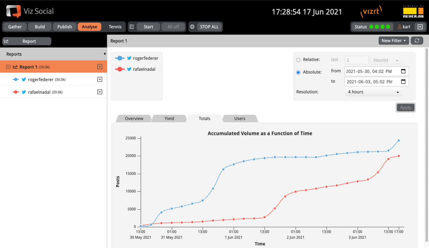
Totals
The Totals tab shows the cumulative total of incoming traffic per data set as a function of time for the configured time window. Counting always starts with zero for the first/leftmost time slice, so it does not take posts into account from before or after the configured time window. The mouse-over canvas shows the exact numbers per time slice for all data sets. When a Search is going slow, it results in a horizontal line, and when it is going fast, a steep increase can be observed. All lines are monotonously increasing.
In case overlays are active, both filtered and unfiltered data can be shown in parallel and individual data sets can be visually emphasized by selecting them in the left column.
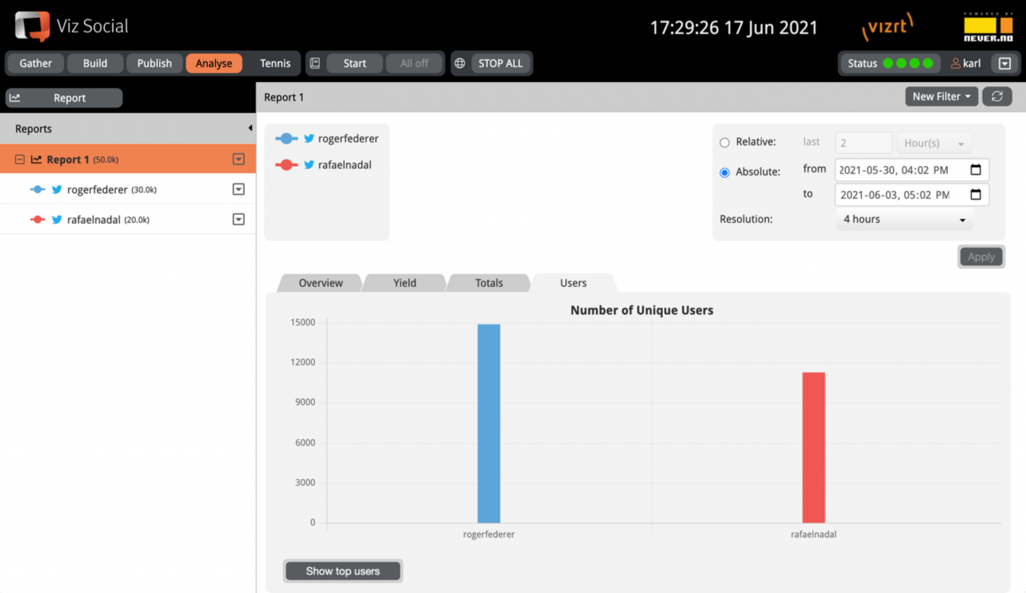
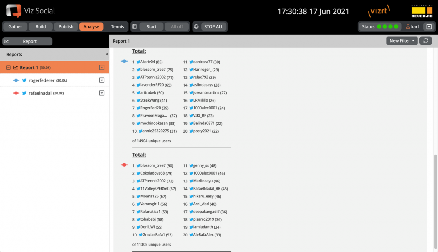
Users
The Users tab shows the top N most active users per data set for the configured time window. With the dropdown menu at the top, the value of N can be selected. In the bar chart at the top, the number of unique users can be compared across different data sets.
In case overlays are active, both filtered and unfiltered data can be shown in parallel and individual data sets can be visually emphasized by selecting them in the left column.