Viz Mosart User Guide
Version 5.0 | Published June 21, 2022 ©
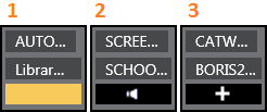
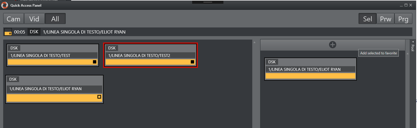
Quick Access Panel
Viz Mosart provides several ways of controlling a newscast show. Stories gathered from an NCS system are displayed as a rundown, as planned by the Director. But a Producer/Mosart operator can divert from this plan by skipping stories or items in the rundown or bring in new elements. This is done with keyboard shortcuts or browsing through the rundown. The Quick Access Panel (QAP) provides a compact view of the rundown content, with button sizes optimized for touch screens.
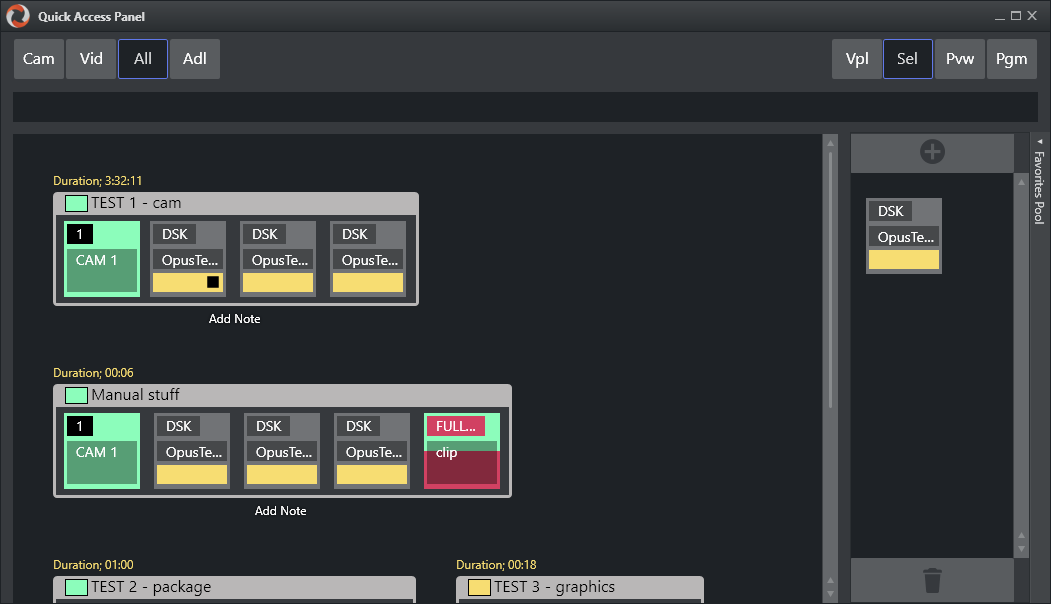
The Quick Access Panel
-
Makes it easier for a Producer making a dynamic rundown. It can also be a convenient way for Co-producers or Co-pilots to add more content to a rundown, while the Producer runs the show.
-
Shows all the executable control elements of the entire rundown, as buttons grouped by their originating stories.
-
Includes modifiable Story Filters, in the example above Cam, Vid and All.
The Producer or Co-pilot can filter to find specific elements, for example only cameras, which they can then modify in a running rundown.
The Quick Access panel can be displayed and operated separately from a second Viz Mosart client or as an standalone panel on the primary Viz Mosart client. The button size can be changed to suit typical screen sizes setups.
This section contains the following topics:
Changing the Appearance of the QAP
To View the QAP Standalone
To keep all details on the buttons visible, you can have the QAP in its own window.
-
Start a new Viz Mosart client
-
Create a new workspace
-
Float the QAP with View > Floating windows > Quick Access Panel
-
Select View > Save workspace
to save the new layout. -
(Optional) Create shortcuts to switch between workspaces.
To Change the Size of QAP Buttons
The size of the boxes can be modified individually in the right-click context menu of the top template group button, under Box width.
Story Item
Story Control
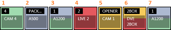
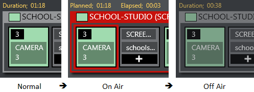
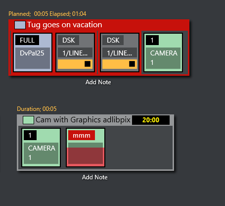
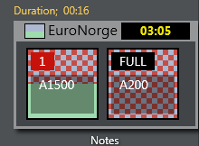
The Quick Access Panel shows each story as a rectangular box. Within the story box, each element and sub-element appear as a button. The story type is indicated in the story box header by color, corresponding to the type of story element.
The type of the story is determined by the elements it contains. Beneath the story box the user can add a description by clicking Add Note.
-
The story item is always displayed within a story.
-
The background of the button indicates the template type.
-
The heading indicates template variant.
-
A white text and red background as the template variant text indicates an unavailable template.
-
The transparent text shows the slug.
-
You can take items (e.g. lower third, accessories, sound elements) On Air by clicking the button. The button gets a red border and appears in the program window. Take it Off Air by clicking the button again. Notice that if the item has a fixed time, it goes Off Air autonomously.
Note: Clicking an item that already has gone Off Air, puts it back On Air again.
Primary Elements
-
CAM: Camera
-
PACKAGE: Video
-
VO: Voice over
-
LIVE: Live element
-
GRAPHICS: Full screen graphic element
-
DVE: Butterfly/DVE
-
FLOAT
Secondary Elements
Secondary elements are shown with a gray background.
-
LOWERTHIRD
-
SOUND
-
ACCESSORY
Story Status
If a story is On Air, its frame becomes red with a white font. The item that is On Air also gets a red frame. When the story or story item has been On Air, it gets a denser color.
If a lower-third has continue points, a bubble appears on the right, indicating remaining continue points.
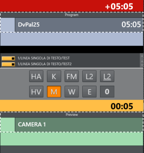
Story Timing Information
Timing information is shown on top of stories.
-
Duration (normal): How long the story is planned to last.
-
Planned (on air): The same as duration.
-
Elapsed: How long the story has been On Air.
-
Duration (off air): How long the story lasted.
-
Countdown (black box): Time until story is planned to go On Air.
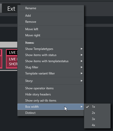
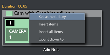
Quick Access Panel Context Menu
The context menu offers several options:
-
Set as next story: This story is set as next.
-
Insert items: Inserts all visible items (except floats) in the current order after the running item in the current story. If the command mode is Air Mode, the first item is taken directly.
-
Insert all items: Inserts all items (except floats) in the story after the running item in the current story. If the command mode is Air Mode, the first item is taken directly.
-
Count down to: Starts counting down to the first visible item in the story.
Command Modes
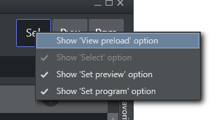
The result of pressing the Quick Access Panel buttons in the list varies depending on which Command Mode button is active.
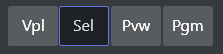
-
You select which command buttons are displayed by right-clicking any of the displayed buttons.
Vpl - View Preload Mode (hidden by default)
-
If selected item is a video clip or graphic, it is sent to the configured preload/preview server/engine.
Sel - Select Mode
-
The selected item becomes the focused item.
This item can then be sent to preview, program or wall by selecting within the dotted line on the relevant control.
Prw - Preview Mode
-
The selected item is added to Preview.
Prg - Program Mode
-
The selected item goes directly On Air.
If the user holds while clicking any of the boxed buttons, the boxed item is sent-to-preview (as with the story items in the rundown).
Story Filters
An important part of the Quick Access Panel are the filters. By selecting various filters, you switch between different views. For example, you may have one for Cameras, one for Videos, one for Live and DVEs.
Filter Bar Context Menu
Right-clicking in the filter bar opens a context menu, for filter operations.
-
Rename: Changes the name of the filter.
-
Add: Adds another filter.
-
Remove: Removes this filter.
-
Move Left: Changes the order of the filter left.
-
Move Right: Changes the order of the filter right.
-
Items (header): Applies filters below to the items within each story.
-
Show Templatetypes: Selects which kind of template types that are visible when this filter is applied
-
Show items with status: Selects which statuses the visible items can have: Valid, Invalid (missing content etc), Aired (has been On Air), OnAir (currently On Air), Other.
-
Show items with templatestatus: Selects if items with Valid or Unavailable templates are allowed; or both.
-
Slug filter > Add: Adds a slug filter.
-
Slug filter > Delete: Removes a slug filter by selecting from a list.
-
Template variant filter > Add: Adds a template variant, within the selected template group.
-
Template variant filter > Delete: Deletes a template variant, within the selected template group.
-
Story (header): Applies the filters below to each story.
-
Story > Show story types: Selects which kind of story types that are visible when this filter is applied. Lists all primary and secondary templates.
-
Story > Show story with status: Selects if items with the different statuses are visible when this filter is applied: Valid, Aired (has been On Air), OnAir (currently On Air), Preview (story is next), Other.
-
Story > Add slug filter: Adds a filter of the story slug/title.
-
Story > Delete slug filter: Removes a filter of the story slug/title.
-
Show operator items: Displays elements added within the GUI when checked. If not, all elements added by the GUI operator are not visible, only the NCS content is shown.
-
Hide story headers: When checked, only items in a list without story headers are shown, e.g. to save space.
-
Show only ad-lib items: Shows only items that do not have a planned in-time in the rundown show. Applies to ad-libpix templates and manual lower thirds.
-
Box width: (1x, 2x, 3x, 4x): Specify the size of the item boxes. 4x is largest box, useful for viewing full clip names or long lower third slugs.
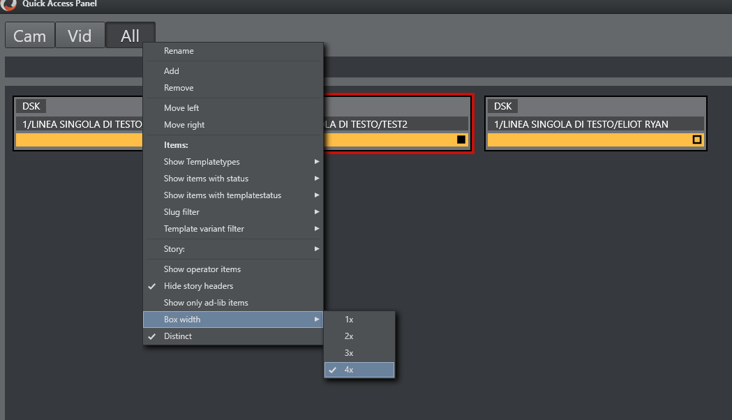
-
Distinct: Removes any duplicate item templates from the list. This selection also automatically enables Hide story headers.
To Add a New Filter
-
In the filter button row, right-click and select Add.
-
Enter a name for the filter.
The first three letters of this name will appear on the filter button. The name must be unique.
The Quick Access Tab shows the same filtered elements grouped in stories.
Example Filters
Show Missing Clips and Graphics: A filter to display the checkered clips or graphics in the rundown can be useful during a show to quickly verify if clips and graphics are available. It can also be very useful to add countdowns to these clips. The countdown displays how long until the clip has to be ready.
-
Show template types > [PACKAGE | VO | GRAPHICS]
-
Show items with status > [InValid]
The countdown shown in the upper right corner can be set by right clicking the story.
Show Missing Templates: The filters can also be used to display missing templates. By applying the filter Show items with template status > Unavailable, the producer (or anyone using a GUI) can quickly spot any elements missing a proper template.
Show a Slug Filter: If the NCS Stories has a naming convention, it can be easy to create container stories. For instance all highlights from a soccer match can be added to a specific story. Then by applying the slug filter “SOCCER_HIGHLIGHTS*”, all of these clips become available to the producer very quickly without having to scroll up and down the rundown. This approach also works very well with FLOATS (Adlibs) - clips.
Show Valid Floats: If the producer wants to have valid floats in the current On Air story readily available, this filter can be used.
-
Show items with status > Valid
-
Show template types > FLOAT
-
Show items with template status > Valid
-
Show story with status > On-air Story Items
Pool Favorites
The Favorites pool is by default hidden. Enable it by clicking on the bar on the right edge of the Quick Access Panel. This expands the pool Favorites section.
Working with Pool Favorites
To Add an Item to the Favorites Pool
-
Mark Sel as command mode.
-
Select an item in the left section.
-
Click the + icon at the top of the Favorites pool panel.
To Remove a Favorite from the Pool
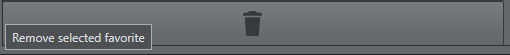
-
Mark Sel as command mode.
-
Select an item in the pool.
-
Click on the big trashcan button bar at the bottom of the favorites pool.
The items in the Media Pool are the same as in the Quick Access Panel pool.