Viz Mosart User Guide
Version 5.0 | Published June 21, 2022 ©
User Interface
You can configure the appearance of Viz Mosart to suit your workflows, and choose which menu items, text descriptions and the logical flow of displayed information will be displayed.
This section describes the configuration alternatives for each panel:
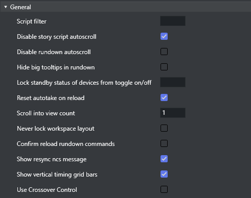
General
-
Script filter: Filters script text. The format is 100,50 where the first number is the maximum length at the start, and the second number the maximum length at the end. Used to limit the size of the script text from the NRCS story in the UI.
-
Disable story script autoscroll: Disables the auto-scroll functionality in the story script. This functionality keeps the current item at the top of the Script window.
-
Disable rundown autoscroll: Disables the auto-scroll functionality in the rundown. This functionality keeps the view of the rundown in sync with the on air story, and displays the current story line according to the value set in 'Scroll into view count'.
-
Hide big tooltips in rundown: When selected, there no longer appears a big tool-tip when you hover over an item in the rundown.
-
Lock standby status of devices from toggle on/off: A list of which devices should be locked from being manually toggled to standby status. Comma separated list (for example, Video server, audiomixer).
-
Reset autotake on reload: Defines the behavior of the auto-take mode on Reload (Default SHIFT+F12). When selected, Viz Mosart reverts to normal mode on reload.
-
Scroll into view count: Defines how many story lines are auto scrolled into the UI rundown window when running a show.
-
1 will continuously keep one story above the current on air story, visible (the previous story to the current).
-
2 will keep two story lines visible, above the current one.
-
-
Never lock workspace layout: When selected, it is always be possible to change the size of the modules in the workspace. If unselected, the workspace layout will be locked while on air.
-
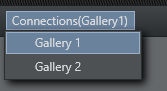
Show the connections menu: Enables the appearance of the Connections menu. In this menu, the Viz Mosart UI can be connected to various control room server pairs, making it possible to use the same UI to display/control several control rooms/studios.
-
Confirm reload rundown commands: When selected, a confirmation dialog menu is displayed whenever the user issues a Reload Rundown command.
-
Show resync ncs message: When selected, a popup window asks for confirmation whenever a rundown is locked and then unlocked again.
-
Show vertical timing grid bars: When selected, horizontal lines show to indicate time.
-
Use Crossover Control: When selected, the UI displays the status of the Viz Mosart which is configured on the server.
Browse Mode
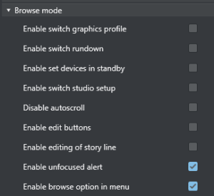
The check boxes under the Browse mode header control various actions whenever a Viz Mosart UI is set in browse mode. By default, most are unchecked, rendering the Browse mode UI completely “safe”.
-
Enable switch graphic profile: When enabled, it will be possible to change graphics profile while in browse mode.
-
Enable switch rundown: Change rundown in browse mode.
-
Enable set devices in standby: Change standby devices in browse mode.
-
Enable switch studio setup: Change studio setup in browse mode.
-
Disable autoscroll: Disables the autoscroll functionality in the rundown and in the script view in browse mode.
-
Enable edit buttons: Use the edit buttons in browse mode.
-
Enable editing of story line Edit story line in browse mode.
-
Enable unfocused alert: When not enabled, the unfocused alert is not shown in browse mode when the application does not have focus.
-
Enable browse option in menu: Enables the appearance of the View > Browse mode menu item, and makes it possible to turn browse mode off.
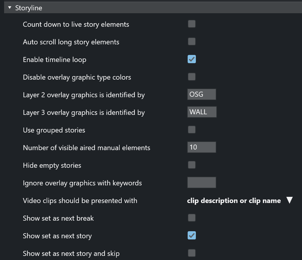
Story Line
Story line options control behavior and display characteristics of each story in the rundown.
-
Count down to live story elements: Enables countdown to stories containing either a LIVE, DVE or TELEPHONE template.
See the topic Countdown to a Selected Story. -
Auto scroll long story elements: When selected, long story items (with scrollbars) are automatically scrolled horizontally while the story item is played. Makes it easier to see when lower thirds appear.
-
Enable timeline loop: Enables the loop timeline context menu.
-
Disable overlay graphic type colors: Disables the use of Layer 2 and Layer 3 identification (otherwise, user sees Layer 2 overlay graphics is identified by and Layer 3 overlay graphics is identified by).
-
Layer 2 overlay graphics is identified by: Overlay graphics connected with any Handler name input here is displayed in the secondary overlay graphics layer. For example, OSG

-
Layer 3 overlay graphics is identified by: Overlay graphics connected with any Handler name input here is displayed in the tertiary overlay graphics layer. For example, WALL
-
Use grouped stories: When selected, stories with the same prefix are displayed in story groups in the UI. All items within each story group are also displayed in the Asset window. Can also be used with Quick Access filters.
-
Number of visible aired manual elements: Number of manual elements already aired that should be visible in a story. Use -1 to show all. Default value is 10.
Note: Showing more than 10 elements in each story may cause performance issues.
-
Hide empty stories: When selected, stories without items are not shown in the rundown. They are reduced to one straight line.
-
Ignore overlay graphics with keywords: Overlay graphics connected with any of the specified handler names are hidden in the UI. Can be used to remove fixed overlay graphics.
-
Video clips should be presented with: Select how you want video clips to be displayed to the user in the user interface, selecting from the drop-down list.
-
Show set as next break: When selected, Set As Next Break is available as an option in the rundown context menu. Selecting this option causes Viz Mosart to regard the selected story line as a Break line for countdown and timing purposes.
-
Show set as next story: When selected, Set As Next Story is available as an option in the rundown context menu. (Right-click.) The user can jump to stories further up or further down in the rundown, independently of the NRCS running order.
Default: On -
Show set as next story and skip: When selected, the story line context menu option Set as next story (skip) is available.
For example: The story on air consists of three items, and the current item on air is number one of these three. Choosing Set as next story (skip) for another story in the rundown will then skip item 2 and 3 of the current on air story and set the first item of the chosen story in preview. (Whereas selecting Set as next story keeps the remaining items in the on air story as the following items to be played out, before the chosen story is set as next story. Default: Off
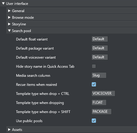
Search Pool
Search pool options affect the Search tab and Quick access tab in the Media Pool, usually displayed in the lower right corner.
-
Default float variant: The float variant that Viz Mosart adds to any video file found in the Search or Quick Access tab when dragged to the rundown, a shortcut key or the Favorites tab. See below for information on the drag and drop feature.
-
Default package variant: The package variant that Viz Mosart adds to any video file found in the Search or Quick Access tab when dragged to the rundown, a shortcut key or the Favorites tab. See below for information on the drag and drop feature.
-
Default voiceover variant: The voiceover variant that Viz Mosart adds to any video file found in the Search or Quick Access tab when dragged to the rundown, a shortcut key or the Favorites tab. See below for information on the drag and drop feature.
-
Hide story name in Quick Access Tab: When checked, The Quick Access tab shows the filtered items as a list without any story headers.
-
Media search column: Values entered here define the format of search results displayed when searching the video servers. Values can either be entered without name tags, in the format: "slug, durationtc" or with name tags, in the format: "Name=slug, Dur=durationtc"
This tells Viz Mosart to display results with Name:xxx (found in the slug column on the server database) and Dur:xxx (found in the durationtc column on the server database).
The resulting search window could look like this:
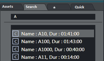
Valid property fields: SLUG, DESCRIPTION, STATUSDESCRIPTION, RIGHTS, DURATION, STATUS, STAUSDESCRIPTION -
Recue items when reaired: When checked, previously played video items dragged from the Assets and Favorites tabs into the rundown are recued.
-
Template type when drop + CTRL: Typing FLOAT, PACKAGE or VOICEOVER here defines which of the three types is connected to material dragged from the Search window when holding down the CTRL key.
-
Template type when dropping: Typing FLOAT, PACKAGE or VOICEOVER defines which of the three types is connected to material dragged from the Search window without holding down a key.
-
Template type when drop + SHIFT: Typing FLOAT, PACKAGE or VOICEOVER defines which of the three types is connected to material dragged from the Search window when holding down the SHIFT key.
-
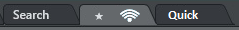
Use public pools: When checked, manually updated Favorites Pool tabs are shared between GUIs connected to the same server. A shared Favorites tab is indicated by a small symbol in the top right hand corner of the tab.
Assets
Asset options are options regarding the asset tab in the media pool usually located in the lower right corner.
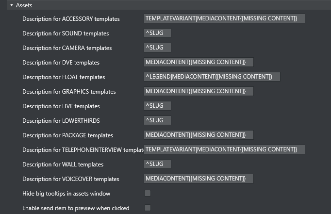
-
Description for ____ templates: Entering a legend syntax description in this field defines the format displayed for assets in the Assets Tab, in the same way as with the Media search column. The syntax for defining the legend is shown in the Asset Legend Syntax section below.
Valid parameters are listed in the Assets Properties list further down. The legends used in Asset window are customizable for all Viz Mosart template types shown in the table above.
Legends for other template types are shown using the corresponding slug. -
Hide big tooltips in assets window: Normally when you hover over an item in the Asset window, a big tool-tip appears with the full details of the item. If this is not wanted, the tool-tip can be disabled by checking this box.
-
Enable send item to preview when clicked: If selected, clicking on a primary item in the Asset window immediately sends it to preview (it is inserted as the next item in the story currently On Air).
Note: If an item was unintentionally sent to preview in this way, this can be undone by pressing Skip Next (default F9)
Asset Legend Syntax
Legends for template types in the Asset window are defined as a set of properties divided by the pipe (|) character where each property has the following syntax:
[separator][[Title]]Property[{DefaultValue}, where:
-
[separator]: Optional separator to separate the property from its predecessor. Using a carat (^) as the first character ensures that the first property this the following property. Otherwise, all legends start with the slug.
-
[[Title]]: Optional title. Needs to be defined inside [] brackets.
-
Property: Named property, see table below.
-
[{ DefaultValue}]: Optional default value. Needs to be defined inside {} brackets.
Note:In the syntax above [] is also used to denote optional content
Examples:
-
MEDIACONTENT{[MISSING CONTENT]}|, [Duration=]DURATION
Displays Slug + Clip/Graphics description + clip duration. Description shows “[MISSING CONTENT]" if the template lacks content. Typically if no content is added in the NCS.
-
^TEMPLATEVARIANT| MEDIACONTENT{[MISSING CONTENT] }
Displays template name + Clip/Graphics description (i.e. starts with template name).
Assets Properties
Various template properties are available for use in asset legends:
-
CLIPDESCRIPTION: Normally clip slug (slug).
-
CLIPHIRESPATH: Clip reference. Normally clip slug (clip_hirespath).
-
CLIPREFID: Clip reference id. Normally clip server identity number (metadata_lookuppath).
-
CONTINUECOUNT: Continue count for fullscreen graphics (continuecount).
-
DESCRIPTION: Item's description (clip_hirespath).
-
DURATION: Clip duration in mm:ss.
-
GRAPHICSDESCRIPTION: Graphics description. Normally name of full-screen graphics (graphics_description).
-
GRAPHICSID: Graphics id. Normally graphics id used by graphics system (graphics_id).
-
ITEMIN: In-time in hh:mm:ss for secondary objects (like accessories and CGs).
-
LEGEND: Equals SLUG if present. Otherwise set to DESCRIPTION.
-
MEDIACONTENT: Equals CLIPDESCRIPTION for clips and GRAPHICSDESCRIPTION for fullscreen graphics.
-
SLUG: Textual description of the element. Normally as entered in NCS (slug).
-
TEMPLATEVARIANT: Template variant name (templatetype).
-
TRANSITION: Transition given as [CUT|MIX|EFFECT](duration|effectno) (transitions(rate)).
Default Value
The slug is implicitly used as the first value. This is the same as entering ^SLUG as the description (if the carat (^) is not present as the first character then the slug is used as the first value).
To use other properties as the first value, the description should start with the carat (^) character.
Preview and Program Windows
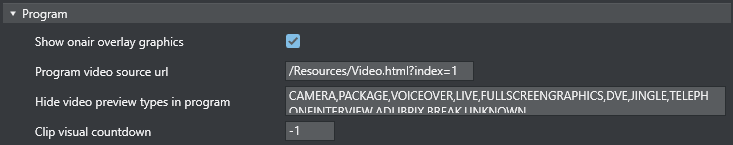
Program
-
Show onair overlay graphics: When selected, overlay graphics are displayed in the Program window when they go on air.
-
Program video source url: Specifies which source to use for the program video feed. Can be an html page or NDI source url. Keep empty if not to be used.
-
Hide video preview types in program: List of template types that should not display the preview video. Only applicable when producing with NDI video streams. Default: all available types.
-
Clip visual countdown: If this has a value above 0, the countdown of PACKAGE and VOICEOVER change color to alert the user if the countdown reaches this value.
See also Timing Information and Countdown of Video Wall Elements.
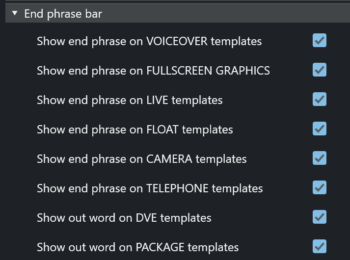
End Phrase Bar
Also called out words, these configurations enable the user to define which Viz Mosart types should have Last Words functionality.
When selected, the last words in the NRCS script (or the last words defined through a command in the script, depending on NRCS and Viz Mosart type) are displayed in a black box in the UI Program Window.
-
Show end phrase on VOICEOVER templates: When selected, the last words in the script of VOICEOVER templates are displayed in a black box in the UI Program window.
-
Show end phrase on FULLSCREEN GRAPHICS: When selected, the last words in the script of full-screen graphics templates are displayed in a black box in the UI Program window.
-
Show end phrase on LIVE templates: When selected, the last words in the script of LIVE templates are displayed in a black box in the UI Program window.
-
Show end phrase on FLOAT templates: When selected, the last words in the script of FLOATtemplates are displayed in a black box in the UI Program window.
-
Show end phrase on CAMERA templates: When selected, the last words in the script of CAMERA templates are displayed in a black box in the UI Program window.
-
Show end phrase on TELEPHONE templates: When selected, the last words in the script of TELEPHONE templates are displayed in a black box in the UI Program window.
-
Show out word on DVE templates: When selected, the last words in the script of DVE templates are displayed in a black box in the UI Program window.
-
Show out word on PACKAGE templates: When selected, the last words in the script of PACKAGE templates are displayed in a black box in the UI Program window.
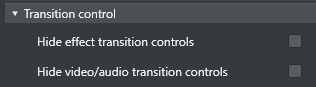
Transition Control
Allows the user to hide some of the transition controls located between the Program and Preview windows. Can be used to save some space in the UI.
-
Hide effect transition controls: Hides the transition controls
-
Hide video/audio transition controls: Hides the video/audio transition controls
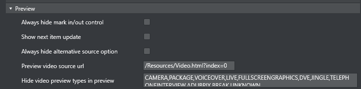
Preview
-
Always hide mark in/out control: Hides the mark in/mark out selector that is displayed when a clip is in preview. (If unchecked, these selectors will be shown when a clip is in preview, otherwise not.)
-
Show next item update: When selected, a warning is displayed in the Preview window if the story in preview is updated from the NCS.

-
Always hide alternative source option: Hides the combo-boxes that are displayed on top of the template previews in Preview (and Program). Selected this to only see the source.
-
Preview video source url: Specifies which source to use for the preview video feed. Can be an html page or NDI source url. Keep unselected if not to be used.
-
Hide video preview types in preview: List of template types that should not display the preview video. Only applicable when producing with NDI video streams. Default: All available types
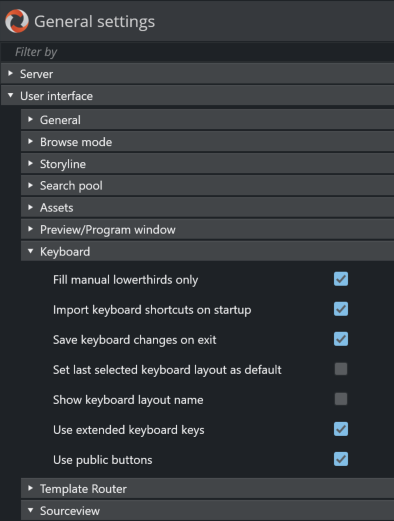
Keyboard
-
Fill manual lowerthirds only: When selected, only NRCS-bound lower thirds fill keyboard shortcuts with manual lower third. When unchecked, all lower thirds fill any keyboard lower third.
-
Import keyboard shortcuts on startup: When selected, the UI attempts import of keyboard settings from the server every time the UI restarts.
-
To export a keyboard settings file to the server, select LAYOUT - EXPORT in the keyboard shortcuts window.
-
-
Save keyboard changes on exit: When selected, all changes to the keyboard layout (for example, unassigned keys) are saved on exit.
-
Set last selected keyboard layout as default: When selected, the last used keyboard layout opens the next time the UI is started.
-
Show keyboard layout name: When selected, the currently selected keyboard layout name is displayed in the menu bar at the top of the Keyboard shortcuts window of the UI.
-
Use extended keyboard keys: When selected, some special keys like Enter/Return are treated differently. The extended variant is shown with an asterisk (*) in the keyboard editor.
-
Use public buttons: When selected, manually updated shortcut buttons are shared between all UIs connected to the same server. A shared button is indicated by a small symbol
 in the top right-hand corner of the button (see Button Details in the section Keyboard Shortcuts).
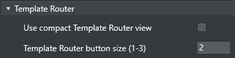
Template Router
Note: Template Router is the new name for the Wall Manager.
-
Use compact Template Router view: When enabled the Template Router will only show the on-air part of the Template Router. Saves a lot of screen real estate.
-
Template Router button size (1-3): Option to select the size of the Template Router button. Can save some screen space. Depends on screen size and resolution.
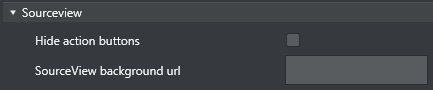
Sourceview
-
Hide action buttons: When unchecked, the three action buttons Sel, Prg, Prw are shown in the upper right corner of the Sourceview. These can be used to send the clicked items to preview or program or to enable select. If checked, only Select mode will be used and the buttons are hidden.
-
SourceView background url: http: based background for sourceview. Can be used to provide live video using the http protocol.