Viz Mosart User Guide
Version 5.0 | Published June 21, 2022 ©
Rundown Window
The rundown window contains the rundown/story list, built from the content received from the NRCS.
Each story line consists of a story info area to the left and the Viz Mosart templates and secondary elements extracted from Viz Mosart commands in the NRCS, to the right.
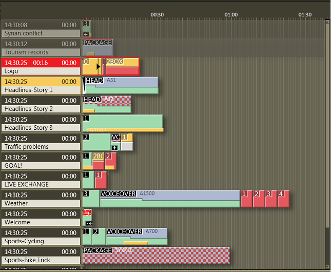
Story Info
The left info area of a story normally shows the following information:
-
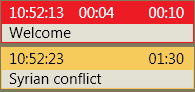
Estimated On Air time in the top left hand corner.
-
The editorial duration of the entire story as entered in the NRCS in the top right hand corner.
-
The story title as entered in the NRCS on the second line.
-
When the story is On Air, another timer appears in the middle of the top line, showing how long the story has been running.
-
The story currently On Air is marked as red, and the next story that is taken to air is marked as yellow.
Story Elements
The templates are represented in the right hand area of the rundown window by color-coded elements. The length of the element reflects the calculated or exact duration of the template, depending on the template type.
Stories with no recognized Viz Mosart commands are shown as empty lines in the rundown window i.e. without any story elements in the story. Stories with recognized template types but unrecognized variant commands are shown with the variant title in red, as in the illustration below:

When a story contains several elements with long duration, a vertical scroll bar appears to the right, which means one story will not display over more than four story rows in the Viz Mosart GUI.
The story elements are described in detail in the following sections:
Primary Story Elements
Camera
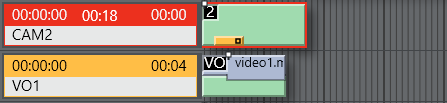
The Camera template type is displayed as a green element in the GUI. The variant of the template type (often the camera number) is indicated in the top left hand corner of the colored element. The duration of the template is calculated from the presenter text as entered in the NCS.

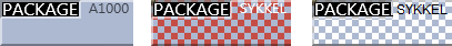
Package
This template type is for playing (or recording) a video clip.
The package template type is displayed as a light blue element in the GUI. The variant of the template type is indicated in the top left hand corner of the colored element. The length of the package element is calculated from the actual clip length when available on server.
If the package clip is not available from the video server it has a blue/red checkered pattern, and placeholder clips are displayed with a white/blue-checkered pattern.
Additionally, zebra-stripes means that cue failed.
Keyframes
In some systems, Keyframe markers are displayed with grey semicolon markers:
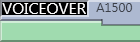
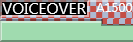
Voiceover
The voiceover template type is displayed as a light blue and green element in the GUI. The variant of the template type is indicated in the top left hand corner of the colored element. The small notch in the green bar shows the calculated duration of the presenter text. The light blue represents the clip as with the server template type and the green represents presenter text as with the camera template type. If the clip is not available from the server, the clip section of the element has a checkered pattern.
The length of the voiceover element is calculated from the actual clip length when available on server.
Live/external Source
The live type is displayed as a red element in the GUI. The variant of the template type is indicated in the top left hand corner of the colored element.

Graphics
The fullscreen graphics type is displayed as a yellow element in the GUI. The variant of the template type is indicated in the top left hand corner of the colored element. Duration of the element is timed from the presenter text entered in the NCS. For graphics systems which support this feature, the element has a checkered pattern if the attached graphics content is not available for playout from the graphics system.

Note: If back-to-back fullscreen graphics are within in the same story (and use the same engine), the scene is not retaken for each graphic, but just kept playing. As the show advances, and one story is left, a new story entered, the graphics are taken again (i.e. the engines are ejected) so that any other graphics that are using the same engine are taken normally.
Digital Video Effect (DVE)
The DVE type is displayed as a yellow and red element in the GUI. The variant of the DVE template type is indicated in the top left hand corner of the colored element.

Telephone
The telephone interview type is displayed as a yellow and white element in the GUI. The variant of the template type is indicated in the top left hand corner of the colored element.

AdLib Pictures/Floats
The ad lib pictures template type is represented by a symbol at the right end of the story line in the rundown window. If the associated media object is not on the server, the symbol is checkered.
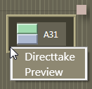
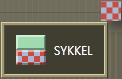
The element also appears in the Assets window as a colored slug with a green top half and light blue bottom half for clips, and orange bottom half for graphics. They can be taken On Air or to preview either by right clicking and using the context menu in the rundown window or the Assets window.
Adlib picture templates adds the audio faders specified in the template to the current audio fader set. The faders are subtracted when returning from the Adlib pictures. Adlib pictures are typically used in live external or studio interviews.
Adlib pictures pause when it is taken Off Air. If the Ad lib pictures is inserted again the clip continues from the paused point.
Break
The break/continuity template is displayed as a white element. The break story is the default start and end-point of the show from which total show timers are made. Break templates can also be used for commercial breaks, when master control takes over.

Other Primary Templates
-
Jingle
-
Video Wall
Secondary Story Elements
Overlay Graphics
Overlay graphics (lower thirds) are shown as a yellow secondary element. Secondary elements appear on top of primary elements and are executed relative to the primary template. The secondary element is scaled to the duration of the lower third element set in the NCS.

Different types of overlay graphics with separate handlers in the Overlay Graphics application, such as lower thirds, wall elements or OSGs, can be displayed in different lower third level.


See General Settings for details on setup.
Take In
Take-in of lower third elements may be performed either manually or automatically from Viz Mosart.
-
Automatic: If an in-time is set in the NCS for the lower third Viz Mosart automatically takes it in.
-
Manual: If no time-in is set in the NCS for the lower third, Viz Mosart marks it as a manual lower third. These elements are displayed on the right hand side of the GUI window, and can be executed in the same way as adlib pictures.
Take Out
Take out of lower thirds may be performed in four ways. These are displayed differently in the Viz Mosart GUI:
-
AUTOOUT: Is taken in and taken out automatically from the in-time and duration or out-time set in the NCS
-
 BACKGROUNDEND: Is taken in automatically as defined in the NCS and taken out with the primary element it is attached to.
 -
 STORYEND: Is taken in automatically as defined in the NCS and taken out when the story it is attached to is taken Off Air.
 -
 OPENEND: Is taken in automatically as defined in the NCS and is not taken out before the operator takes it out.
Audio Play
Audio Player secondary elements are displayed as a small speaker symbol on top of a primary template. Its position represents the time code given in the NCS. The audio starts to play when the timeline reaches the position. If no in-time is defined for the sound it appears as a manual element in the symbol in the right hand area of the rundown where manual lower thirds and adlibs are shown.

Accessory Elements
Accessory secondary elements are displayed as a small plus (+) icon on top of a primary template  .
.
There are two ways to use an Accessory. This relates to how they are taken:
-
Automatic: (timecode driven) The element's display position represents the timecode provided in the NRCS. The Accessory item is taken when the timeline reaches the accessory icon.
-
Manual: If no in-time is defined for the Accessory item, it is displayed as a manual element, with its icon to the right of the rundown, similar to where manual lower thirds and adlibs are displayed.
Color coding
Black background: Normal, the element is available.
Red background: The accessory template does not exist/is unavailable.
Other Secondary Templates
-
Sequence
Additional Rundown Features
Story Editorial Time
The story planned duration (editorial time) entered in the NCS is indicated by a grey marker on a story element or after the last story element.

Autotaking an Element
If a primary story element is programmed with "autotake next" this is indicated at the end of that element with a black triangular symbol.
Any element e1 following immediately any element e2 based on that template, will be taken automatically when e2 is 'finished'.

Effect Transitions
If an element is set to use an effect transition (from the NCS or the Template Editor), this is indicated with a black and white symbol.

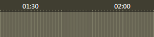
Timing Information
At the top of the rundown window, there are indicators at every 30 second mark. Vertical lines running down the rundown window indicate every second, and broader lines every ten seconds.
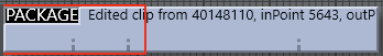
Mouse-over Rundown Info
Hovering the mouse pointer over an element in the rundown displays the NCS script and timed commands connected with that element.
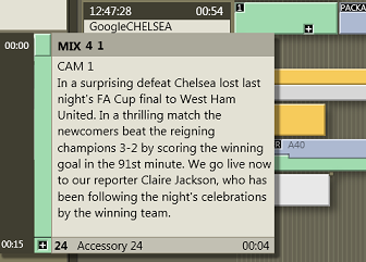
In this example, mousing over the Camera 1 element displays the transition which is used going into the template - a four frame mix - and the template variant “1”. In addition, we can see the entire script written into the NCS story connected with this template, and the details of a secondary accessory template element.