
Viz Pilot User Guide
Version 8.0 | Published May 30, 2017 ©
Organizing the Playlist
Use the shortcut menu in the playlist columns described below to organize a playlist.
Playlist Columns
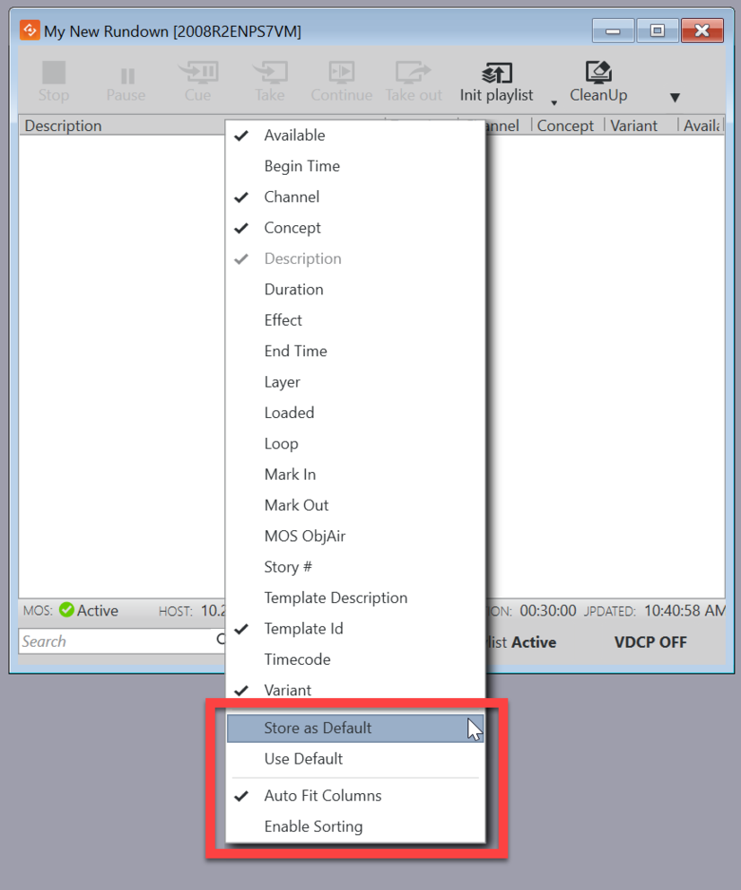
After opening the playlist window (see How do I open the playlist window?) right-click a column header (the Description column header is right-clicked in the image below) to expose a shortcut menu with options for hiding and showing all columns in a template.
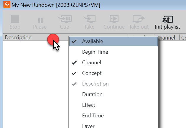
Tip: Click on items in the shortcut menu to select which columns should be displayed. Drag the columns to rearrange them.
-
Available: Displays the status of external resources needed by the Viz Engine (e.g. transferred video, and if it is available on the video playout engines). Errors are shown as tooltips.
-
Begin Time: Shows the activation start time for a group (format hh:mm:ss).
-
Channel: Shows which output channel an element should be sent to. Various elements can be sent to different output channels. The output channels can be set directly in the column. By default the main [PROGRAM] output channel is selected, but this can be overruled by setting an alternative channel for this element only or in a template (that all data elements made from it will have). By creating a group and placing elements within it, all elements in the group will be organized by having the same channel. The Channel column is presented by default.
-
Concept: Shows which concept(s) the playlist element is associated with.
-
Description: Shows the description of the element. By default this will show the path of the scene (or the element name of a stand-alone media file). May be edited in-line in the playlist.
-
Duration: Shows the length of the element.
-
Effect: Opens the Choose Effect dialog, which makes it possible to select a transition effect between two pages.
-
End Time: Shows the activation end time for a group (format hh:mm:ss).
-
Layer: Allows loading of graphics in separate layers on Viz Engine (front, middle, back). For example, a lower third can be shown in front of a virtual studio set or any other background, or a bug can be shown in the front layer while a lower third is shown in the middle layer. This column is presented by default.
-
Loaded: Shows the loaded status (in memory) of the scene and images used for a playlist element of that scene. Errors are shown as tooltips.
-
Loop: Displays a loop information column. Only a playlist or videos can be looped, not groups or individual elements in a playlist.
-
Mark In / Mark Out : Sets mark in/out times for video clips.
-
MOS ObjAir: Two states are possible: READY or NOT READY, as defined by the MOS protocol (see www.mosprotocol.com). If READY no change to default, if element or group marked NOT READY element will be skipped during playout.
-
Story #: Shows the story number for stories in MOS playlists. This is only supported from the ENPS newsroom system.
-
Template Description: Shows the template description (e.g. name).
-
Template Id: Shows the template ID.
-
Timecode: The timecode is an offset time on format hh:mm:ss:ff. It indicates that an element should be played out relative to the parent group or video. This is used for instance in composite groups with a video and overlay graphics that is played out on a timeline.
-
Variant: Select a concept’s variant from the drop-list (see the Concept column).
Other options in the playlist column shortcut menu
The last four items on the playlist window shortcut menu allow you to set default playlist layout, among other things.
Note: Unlike the other options in the menu, selecting/de-selecting them does not hide or show columns in the playlist window.
-
Store as Default: Select this option to use layout and Playlist Pane settings for all new playlists.
-
Use Default: Reverts to the default layout.
-
Auto Fit Columns: Automatically fits all displayed columns to the given width of the playlist.
-
Enable Sorting: Enables sorting. Click a column header to sort items. Items cannot be rearranged by dragging