
Viz Trio User Guide
Version 3.2 | Published June 29, 2021 ©
The Viz Trio Designer
The Viz Trio Designer

Viz Trio Designer contains pre-defined scene elements that are created in Viz Artist and include adjustable control plug-ins required to expose the scene properties. You can easily group different scene elements together to create more advanced scenes. It's also possible to modify the scene element’s properties, if they have been exposed for editing (see Control Plug-ins).
This section covers the following topics:
Starting the Designer
-
Click Tools and select Trio Designer from the menu.
Scene
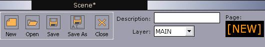
The scene pane is located in the upper left corner of the Designer; it contains functions for scene management and control.
-
New: Create a new scene.
-
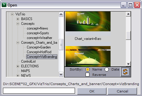
Open: Displays the Viz browser, which provides access to the Viz scene database. An icon to the right of the scene database pane represents each scene as it was when last saved. Scenes are organized in folders accessible from the folder tree on the left. The tree structure is the same as that in the SCENE folder in the Viz Artist data directory. Scenes can be sorted by Name or Date.
-
Description: This is displayed in the Template Description column in Viz Trio.
-
Layer: Specify the renderer layer for the new scene. Graphics can be played in the FRONT, MAIN and BACK layer. The MAIN layer, also called MAIN, is the default layer. By using different layers, you can have up to three elements on screen simultaneously. However, if they are positioned at the same X and Y positions, graphical elements in the front layer will cover graphical elements in the main and back layers. Correspondingly, graphical elements in the main layer will block graphics in the back layer.
-
Callup Code: For the selected page. New pages that have not been saved have the page name [NEW]. Click Save As to save the page with a specific callup code.
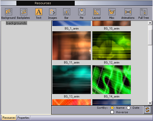
Resources
Note: The library path is set in Show Properties, and should be named LIBRARY.
The Resources pane contains all the scene elements available to Viz Trio, and is automatically displayed when opening the Designer. Scene elements are created in Viz Artist, and include the required control plug-ins.
Info: Scene elements are not standalone scenes, rather they are like building blocks that can be pieced together with other scene elements to create a standalone scene on the fly.
Scene elements are organized under a LIBRARY folder in Viz containing the following sub folders: BACKGROUNDS, BACKPLATES, TEXT, IMAGES, BARS, PIES, LAYOUT, MISC and ANIMATIONS. These folders become available when selecting the corresponding categories using the buttons in the Resources pane.
In addition to pre-defined scene elements, you can use ordinary Viz Artist scenes when creating new scenes in Designer if a group with a placeholder has been added to the scene. The Viz Artist folder tree is displayed when clicking the Full Tree button.
The storage location distinguishes scene elements from ordinary standalone scenes as the scenes must be stored in the designated LIBRARY sub-folders. This will ensure that they become available as scene elements in the Designer interface, see To create a new scene element for further details. The scene elements also contain control plug-ins that let you edit exposed properties and organize them in parent-child hierarchies.
IMPORTANT! Standalone scenes cannot be edited in the Designer. They can only be used as-is, and must be added to separate placeholders in the Scene tree. Standalone scenes cannot parent other scene elements.
-
Background: Shows the background scene elements available in BACKGROUNDS library folder. Select a background, and add it to the scene by dragging and dropping it into the root placeholder.
-
Backplate: Shows the backplate scene elements available in the BACKPLATES library folder. Select a backplate, and add it to the scene by dragging and dropping it into the root placeholder.
-
Text: Shows the fonts scene elements in the TEXT library folder. Adding text to a scene adds a text tab-field that is used by the operator for editing in the Page Editor. Font scene elements may have special effects such as alpha, mask, and shadow. Select a font scene element, and add it by by dragging and dropping it into the appropriate placeholder. This will automatically enable text editing in the tab-field.
-
Images: Shows the images available in the IMAGES library folder. As with the Text button, the Images button adds a tab-field for editing by an operator. Clicking Images opens the Images library where an image can be selected and added by dragging and dropping it into the appropriate placeholder.
-
Bar: Shows the bar scene objects available in the BARS library folder. Select a bar scene element, and add it to the scene by dragging and dropping it into the appropriate placeholder. To create a scene with several bars, a layout scene element should be created that can hold the individual bar scene elements.
-
Pie: Shows the pie scene objects available in the PIES library folder. Select a pie, and add it to the scene by dragging and dropping it into the appropriate placeholder.
-
Layout: Shows the layout scene elements available in the LAYOUT library folder. The folder contains design elements which allow for easy alignment of other scene elements, by organizing them in lines or rows, for example. The layout elements themselves usually do not contain any graphics, but should rather ideally function as placeholders in which other types of scene elements can be added. Select a layout, and add it to the scene by dragging and dropping it into the root placeholder.
-
Miscellaneous: Shows the scene elements available in the MISC library folder. Store things here that do not fit into other categories, such as 3D objects, bullets, and placeholders. Select a scene element, and add it to the scene tree by dragging and dropping it into the appropriate placeholder.
-
Animation: Shows animation scene elements in the ANIMATIONS library folder. Add an animation to the scene by dragging and dropping it into the placeholder that contains the scene element you wish to animate.
-
Full Tree: Shows a full Viz directory structure of all available scenes.
Scene Tree
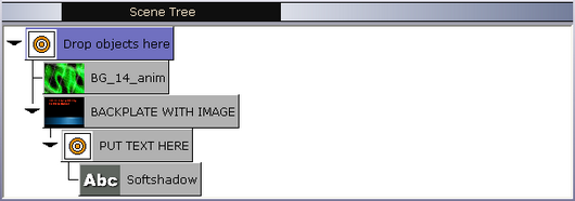
The scene tree shows all the graphical elements in a scene in a logical way. The tree consists of placeholders containing the different types of scene elements.
A standalone scene is built by selecting various scene elements from the Resources libraries and dragging them into the scene tree, where you can create a hierarchy between elements and groups of elements in logical divisions. This lets you assign new properties to more than one scene element in a single operation.
The black arrow to the left indicates that the placeholder contains sub-containers. If the arrow points to the right the sub-containers are not displayed. Click on the arrow to expand the sub-containers. The arrow will then point downwards.
Deleting an Item in the Scene Tree
-
Select the appropriate scene element and then press the DELETE key. Note that this also deletes sub-nodes.
Caution: You cannot undo a delete operation.
Tab Fields
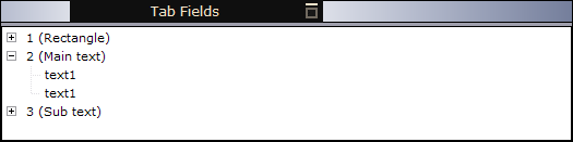
Scene elements can have one or more tab fields. When selecting a scene element in the Scene Tree, the associated tab fields are displayed in the tab fields pane in the lower left corner of the designer tool. The tab fields pane shows which Properties can be exposed for editing in Viz Trio. Click + to expand the list.
Page Editor
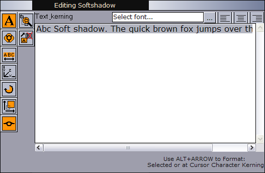
When selecting a tab-field from the Tab Fields pane, the corresponding page editor is displayed in the upper right corner of the Designer. Use the page editor to edit the selected tab field’s properties, such as changing material, position, rotation, text, etc. if they have been exposed for editing.
The type of page editor displayed varies according to the type of element selected, for example text or images. The buttons on the left represent the properties that can be exposed. To display an editor, click on the appropriate button or select the property in the Tab Fields pane.
Properties
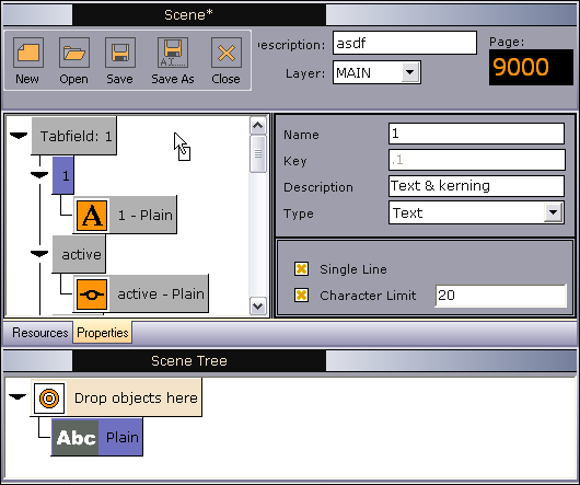
Select the Properties tab at the lower left. Here, you can define which Tab Fields to expose to editing in Viz Trio.
This section covers the following topics:
Property Tree
When creating a new scene, the properties pane is initially empty. Tab field properties are exposed for editing by adding them to the properties pane (top left).
There are two ways of Exposing Properties in Designer:
-
one by one in a tab-field, OR
-
exposing all properties in a single operation
Use the Properties pane to define tab field properties to expose for editing. The Tab Fields pane provides a list of properties that can be exposed for editing for each of the tab fields in a scene. Expose as many as needed for editing.
A designer can define properties to be exposed for editing when creating a scene element in Viz Artist. Exposed properties may vary from scene to scene.
Note: Additional properties must be exposed through Viz Artist.
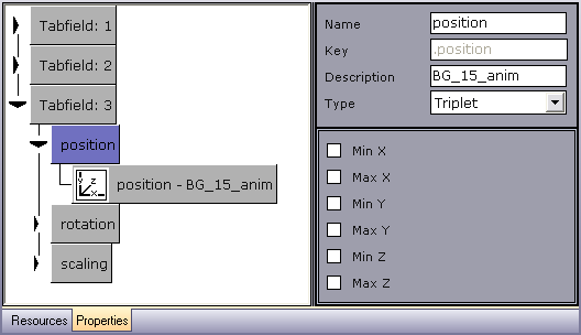
The nodes in the properties tree are named Tabfield: 1, Tabfield: 2, Tabfield: 3, etc. as they are added. The order of the tab fields can be rearranged by drag and drop.
Each tab field has sub-nodes representing the exposed properties (such as position and rotation). The sub-nodes have child nodes that represents the receiver of the exposed property’s data value, for example, the selected scene element. The child node typically displays a property name and a symbol, and the receiving scene element’s name (for example, background).
It's possible to expose several properties for one tab field by dragging the property icons into the same tab field container from the Page Editor.
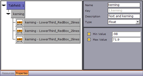
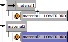
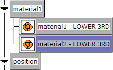
It's also possible to map two or more property receivers to one exposed property in order to control the value of several property receivers through a single exposed property. This is useful for changing a property such as kerning or material for several scene elements in a single operation, for example. This is shown in the example below, where the exposed property kerning controls the kerning value of the three attached property receivers LowerThird_RedBox_2lines.
Different types of property receivers such as an image and a text object can be mapped to the same exposed property, even when located in different tab fields. This lets you edit all the associated property receivers in one single operation.
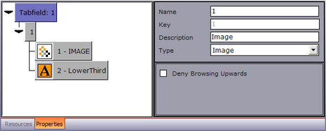
In the example below, the exposed property Image controls the content of the associated image and text property receivers. This means that when a new image is selected (see Search Media), the text related to the image will also be added.
Another example is when you are connected to a newsroom system and you change a text and an image in the same tab field by entering a text string rather than the whole path. This indicates that there is a folder of images (such as flags) and the Viz Trio system receives ‘US’ from the external system; it will then load the image with the path: ‘image location prefix + US’, provided that the image location prefix has been specified.
Property Description Editor
The Property Description editor is in the upper right corner of the Properties pane. The fields become available for editing when selecting a property in the Property Tree. All fields are editable, apart from the Key field:
-
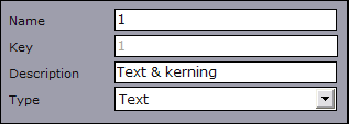
Name: Name of the selected tab field property.
-
Key: The key identifier of the property.
-
Description: Description of the selected tab field.
-
Type: The data input type defined for the selected property. This value determines which Page Editor will be displayed.
Property Type Editor
The Property Type editor is linked to the value selected in the Type field in the Property Description Editor. When selecting a value in the Type field, the fields in the Property Type editor are also updated so that values for the associated parameters can be specified.
Text
Set text parameters:
-
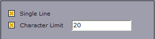
Single Line: Disables text wrapping, displaying the text as a single line.
-
Character Limit: Sets a maximum number of characters for the text tab field.
Float
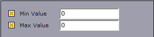
Specify a minimum (Min Value) and a maximum (Max Value) value for the selected property. Select a check boxes to display its input field.
Deny browsing
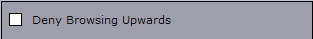
Block the user from browsing for images, geometries, and materials in folders other than the selected folder and its sub-folders.
Duplet
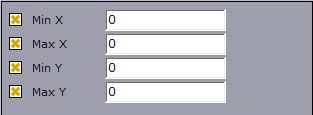
Specify minimum and maximum values for the X and Y axes of the selected property. Select a check boxes to display its input field.
Triplet
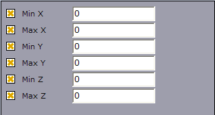
Specify minimum and a maximum value for the X, Y and Z axes of the selected property. Select a check boxes to display its input field.
Exposing Properties
-
In the Page Editor, select the icon or design element representing the property to expose for editing, and drag and drop it into the Property Tree, OR
-
Drag and drop a container from the Scene Tree onto the Property Tree to generate a complete list of exposed properties.
Mapping Multiple Property Receivers to One Exposed Property
-
Drag and drop the property receiver into the exposed property that is to control both properties.
Removing Properties
Select a property and press the Delete key on your keyboard. Note that this will also delete sub-nodes.
See Also
-
Viz Artist User Guide on transition logic.