
Viz Artist User Guide
Version 5.0 | Published December 20, 2022 ©
Designing for Adaptive Storytelling
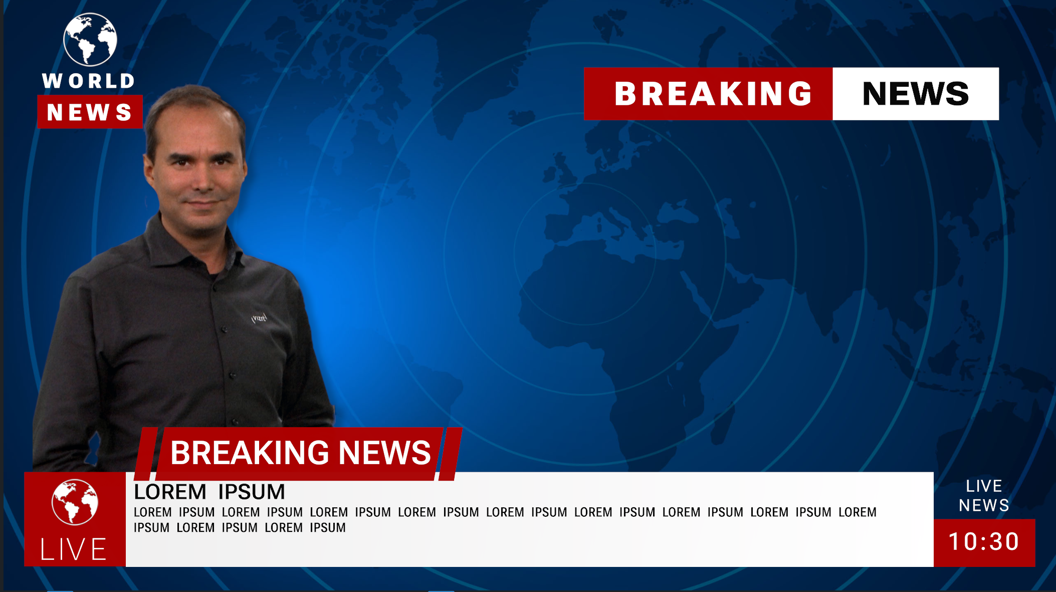
The following tutorials outlines how to start building a typical information graphic and adapt it for multiple output formats.
Planning Phase
Creating scenes for adaptive storytelling requires some planning phase(s). As every format has a different layout, it needs to be decided which elements are needed in which format. Some format like a portrait mode for smartphones might not necessarily have all elements visible. In addition, font sizes might need to be different between different formats. While a regular broadcast resolution works well with smaller and thin fonts, a mobile format might requires more bold fonts. The viewers distance to the device also plays an important role to be able to recognize all screen elements.
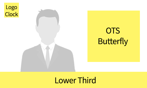
Traditional broadcast layouts offers lower thirds, butterflies and over-the-shoulder elements. The content (for example, an anchor) is placed in a golden shot alignment.
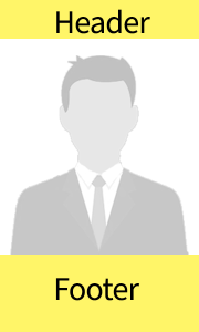
Mobile layouts use a complete different layout. Graphic elements are placed either as headers and/or footers and the main content is located in the middle of your screen.
A table layout might be completely different than a portrait smartphone layout. Notice that Safe or Title areas are not really existent on Mobile Phones, but notches for cameras may need to be respected.
Typography
The viewing distance between traditional broadcast graphics like TV screens is much larger (two meters for a 55" screen) than other devices like smart phones or tablets. A TV screen is usually located a few meters away from the viewer, whereas a smartphone or tablet are very close.
Thin fonts like a Helvetica Neue work better on smartphones/tablets. On a TV screen these fonts may not be used as the viewers distances and eventually the interpolation of the TV screen would make such thin lines unreadable.
Layout
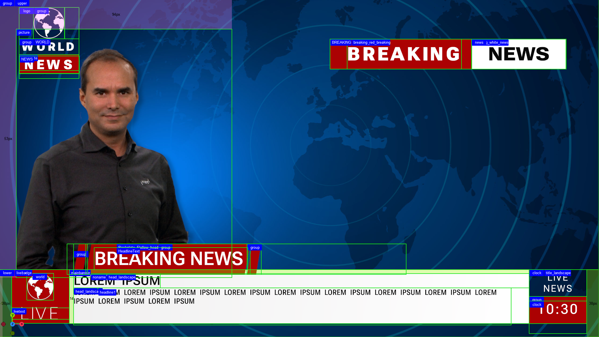
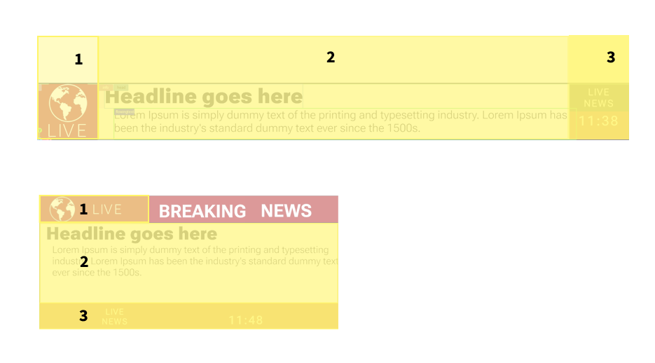
Creating scenes for Adaptive Storytelling requires a new way on how to place your containers. Elements are now positioned relative in space and in relation to other objects. Therefore, the arrangement needs to be split into different boxes. Given the following layout, the layout can be split into the following boxes:
Tutorial
Step 1: Creating the Fundamental Layout
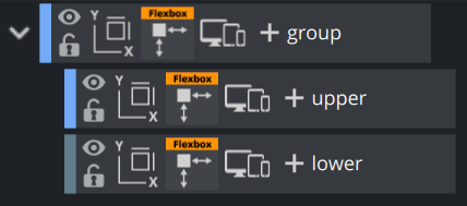
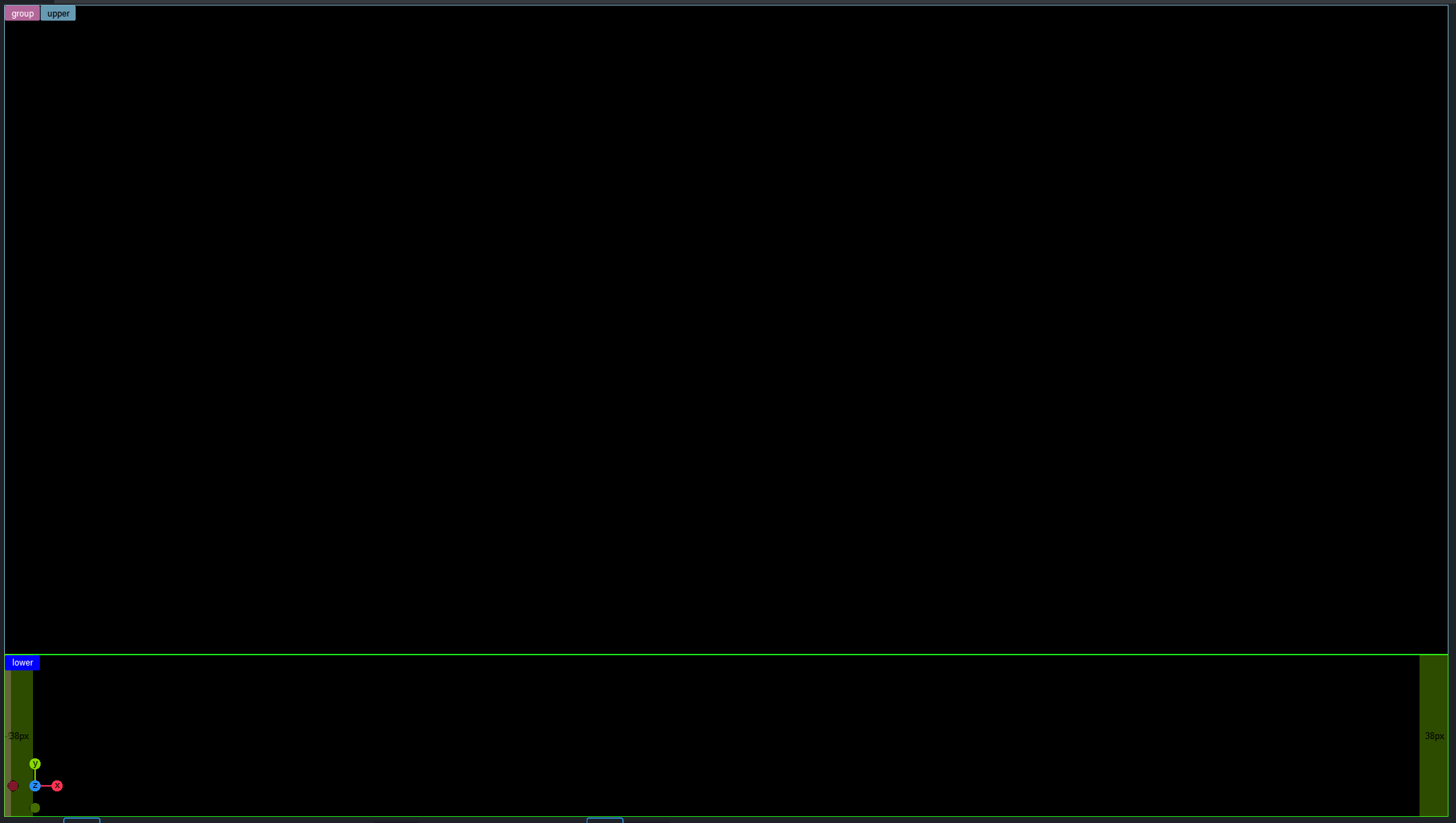
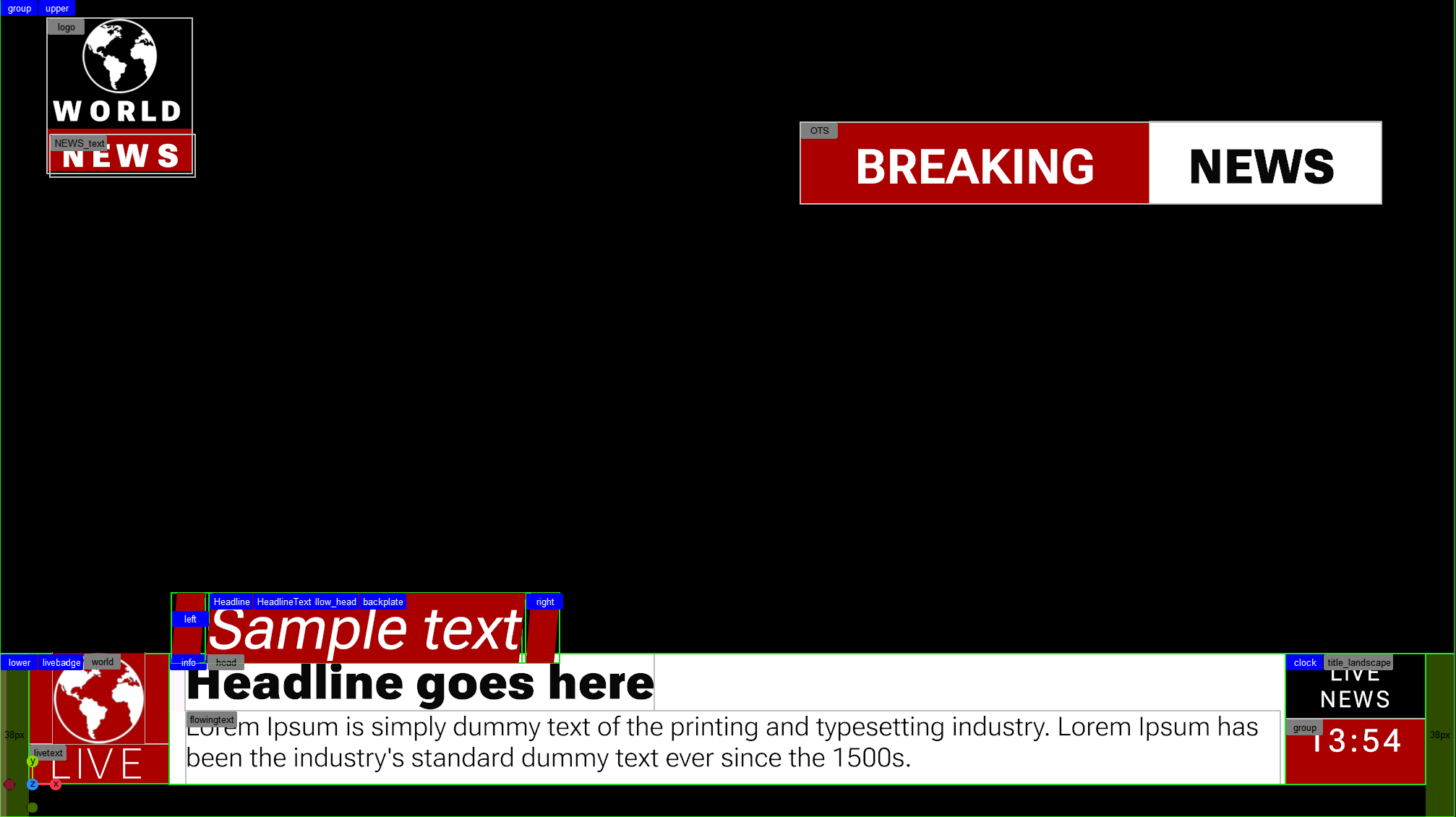
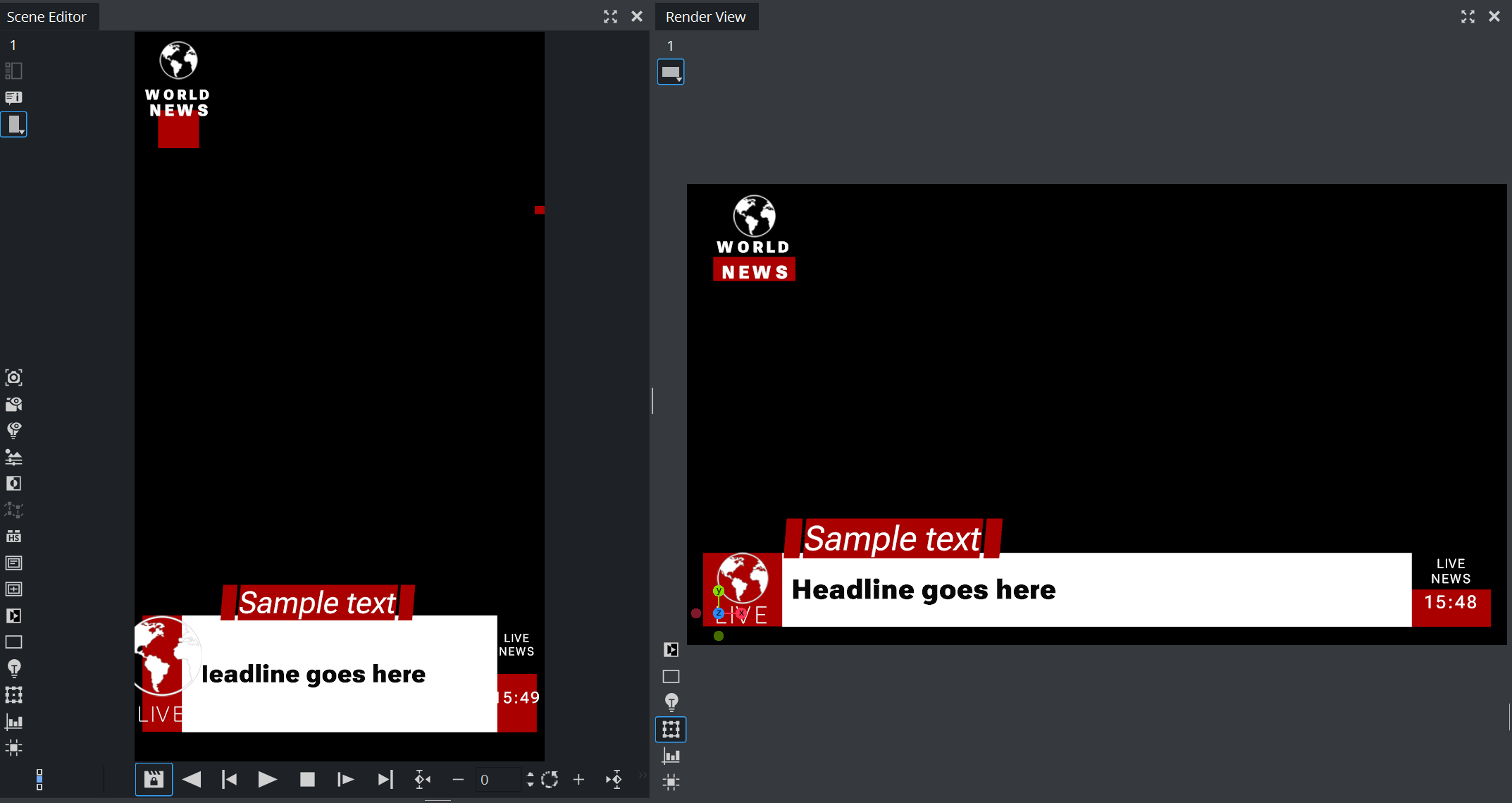
Lets start by building the basic layout for our design. The design starts with a layout of two boxes located underneath the main box:
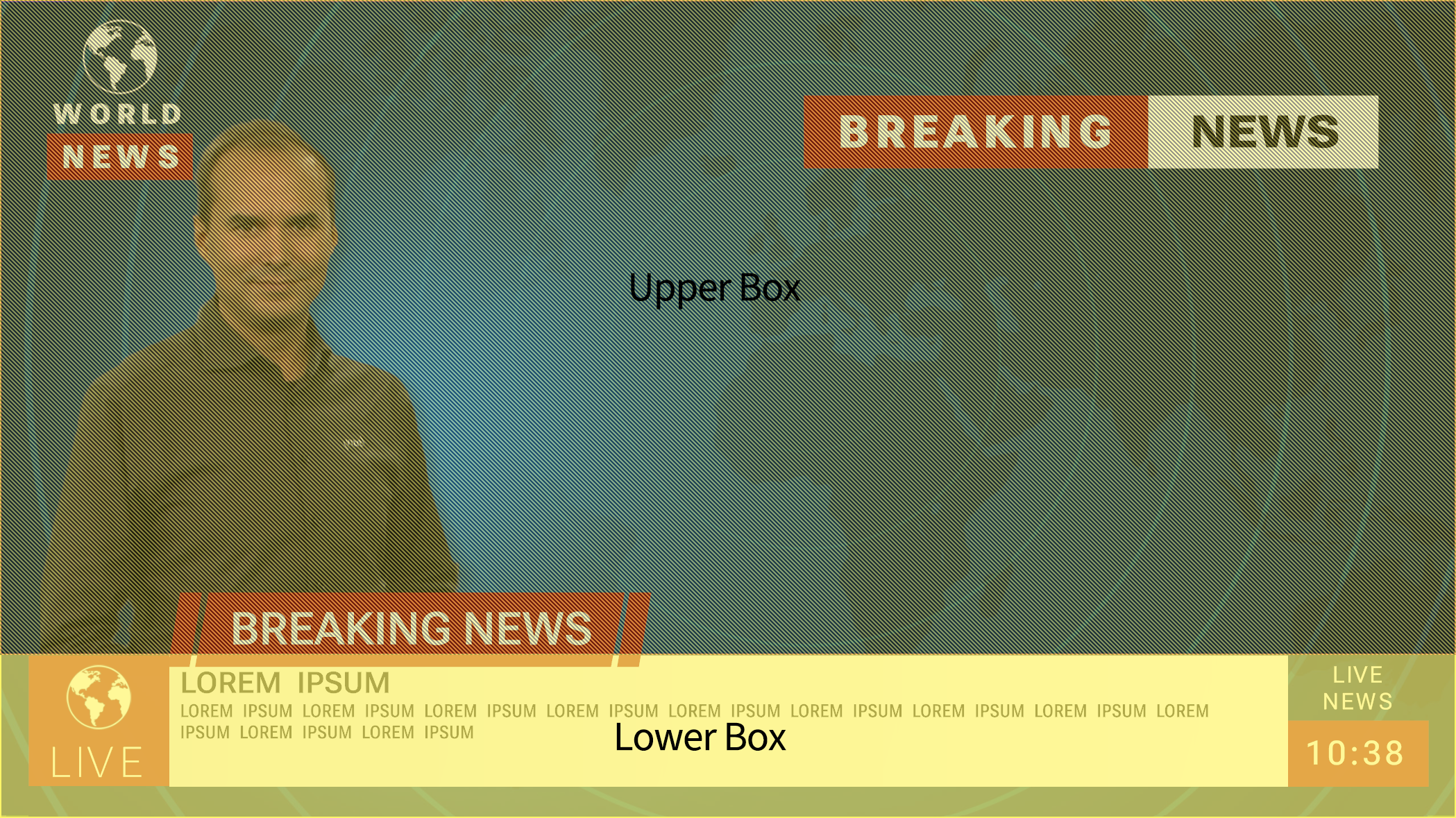
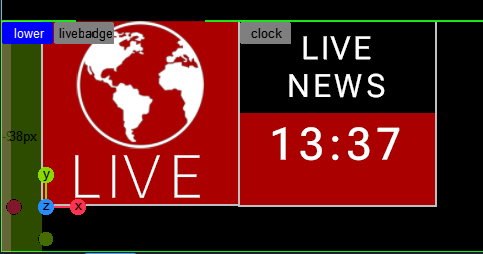
Create the main container and two Subcontainer representing the Upper and the Lower part. In our default format (16:9 HD resolution), the lower takes 20% of the whole height. The top container (group) has a width and height of 100% to fill the whole screen and the Flex direction is set to be column. This aligns the upper on top of the lower. The lower container is set to height of 20%, and Grow and Shrink set to 0. This ensures that the lower always has a fixed size of 20% of the whole screen. It also has a padding on left and right set to 2%. The upper container gets a height to 100% (or auto) and Shrink set to 1. This allows to shrink to the remaining space of 80% in height.
Your layout should now look like this.
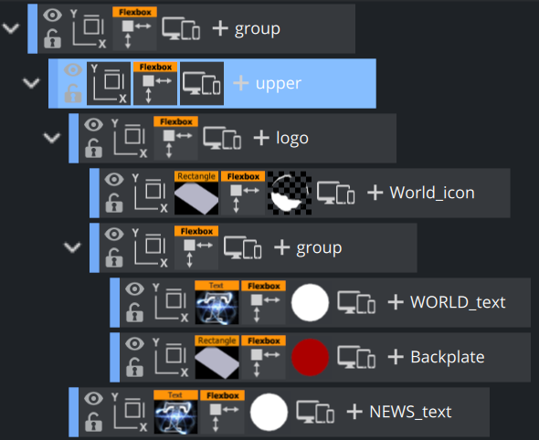
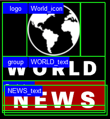
Step 2: Creating the Logo
The logo has the same layout as in the previous step. A basic container holding two subcontainer, layouted as columns to make sure the are positioned from top to bottom. The alignment (Align Items) is set to be Center, the position is done on a absolute base, the width is set to 10% of the whole screen, height is 20%. The second container holds two subcontainers, one is the container for World, the other one is the red backplate. The news container is placed outside the structure, but tracked to the backplate container.
The World_icon container has a width and height of 50%. As the parent box has its items aligned on center. It is placed in the middle of the parent box. Grow is set to 0, this makes sure it does not get bigger, but Shrink is set to 1.0 to allow it to be smaller in other formats that will be added later on. The world Icon itself is a rectangle with a unlit Phong material on it with the world as a texture.
The second container also has a height of 50%, it holds 2 subcontainers WORLD_text and Backplate, aligned also as columns. WORLD_text represents the WORLD" term of our logo. It has a height of 50%, (effectively 25% of the whole logo), no shrink, no grow. There is a Text on it with a variable fontstyle, fontsize is set to 37.0 to fit into the height of the box.
Underneath the WORLD_text container is the red Backplate container. Settings are exactly the same, but it has a red rectangle assigned to it.
As the News part of our logo is located at the same position as the backplate in our design, therefore we create a new font container outside and underneath of our logo structure. In theory, it could also be within the structure, but it destroys the current design we have. It is important that it is located underneath, otherwise the backplate is rendered after the text.
Put a Text "NEWS" onto the "News_text" container. In the Flexbox container, we set the Tracking to the Backplate . This makes sure the position is exactly on the backplate. Adjust the position by settings the Offsets correctly
As the whole logo container is set to be on Absolute Position, we can position it by modifying the offsets according to our design. Your layout should now look like this.
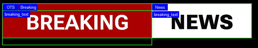
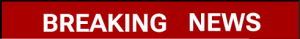
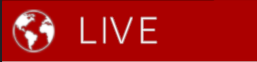
Step 3: Creating the Breaking News OTS
The Over the Shoulder element contains of an additional box, split into two rows. The first one shows a red backplate and the text BREAKING, the second one a white backplate and the text NEWS. As these words are not intended to be changed afterwards, the dimension of the container must not be dynamic. This box is also positioned in absolute mode.
-
Create a new container named OTS with the Flexbox plug-in.
-
Width = 40%, Height = 10%.
-
Set the offsets to be 15% from the top, and 5% from the right side.
This container holds two subcontainers: The first one with a width of 60%, second one with 40%. Add rectangles and a red and a white Phong material.
The two text containers BREAKING and NEWS are subcontainers of these containers as their position is already given. The Text is centered and a white and a black material is needed here. It might be required to add some offset of about 20% to have the text also centered vertically.
Tip: If the texts are not showing up correctly, try to increase the z-value in the Box Transformation Editor to make sure it is placed in front of the backplate rectangles.
This leads to a layout like this:
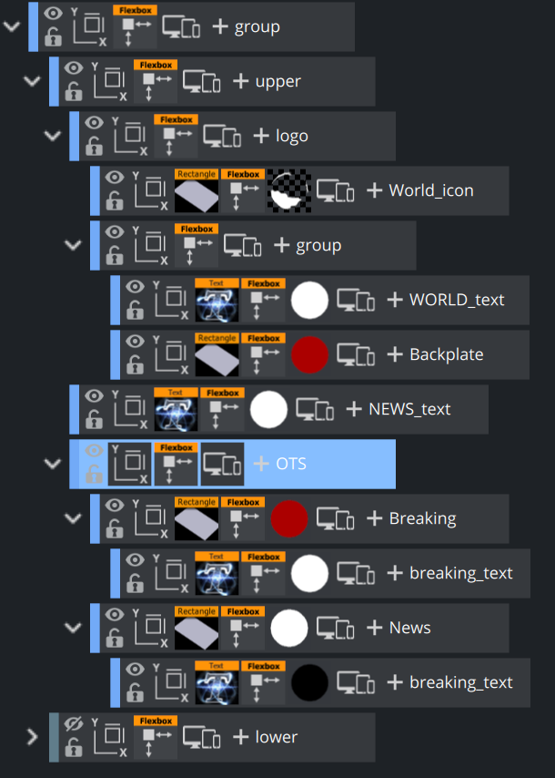
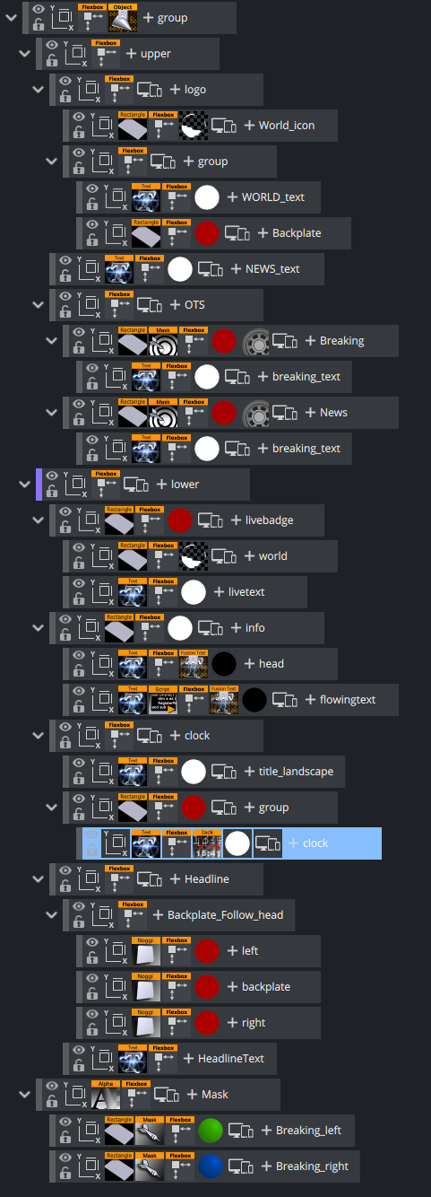
And the Scene Tree:
Step 4: Creating the Banner Part
Lets continue with the more complex lower third banner. This element can be split into three sections. A live badge on the left side, a centered part that shows a headline and some more information text and on the right side, we will have again a tile part and a live clock.

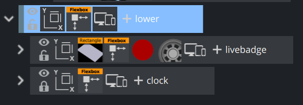
Using our previously added lower container, we need to add three subcontainers and the lower container needs to have a Flex Direction of Row.
-
Container 1 (the world and live) occupy 10% of the whole width and 100% of the height. Set it to not shrink and not grow. This ensures this part is always 10%. It is named livebadge.
-
Container 2 represents the middle area. It takes 80% of the width and 100% of the height. Set the grow and shrink to 1, so the width of this part and be flexible. It is named mainbanner.
-
Container 3 shows the name of the show and a clock. It is built in the same way as container 1. Width of 10%, no shrink, no grow. It is named clock.
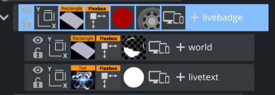
The Live Badge
Let's have a look at livebadge. Its structure is almost the same as in our previous section Creating the Logo.
The container first gets a rectangle as backplate with our red material assigned to it. The Align Items setting should be Center. Underneath, two more containers are placed and aligned in Flex Direction Column. The bottom container holding the LIVE text has a fixed height, which is set at 20%. The World container is flexible in height, set it to Grow and Shrink to 0 and adjust the dimension by setting a height (for example, 50%).
This should result in a tree structure as this:
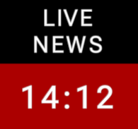
The Clock
Lets continue on the right part, the title and a clock. Create a new container named clock as next container within the lower container. Its width is set to 10%, no shrink, no grow. The structure is like in the previous step. The container is divided into two rows, both of them a height of 50%. The first container called title holds text LIVE NEWS as two center aligned lines. The height of the container is fixed to 50%.
The next and final container of this part of the graphic has also a fixed height of 50% and width of 100%, it holds a red rectangle as backplate. Create a subcontainer for the final clock. Give it a fixed width of 100%, place Text inside, and align it to the center. The clock is done by adding a JaCK plug-in (any similar clock plug-in might work too). Adjust the font size to match your design. It might be required to center your clock vertically by giving an offset to it.
Don't be worried if your clock is stuck to the first container:
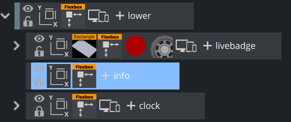
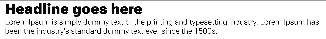
The Information Part
The information container goes in between the live and the clock container:
If the width of the info container is changed in the flexbox plug-in, the clock container automatically aligns to the right side.
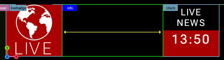
Set Grow to 1 and the container automatically scales up to the available width. Add a white rectangle as backplate. Width should be set to auto, the Height to about 80%. The content is the info container is (as previously) split into to headline container and an additional text container, therefore the Alignment of children must be Column.
Create two subcontainers, name them head and flowingtext. They should already be stacked top-bottom inside the info container. Both containers should be set to grow/shrink on 1. The head container gets a text on it, with a black Phong material. Enter some sample text and adjust the size correctly. Turn off the Geometry-aware scaling in the Box Transformation properties and then set the Bounding Box mode of the Text to Typographic.
In the flexbox properties of the head container, set Grow and Shrink to 0, Width and Height to Auto. In addition, set all margins (expect left) to Auto. The left margin now controls the distance/offset of our headline text to the left Live Badge. You'll notice that the textbox now grows and shrinks correctly according to the amount of text being entered. If we would have kept the geometry aware scaling, the text can be sized down if it gets too large.
Put a ControlText plug-in on it, so it can be controlled from the outside.
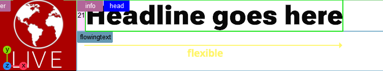
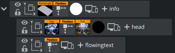
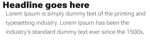
The flowing text part is built in the same way, except that we change the behavior of the box. Here, our box stays at a fixed width, to make sure the text breaks into the next line if it gets longer:

Make sure the wrapping is correctly set in the Text properties, otherwise the text does not wrap into the second line.
Expert Tip: It would be nice if the Head is automatically centered if there is no flowing text set. If the info container is set to align in center, our headline is placed in the center. However this does not work as long as our flowingtext container is still being calculated by the flexbox container on the info container. We have to disable the flexbox plug-in if there is no text set. As this functionality is not yet implemented we need to do a little trick using a script.
What this script does, is that it registers for a callback whenever the text is being changed. the flexbox function is turned off, if the text is empty, otherwise it is turned on. So now we are able to show a centered Headline, if there is no text or we show the regular headline plus flowing text:

Headline only and automatically centered

Headline and Flowing Text combined.
Adding the Top Header
The last and final part of our graphics is a bit more advanced, it combines the functionality of a TextBG (align the Background to the Text) plug-in as well as a Autofollow functionality. The graphics should automatically align to a certain text length and be decorated let and right.
Examples:

Our structure consists of two parts, the backplates with our red Noggi geometries (split into three subcontainers) and the reference text.
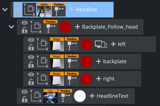
Create Headline container underneath lower. The position is set to absolute, so it does not influence our layout and we can position it wherever needed.
Create a "head" container and name it Backplate_Follow_head. Create a Textcontainer named HeadlineText.
The Textcontainer gets a Text on it, the Geometry aware Scaling in the Box Transformation needs to be turned off, as we want the size of the box to grow and shrink according to the width of our text. The Bounding Box needs to be set to Typographic. The Flexbox container needs to be set to Grow and Shrink enabled (=1), Width and Height should be auto.
It is important to make changes to the Headline container too. The width and height need to be set to auto, otherwise a fixed value (like a certain amount of pixels or percentage) forces our text container to scale up or down again.
This should already allow the box to react to the size of the text. The next step is to bind the Backplate_Follow_head container to the size of our text. Drag the HeadlineText container as Tracking Container target in the Flexbox plugin of container Backplate_Follow_head. Create the three subcontainers left, backplate and right. Add a Noggi and add our red material to it. As left and right stay at their sizes, they need to have Grow and Shrink turned off (=0). The width is a fixed value in pixels like 45px. The middle container backplate shrinks and grows (=1).
Now it looks like this:
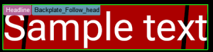
Add -50px Offset on left and right side to the Backplate_Follow_head. The Headline container is in absolute position mode, place it on top of our lower third banner. It might be required to increase the Z-Offset a bit.
This completes our design:
The Final Scene Tree
Step 5: Animating the Over The Shoulder
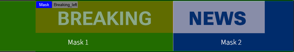
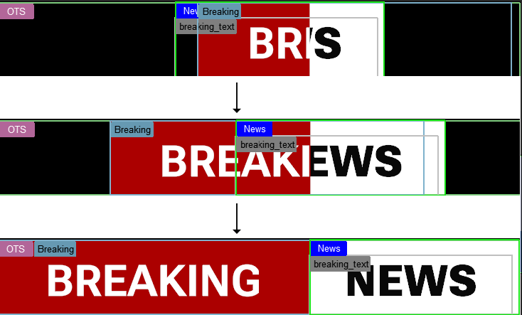
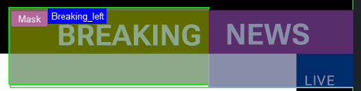
We'll create a simple animation as an example in our tutorial. Animation is limited compared to the traditional three dimensional transformation mode as we are working in two dimensional space only. For example, there is no rotation around the x axis. In our tutorial, we animate the Breaking News OTS by using two masks and let the two boxes fly in from the center:
In our example, we create a set of container to act as masks. This container uses our OTS as tracking container, therefore the masks do not require and re-positioning in other formats. Create a new Mask container, with two sub containers. One masks out the Breaking part, the second one masks the News part.
As the mask is on the same position of the OTS container, we can adjust our two masks by in/decreasing the Width and the Offset on the Left or Right side. Add a Mask Source 1 on the left (=green) and a Mask Source 2 and the right (=blue) container.
To illustrate it, we've put a green and blue color on the containers and added some alpha on it:
Tree:
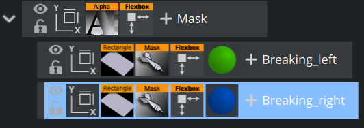
Now we need to put the Mask Target plug-ins on the OTS sub containers, but in opposite order. Our Breaking container needs to be masked by Mask 2, the News container is affected by Mask 1.
To build our unveil animation, we put the Breaking into the Mask 2 area and the News container into the Mask 1 area. Do this by by modifying the Offset values of both containers, in this case it would be better to use absolute pixel values instead of a percentage value.
-
Breaking: Offset left = 460px -> 0px
-
News: Offset right = 310px -> 0px
The values above are sample values only. Now we can animate those values to go from the start offset back to 0 px. Our unveil animation should finally look like this:
Animating the other parts of our sample works accordingly. This is not part of this tutorial.
Information: There is no need to target link the masks to the source containers, they can also be positioned in absolute mode or even without flexbox control. There are no limitations how to place them.
Step 6: Adding a Portrait Mode
As our design is now done and animated for a typical 16:9 layout, we are now going to add a portrait format (for example, to create a layout for smartphones). We are going to adapt our 16:9 broadcast layout into a portrait format suitable for mobile phones:
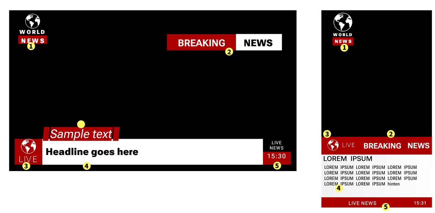
Most of the parts from our original design are also present in the portrait mode:
The Logo (1) is more or less the same, the typography is a bit smaller, the logo appears bigger. The Breaking News (2) becomes part of our Footer graphics block, the news part gets a red background instead of white. The Live Badge (3) becomes part of the Footer graphics block too. The information text (4) gets a smaller headline font, the infotext has more lines to fit in its information. Finally the Clock and Title (5) goes into the last part of the footer graphics.
The additional headline (6) only appears in the broadcast version, not in the mobile version.
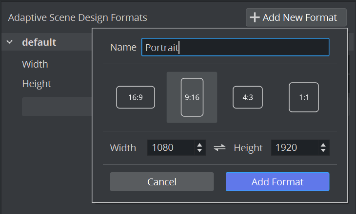
We start by adding a new format in the scene settings. Go to Scene Settings Adaptive Scene Design Formats and create a new Portrait format in 9:16 aspect ratio:
This adds a new entry in the format switcher.
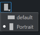
Switch your format to Portrait. This is important as all our changes are then applied to the Portrait, the default is kept untouched.
Add a Render Preview:
It is now a good idea to add a new Render view from within the Workspace Menu. This is set to our Default format. This view is used to monitor our changes and make sure that the original design stays as it should.
Our new Portrait format looks already a bit how it should, however there are a few things that we need to adjust:
Adjusting the Logo for Portrait mode
The logo needs to be adjusted in width and height. Click on the logo container and change the Width from 10 to 20%, the Height from 20% to 10% on the Flexbox instance. Less height, more width. Please notice, that while you change the values in the portrait mode, the default mode should stay untouched. The Width and Height values now are underlined. Right click on the Width or Height entry of your Flexbox plug-in:
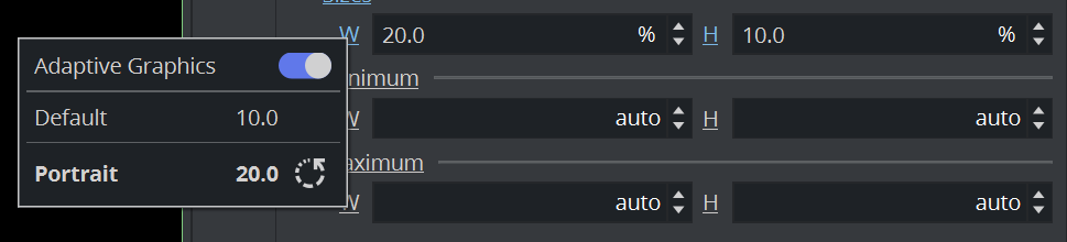
The information window illustrates, that the default width value is 10, but in portrait it is set to be 20.
Change the width of the World_icon to get bigger (100%). The NEWS_text container can be adjusted by simply modifying the Left and Top Offsets. You can use pixel values or %.
This should make our Logo already look correct in portrait and in default format.
|
Default |
Portrait |
|
|
|


Hide the Headline
The additional headline (6) is invisible in portrait mode. As it is anyways positioned in absolute mode, it does not influence our layout if it is not present anymore, therefore click on the Hide icon. 
Note: The Default view it is still visible, but hidden in Portrait mode.
Adjusting the Breaking News for Portrait mode
The Breaking News OTS is transformed the most between Default and Portrait. It changes its position, background color and color of our text. Lets start by adjusting the position. First, make the masks invisible. This makes it easier to adjust the position.
The OTS container is in absolute position mode, therefore adjust the position offset. Set the top back to auto, but the bottom gets a value of 20%. This moves the original Over the Shoulder container as a headline into our footer. The width can be increased to be 80%, the border on the right to 0%. This aligns it to the right. The height can be set to 5%. Adjust the container to match your design by either giving more offsets or shifting using padding on the box or the text underneath.
Next, give the white background of the News part a red color, the text (News) itself should have a white material.
Note: Do not copy the materials, this also changes the original design. Click on the material itself and change the Color part only.
If you want to animate this part also in portrait mode, you have to make sure, your masks are on the correct place too. As animations are also format dependent, you need to recreate the unveil animation for portrait again. This is needed as the position values have changed in this format.
This should now make our original OTS graphic like this:
|
Default |
Portrait |
|
|
|

Finalizing the Header by Adjusting the Badge Part
We need to complete our Header in portrait mode by moving the Live badge to the top. In the Original design, the lower container is arranged as as rows, in portrait it would be better to change this to be columns:
Therefore Part 1 becomes part of the Header and changes its layout to a row, Part 2 mainly keeps its layout and Part 3 goes from top-bottom to left-right layout in a row and finalizes our footer part.
Change the Flex Direction of the lower container to Column. This arranges the livebadge on top, the info next and finally the clock container top to bottom. Remove the paddings of the lower, they are not needed in Portrait mode. The next step is to adjust the live badge: The Flex Direction should also be changed to Row to arrange the world next to the LIVE text. Adjust the width of livebadge to fill the remaining space in our header. The Height should match the Height of our previous Breaking News part.
The world icon needs to be scaled to match into our header. Make sure that Grow/Shrink is turned off, otherwise it scales down. Maybe some Offset on the left side is needed.
The information text is the next step. By default, we have a lot of width to fill the text, in portrait this is limited, therefore we would need to decrease the font size and use more than two lines of text. Change the width of the info to be 100%, so we can use the area. The height can also be extended, leave some space for the final footer part. The layout of our two text container should already match, our info text might need some more line height as we are using more lines now. In the Text editor, adjust the line height, for example + 0.4em.
Let's finish the Portrait design by switching the layout of our clock container also to be row. Increase the Width to be 100% and adjust the bottom offset. The red backplate of the clock needs to fill up the footer space. As the title_landscape ("="Live") is influencing our width, change the position mode from to relative to absolute.
The text in portrait will not be two lines, change it to be only one line (note that the text has not changed in our default layout). Finally, align the clock container by adjusting the offsets on Left and Top.
|
Default |
Portrait |
|
|
|
|
|
|
|
|
|


Now we have finished our tutorial. We've created a flexible layout with animations. It can be played out in classic 16:9 aspect ratio and also looks great in portrait mode. This tutorial highlights some of the use cases on how to create scenes for adaptive playout. There might be smart ways to achieve different looks, but it least it gives an introduction into adaptive scene design.