Viz Artist User Guide
Version 5.0 | Published December 20, 2022 ©
Flexbox in Detail
This chapter explains all settings of the Flexbox plugin in detail.
The flexbox plugin takes advantage of the Box Transformation and allows to build graphics for adaptive storytelling. It is based on the flex implementation of CSS and web development. Therefore you can find a lot of documentation, tips and tricks online.
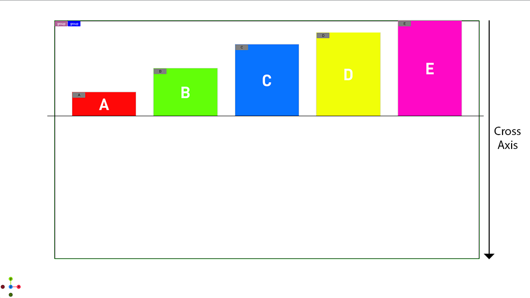
Layout in Flexbox uses two axes, the main axis and the cross axis. The alignment of any child items along those two axes depends on the available height and width.
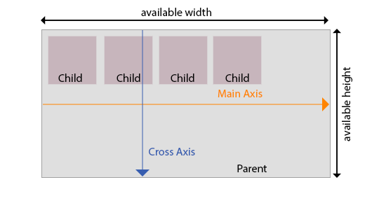
The Main Axis is defined by the direction property. If the direction is set to row, the Main Axis is horizontal. If set to column, the Main Axis is vertical.
Justification defines how items are aligned along the Main axis. Alignment defines how items are aligned along the Cross axis.
Flex Wrap
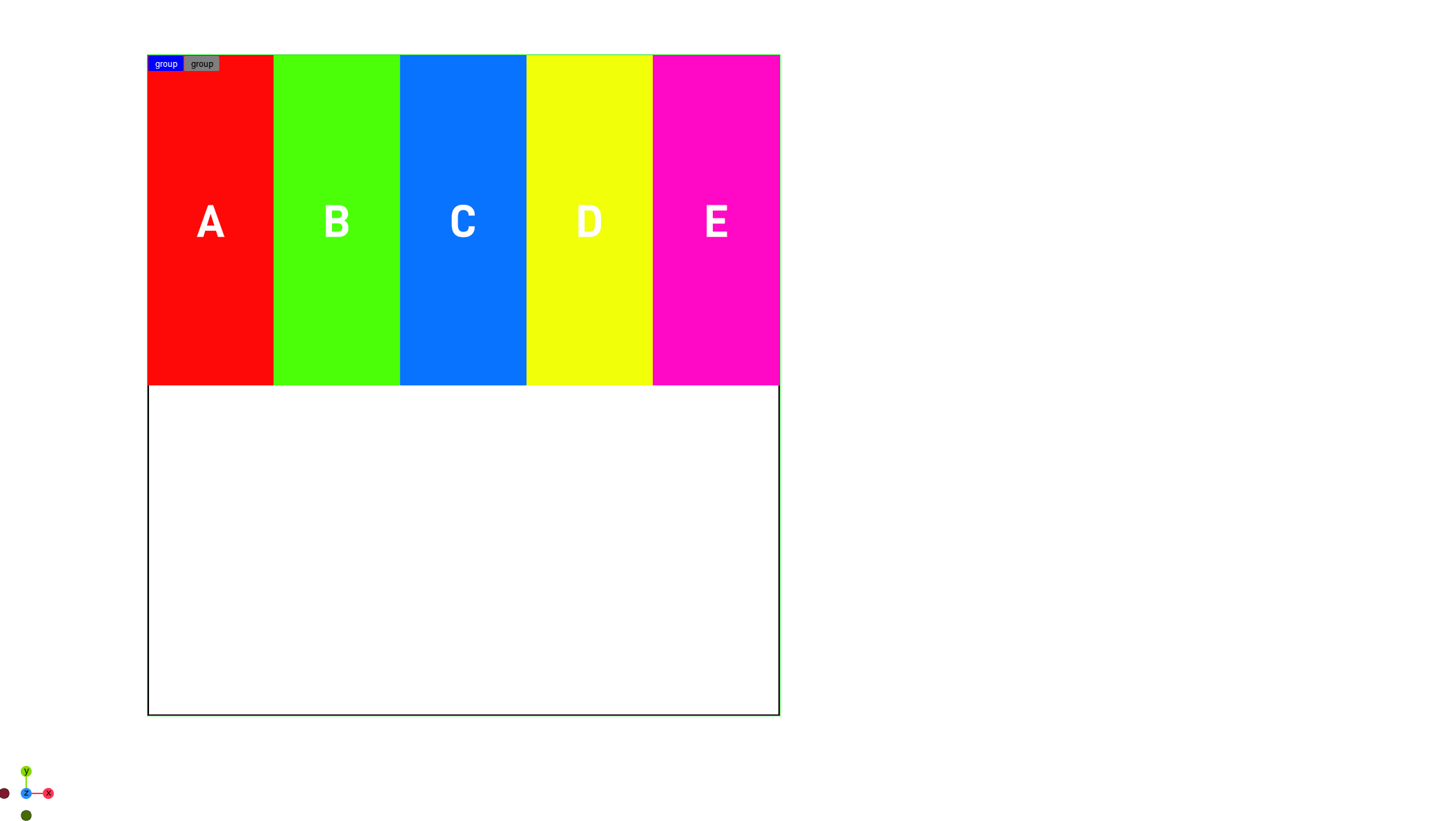
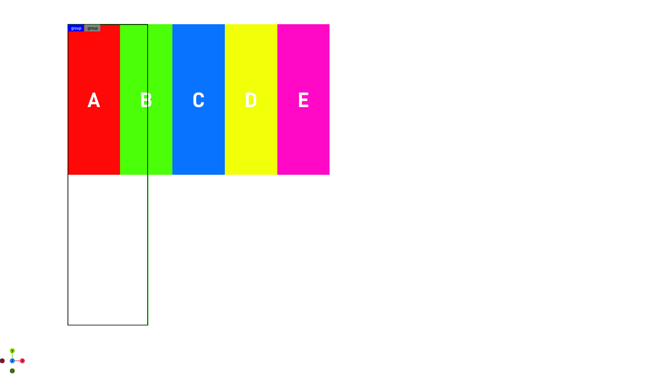
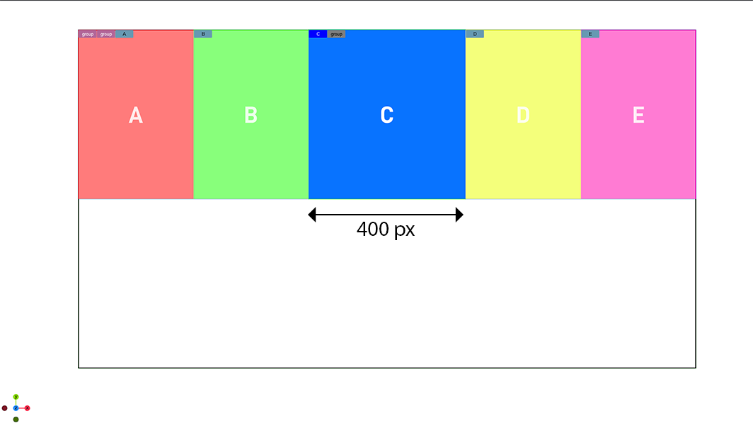
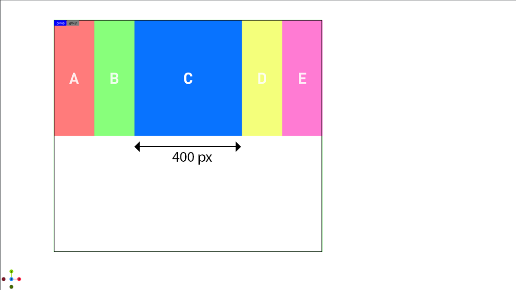
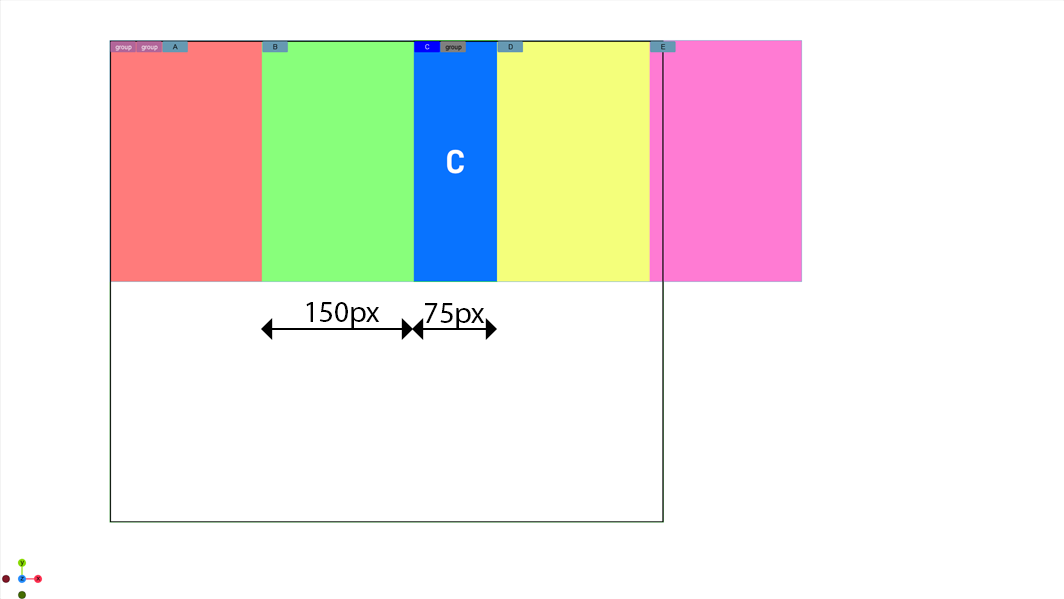
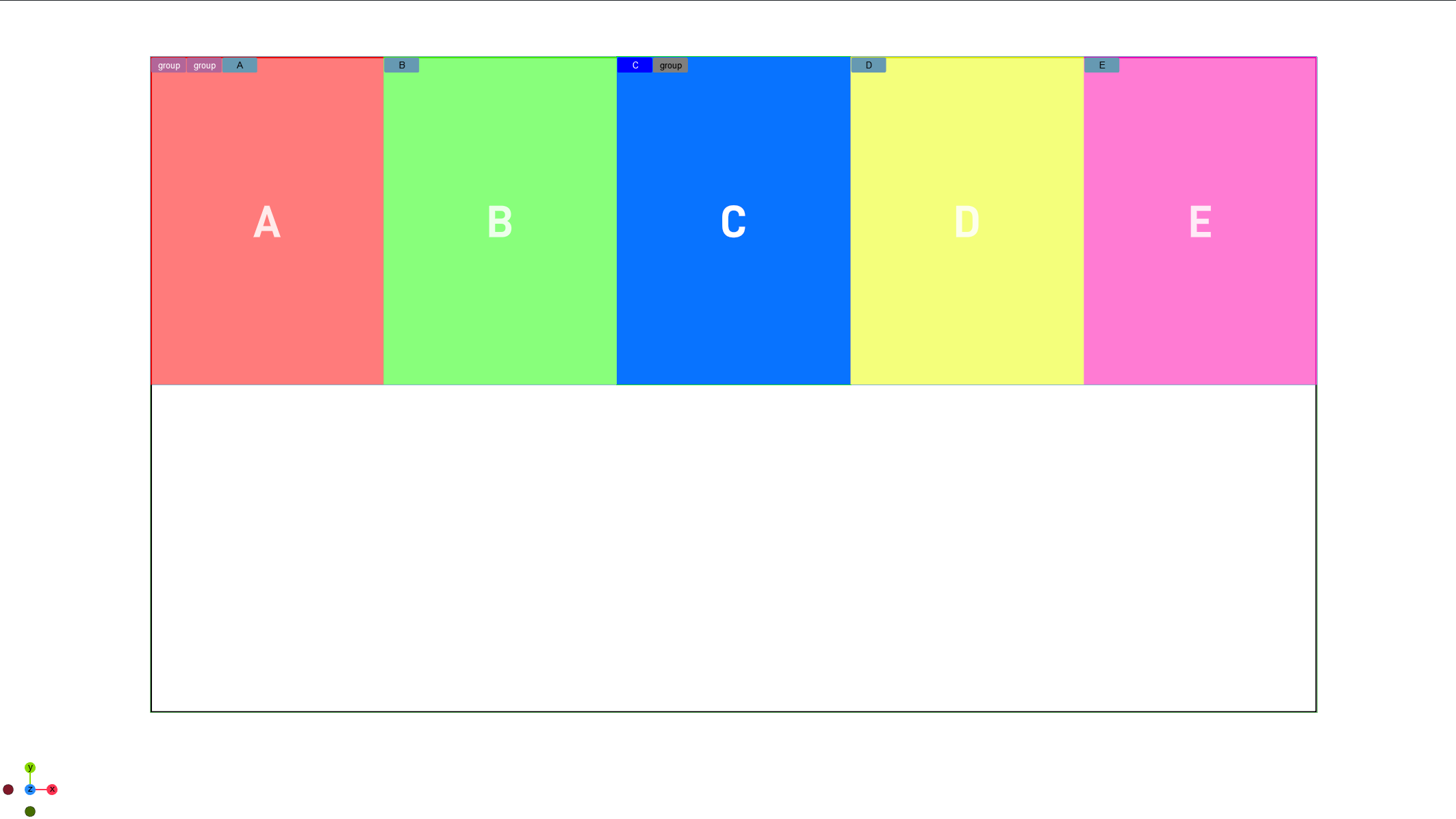
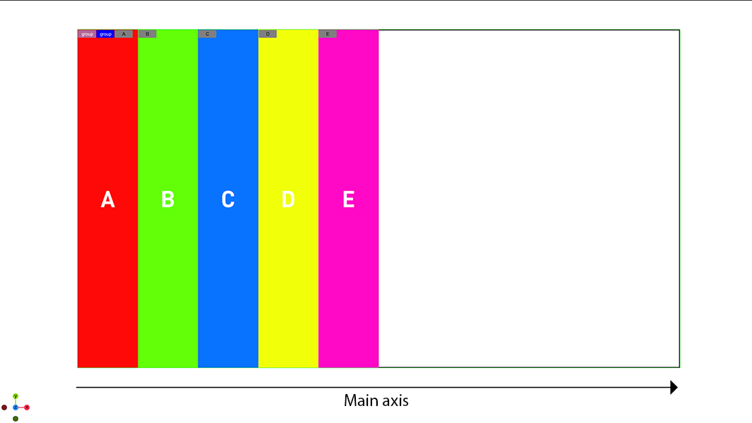
By default children are scaled down to fit into a box. By changing the wrapping mode, children are automatically aligned based on the setting. The following examples use boxes A-E are 300px in width and a minimum width of 150px, but they can grow and shrink.
No Wrap
If no wrapping is used, the boxes are scaled down until they reach their minimum width (140 pixels).
|
Parent 100% |
|
|
|
Parent 50% |
|
|
|
Parent 20% |
|
|
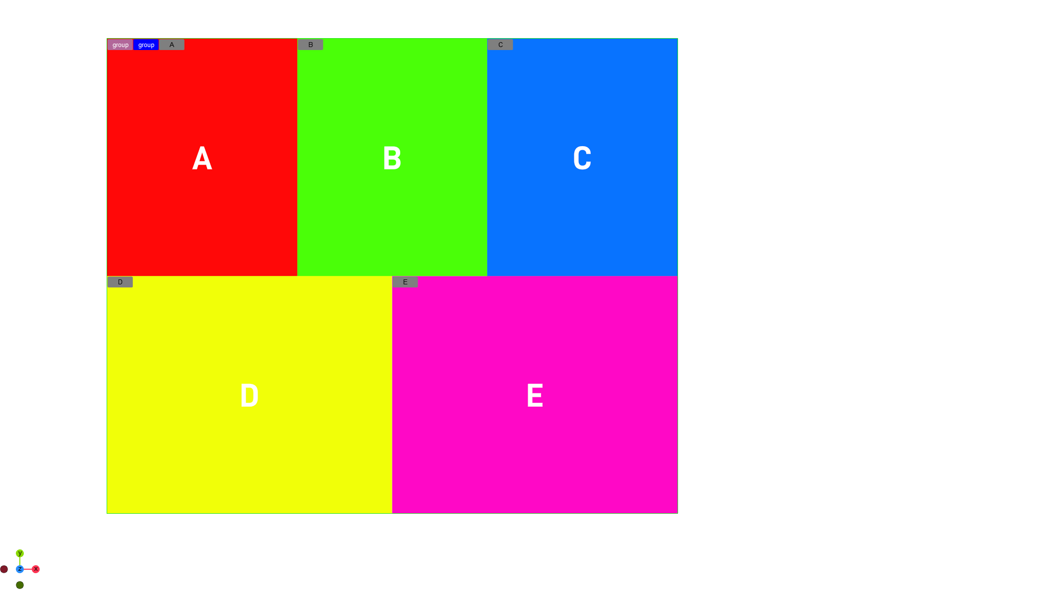
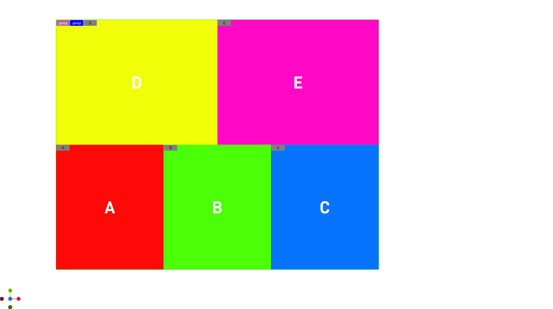
Wrap and Wrap Reverse
If wrapping is turned on, the boxes are scaled down until they reach their minimum size and are then wrapped to fill the space.
|
Wrapping enabled |
|
|
|
Wrapping Reverse enabled |
|
|
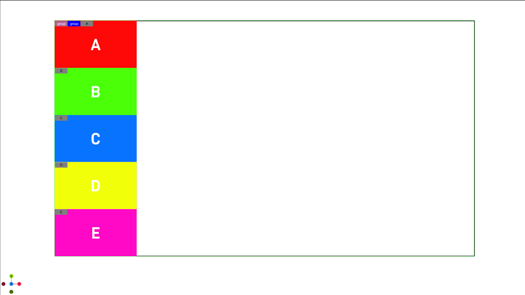
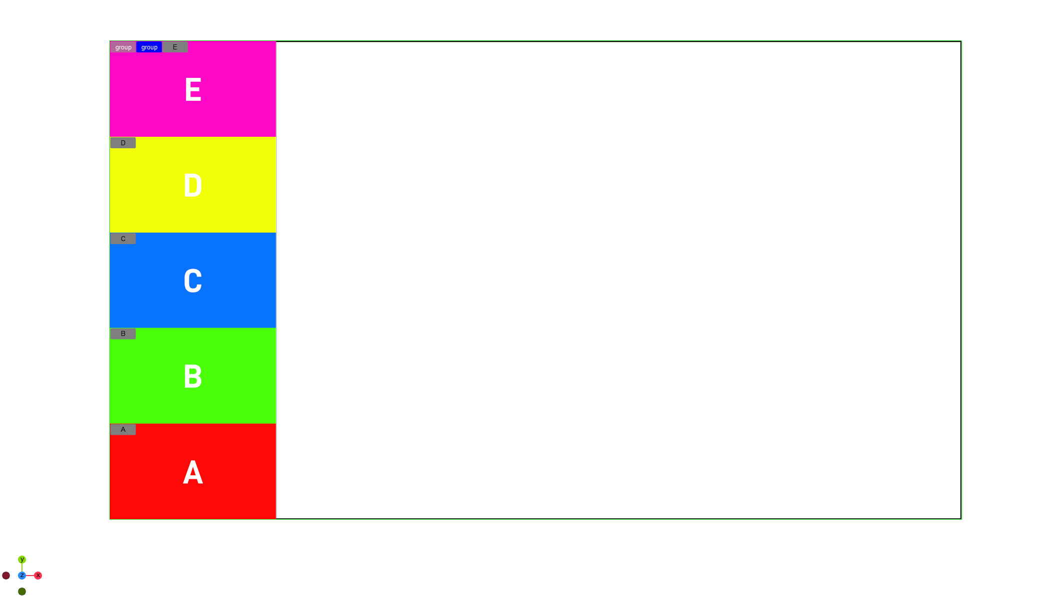
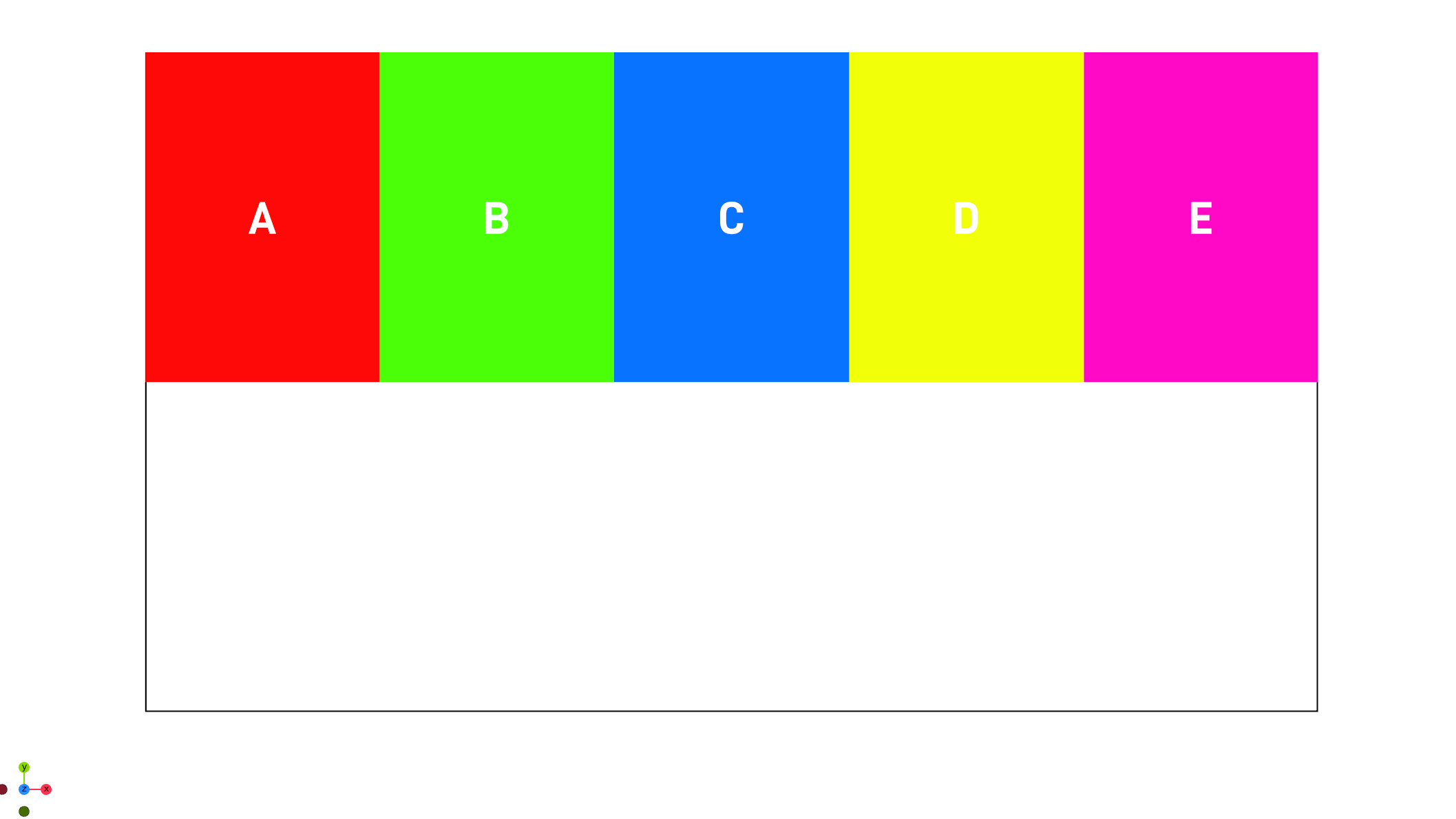
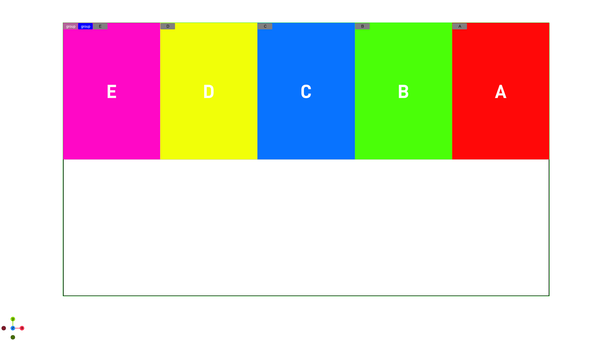
Flex Direction
Layouts can be based on Rows or Columns for all child boxes. This means that all children are placed within a row or within a column. The Flex Direction defines the main axis and defines the direction of all children placed underneath the flexbox container.
|
Column |
|
|
|
Column Reverse |
|
|
|
Row |
|
|
|
Row Reverse |
|
|
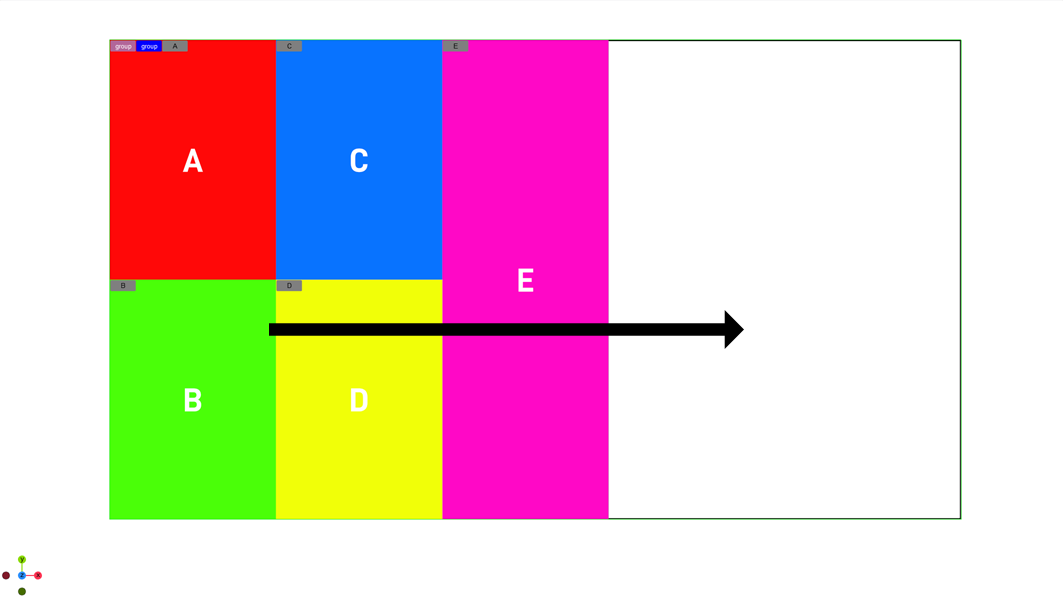
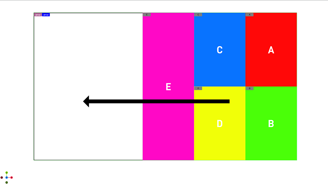
Direction
The direction property defines the main axis. Your children can be aligned starting from the left or from the right side. By default it inherits the setting of the parent flex container.
In Column mode this is being flipped and the main axis is going top to down or reverse.
|
Left to Right |
|
|
|
Right to Left |
|
|
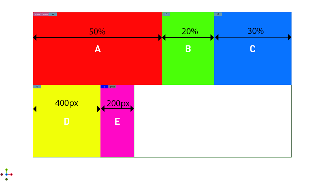
Flex Basis
The basis value defines the default size of a container along the main axis before any growing or shrink is performed. It can be either auto or a given value. This value is like setting the width if flex direction row is used or height or column layout is in use.
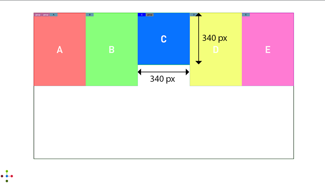
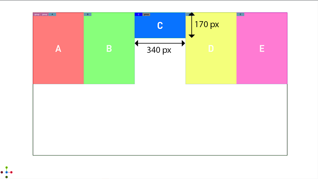
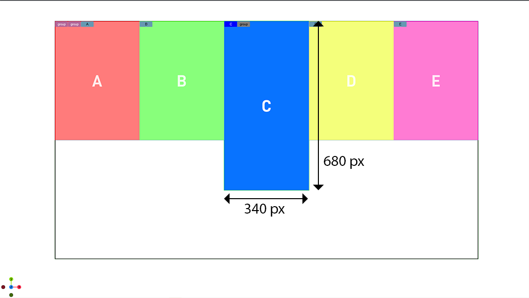
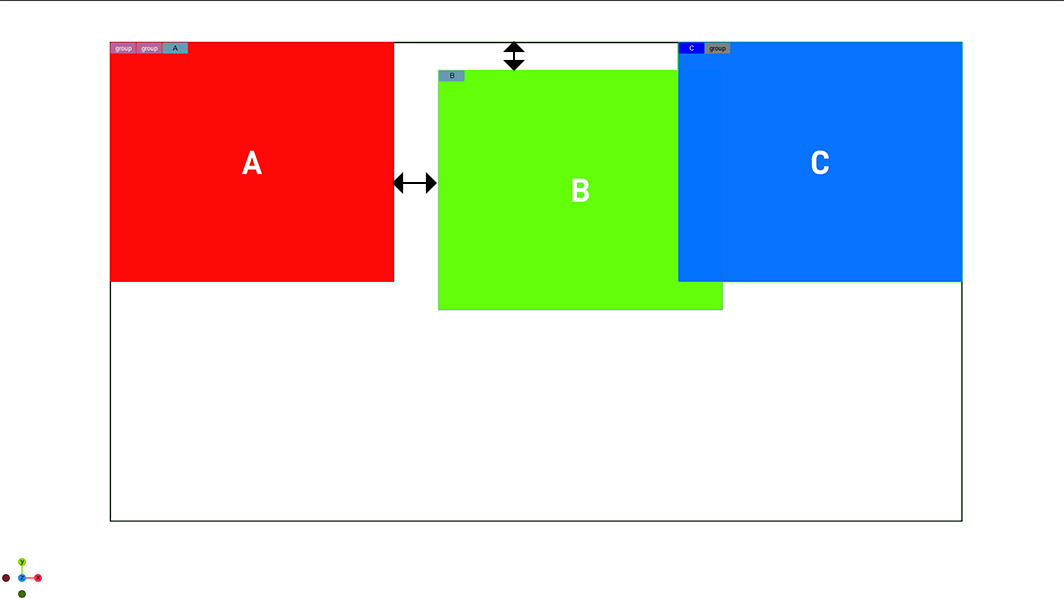
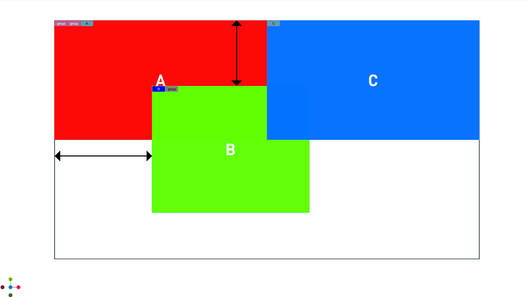
Growing and Shrinking
Defines if and how strong a container can grow or shrink to fit into a parent container. The minimum and maximum width/height values are taken into account. If growing is enabled for all child containers, the remaining space is distributed equally to all children.
The value is used as a proportional factor. For example if one container has a shrink value of 2, it shrinks twice as much as all other containers (see below).
|
Parent container on 100 % |
|
|
|
Parent container on 60 % |
|
|
|
Scaling of container C stays, whereas all other containers shrink to fit into |
|
Parent container on 60 % |
|
|
|
Container C is scaled down twice as all other containers (shrink = 2.0) |
Aspect Ratio
Defines how a flexbox is being scaled. If it is on auto, the width and height taken as it is. If a value is used, it defines the ratio between width and height. For example: An aspect of 2.0 means the width is twice the value of the height.
|
Aspect ratio = 1 |
|
Width and height are the same. |
|
Aspect Ratio = 0.5 |
|
|
|
Aspect Radio = 2 |
|
|
|
Auto |
|
|
Width, Height and Limits
The sizes for width, height, minimum width and height as well as the maximum width and height can be set to be either auto, in percentage values or in pixel sizes.
-
Auto: The size for the box is being calculated automatically based on grow and shrink values, the content as well as the aspect ratio.
-
Pixels: Defines the width/height in pixels.
Note: This dimension can be influenced by other properties.
-
Percentage: Same as pixels, but based on percentage values.
The minimum and maximum values size set the upper and lower size constraints of a container. These properties have higher priority than all other properties and are always respected.
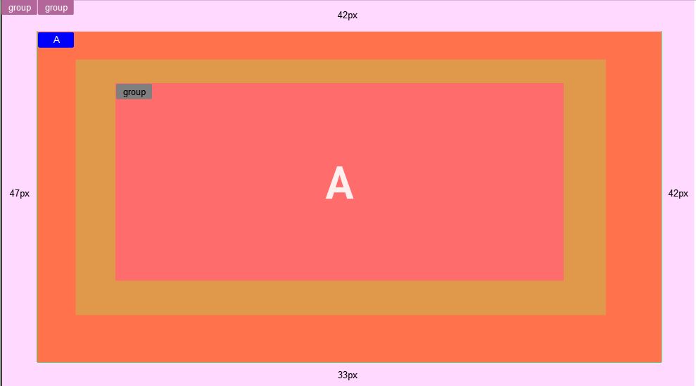
Margins, Padding and Borders
Each container can have some offsets by adding either a margin, padding or border.
-
Margin: Adds an offset to the outside of the element. It offsets itself and all children from the calculated position. It adds to the total size for the element. it can be set to auto, pixels or percentage values. Negative numbers are allowed too.
-
Padding: Affects the size of the container it is applied to. It does not add to the total size of an element if it has an explicit size set. It can be set in pixels or percentage, but can not be negative.
-
Border: Does more or less the same as padding. It can only be set in pixels. The main purpose of having an additional border is to keep compatibility with the original flexbox implementation.
Positioning
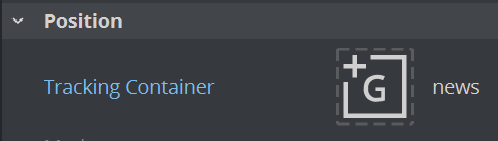
Tracking
To bind one container to another, Flexbox supports tracking. You can specify a reference container and your container follows this position. All other properties are disabled, but offsets can still be applied.
Adding an offset to a container shifts the whole container and its content based on the calculated position by the given values. This offset can be either relative or absolute.
|
Relative offset |
|
Takes the calculated position and adds the given offset. |
|
Absolute offset |
|
|
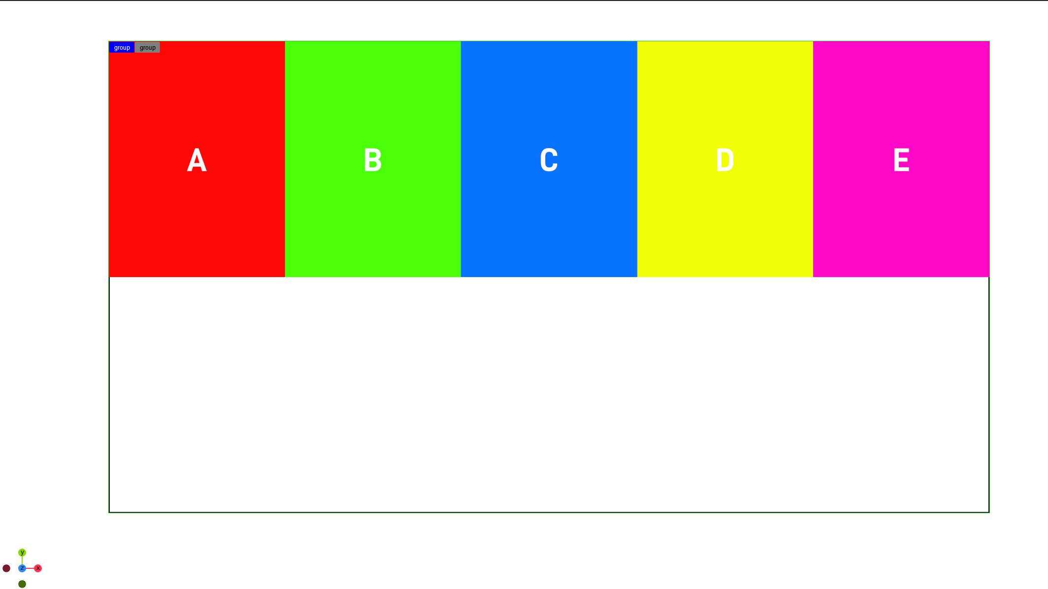
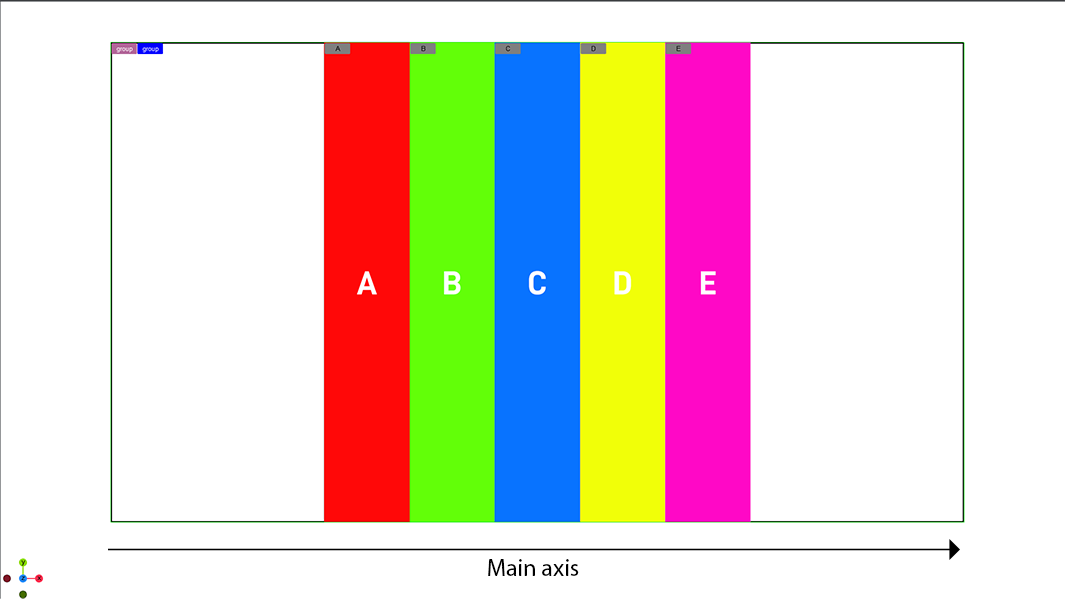
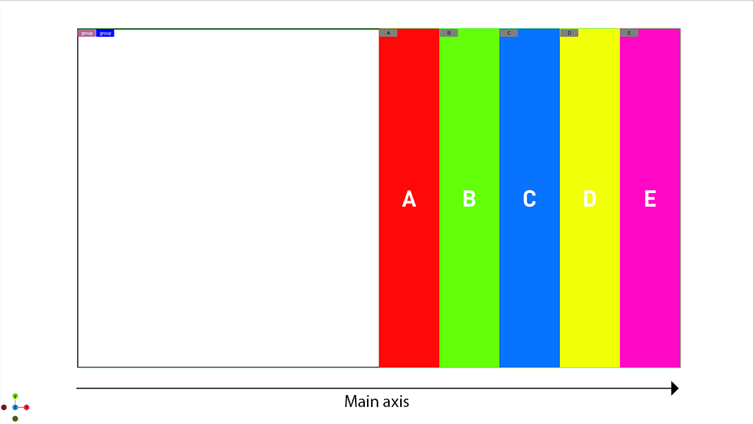
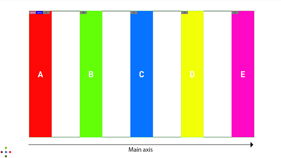
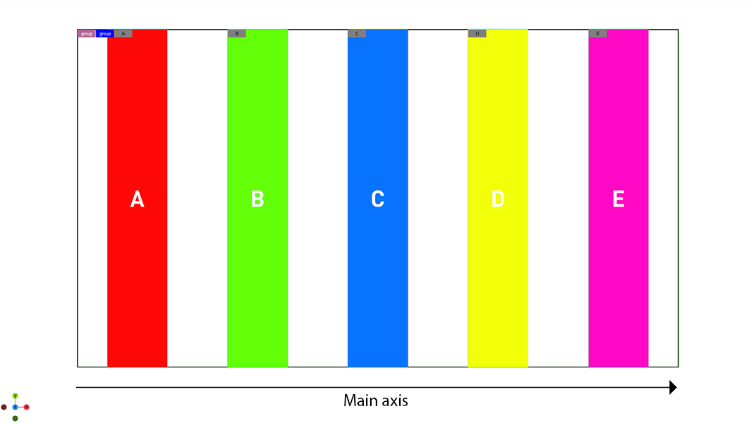
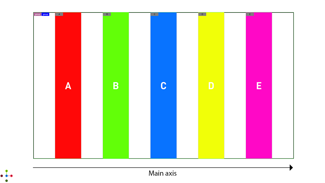
Justify Content
This setting describes how child containers align along the Main Axis. This can be used to automatically center items for example. The samples below show five child containers with a width of 10% and a height of 100%. The following settings are available:
|
Flex Start |
|
|
|
Center |
|
|
|
Flex End |
|
Aligns child containers to the end of the main axis. |
|
Space Between |
|
Distributes the remaining space between all child containers. |
|
Space Around |
|
Distributes the remaining space between all child containers, including start and end as one element |
|
Space Evenly |
|
Distributes the remaining space between all child containers, |
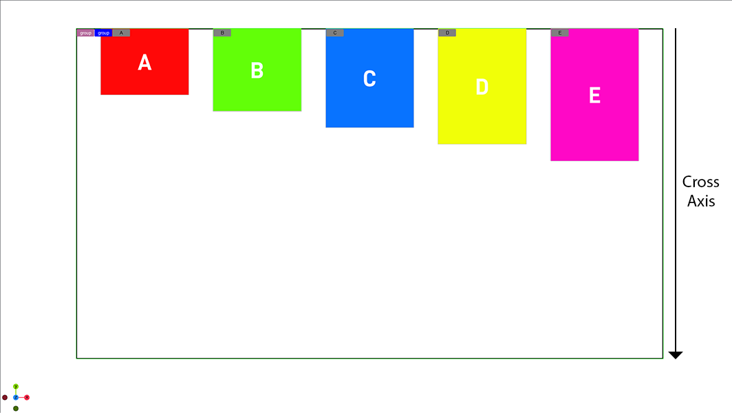
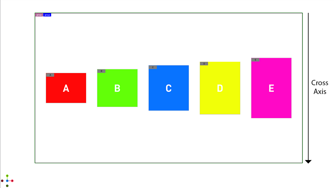
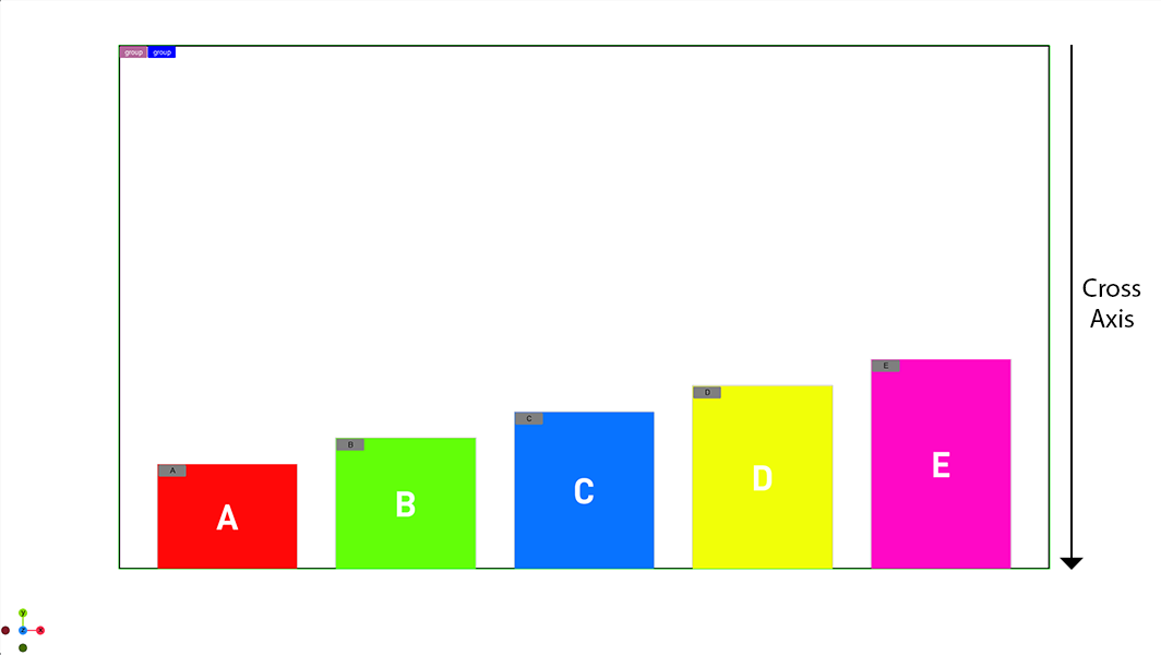
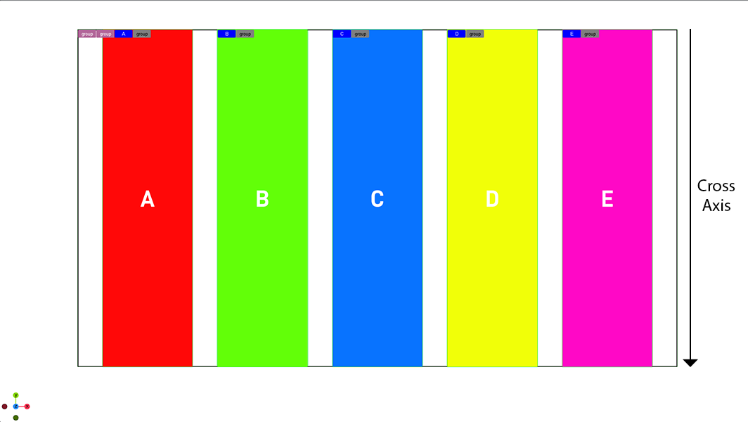
Align Items
This setting describes how child containers align along the cross axis. It sets the default alignment for all child containers, however it can be overwritten by a children using the Align-Self property. The samples below show five child container with a width of 10% and a height of 25%, 30%, 35%, 40% and 45%, Justify content is set to space around. The following settings are available:
|
Auto |
|
Uses the align item of the parent container. |
|
Flex Start |
|
|
|
Center |
|
Aligns child containers to the center of the cross axis. |
|
Flex End |
|
Aligns child containers to the end of the cross axis. |
|
Stretch |
|
The items are streched to fill the cross axis. Therefore the cross axis setting (in our case the height) must be set to be auto to allow the parent to overwrite the value |
|
Baseline |
|
Aligns all containers in a way such that their baselines align. The highest one starts on the top. |
|
Space between |
|
|
|
Space around |
|
|
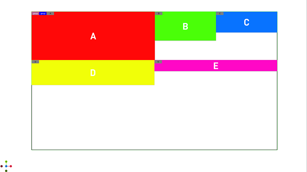
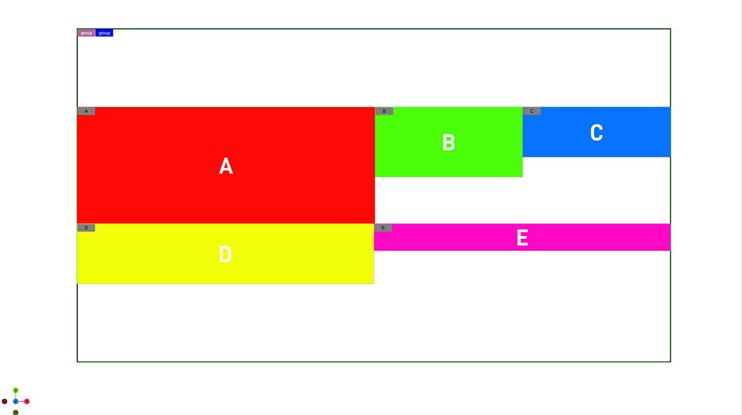
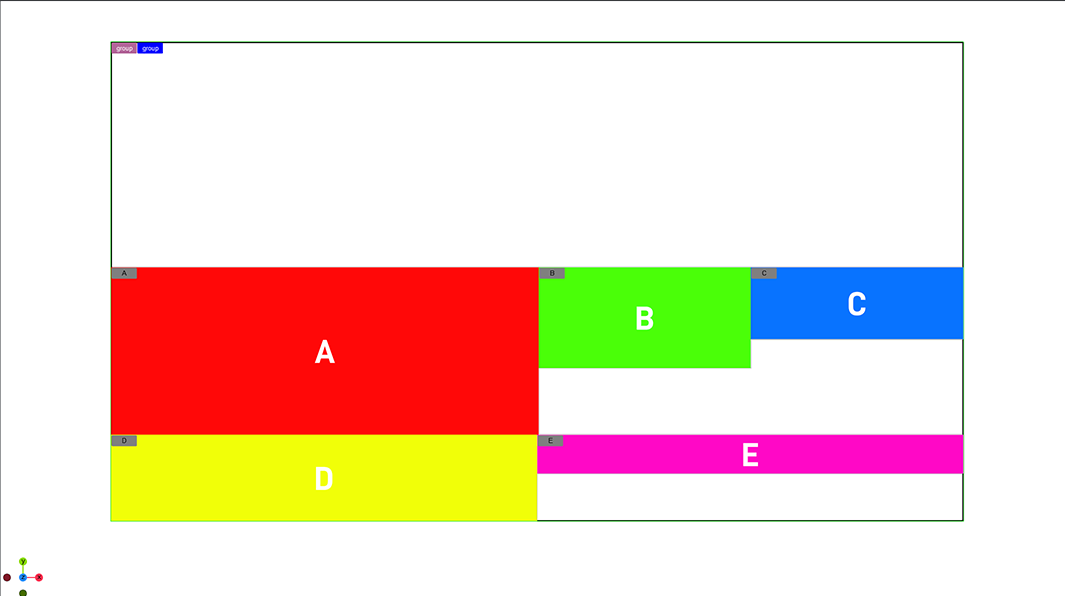
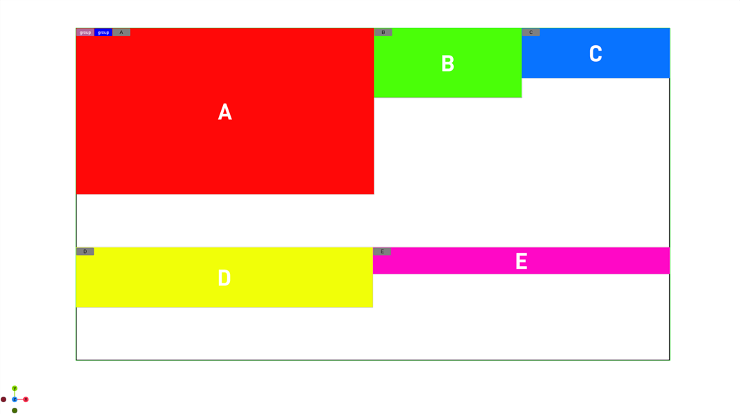
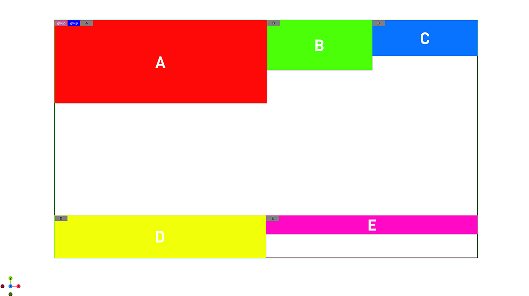
Align Self
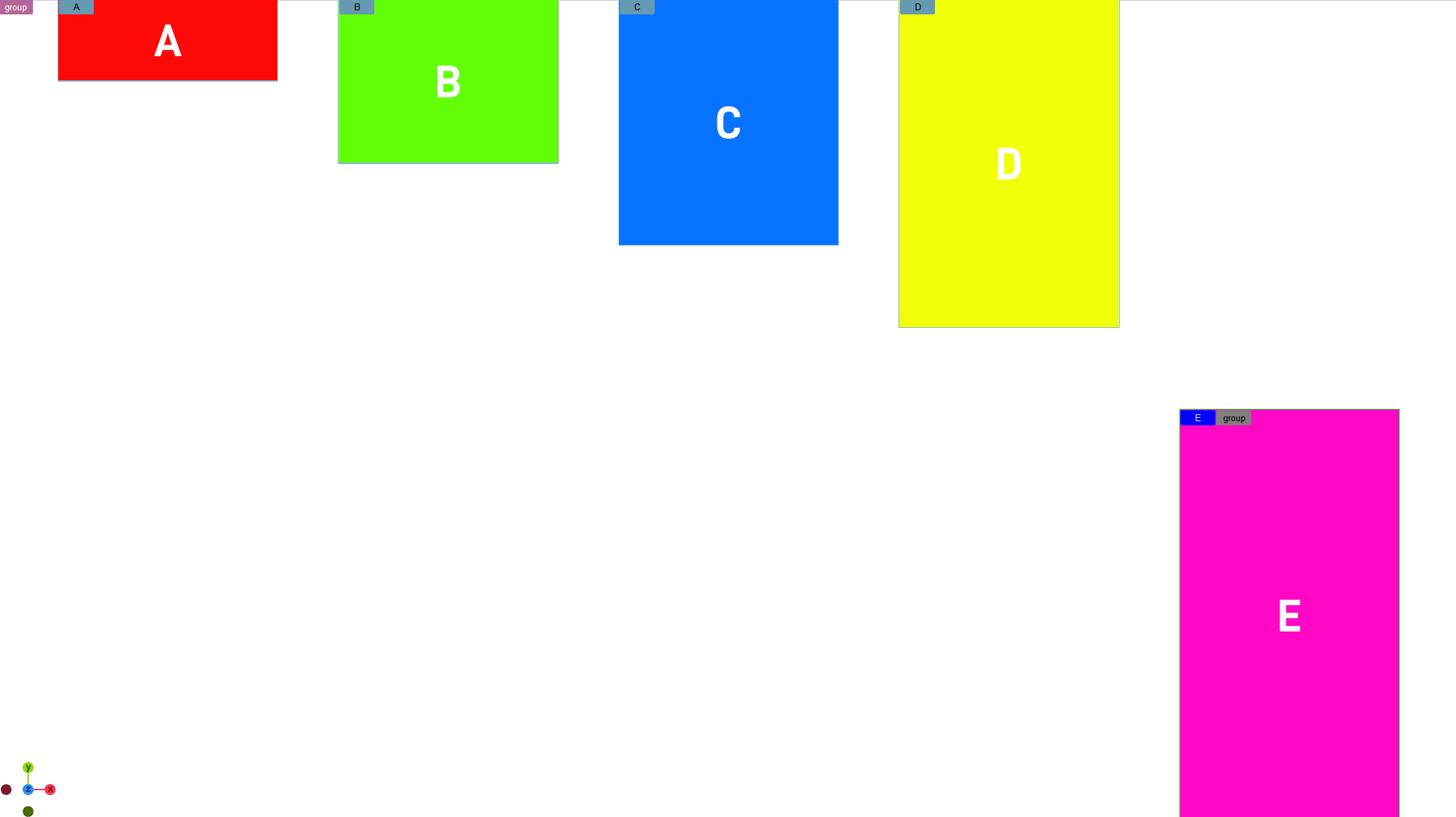
Align self is used to overwrite the Align Items property given by the parent container to is own. In the example below, the parent container is set to be Align Items: Start, but container E has an Align-Self set to be Flex-End. This takes it out of the computed position of the top (parent is set to Flex Start) and overwrite it with its own property Flex-End:
Align Content
Defines how containers are aligned, if the wrap mode forces elements to be distributed in more than on row or column. It has no effect if no wrapping happens.
The following settings are available:
|
Auto |
|
Uses the align item of the parent container. |
|
Flex Start |
|
|
|
Center |
|
Aligns wrapping child containers to the center of the cross axis. |
|
Flex End |
|
Aligns child containers to the end of the cross axis. |
|
Stretch |
|
Stretches the space between the elements to reach the parent containers cross axis. |
|
Baseline |
|
Aligns all containers in a way such that their baselines align. |
|
Space between |
|
Distributes the remaining space between all lines to match the parent containers cross axis. |
|
Space around |
|
Like space between, but also distributes space including top and bottom. |