
Viz Artist
Version 3.10 | Published May 03, 2018 ©
Scroller
The Scroller plug-in is a geometry plug-in, mostly used for creating scrolling tickers, that generates a dynamic line of scrolling items.
When used with Viz Ticker the scene is designed as a transition logic scene where each data item is an instance of a scene template designed as part of the background scene. This is unlike traditional transition logic scenes where each data item would be based on a specific foreground scene controlled by the background scene. Based on the scene template that resides with the background scene the Scroller is able to construct and configure the scene templates on demand for Viz Ticker that manages and reuse them.
To design a scrolling carousel, the Scroller and one or more scene templates must be added to the background scene. The scene templates serve as prototypes for the containers that the Scroller plug-in generates. Alignment of the generated containers is done by editing the alignment of the scene templates.
Tip: When saving a Scroller scene, remember to hide the scene template containers. This will prevent the scene template from being shown on-screen.
Note: This plug-in is located in: Built Ins -> Geom plug-ins -> Ticker
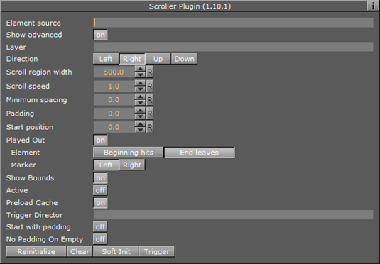
Scroller Properties
-
Element Source: Element descriptions are added here. Descriptions must be entered in the element source syntax, or in the name of a Shared Memory segment that uses the Shared Memory protocol. When designing and testing a scene, the element source syntax is used to make the system scroll instances of the design containers.
-
Show Advanced: Shows additional parameters. Defaults to Off.
-
Layer: Defines the layer name for the scroller. The layer name must be identical to the name of the director that holds the in and out stop points for the carousel.
-
Direction: Defines the direction of the scroller.
-
Scroll Region Width: Defines the width of the scroller. This option is only relevant for left-to-right/right-to-left scrollers.
-
Scroll Region Height: Defines the height of the scroller. This option is only relevant for up-down/down-up scrollers.
-
Scroll Speed: Defines the speed of the scroller. The x position of the scrolling items will be decremented with this value for each frame that passes.
-
Minimum spacing: The minimum spacing between scrolling elements.
-
Padding: Defines an extra padding value that will be added to the width of the bounding box of an item when calculating the spacing between the items. Negative padding can be used to make items overlap.
-
Start Position: Set the initial position as a percentage value in the range 0-100. A value of 100 means the scroller starts fully populated with content. The default value is 0.
-
Played Out: Track movement of scrolling element and notify ticker service on specified position.
-
Element: Position of the scrolling element to be checked with the marker. When set to Beginning hits, notify when beginning of element hits the marker. When set to End leaves, notify when end of element leaves the marker.
-
Marker: Position of the marker related to side of Scroll region.
-
-
Show Bounds: If enabled, the area in which the scroller tries to maintain the illusion of a continuously scrolling flow of items is visible on-screen.
-
Active: Scrolling or flipping is available when enabled.
-
Preload Cache: Use this on configurations with no ringbuffer, to move all spike-load related to item creation to the initialization phase. Designs named DESIGN_designname_Xnnn will have nnn instances created in advance, where nnn is an integer.
-
Trigger Director: Director to be triggered when the Trigger button is pressed.
-
Start with padding: Sets padding for the first scrolling item, for example when Start Position is set to 100 % or the scroller container is hidden at the beginning.
-
No Padding On Empty: An element with zero bounding box will not create any extra spacing between elements.
-
Reinitialize: Reinitialize the plug-in by deleting all cached objects and reconstructing the initial node structure. This parameter can be used to update the scroller after changing for example the item source.
-
Clear: Clears all current ticker items in the rendering window.
-
Trigger: Triggers the director named in the Trigger Director field provided that there are items in queue to be scrolled in. If no director is specified, the scroller is activated.
Tip: The Viz Ticker User’s Guide contains information on design conventions when using the Scroller plug-in.
See Also